It's time for UI update!
-
@AJ-Baxter Unfortunately to attract new users that have never used N++ before, a semi-updated UI is kind of needed.
-
i also think skinnable UI would be a good option, i would love to see a dark UI as well.
i did a quick mockup of how it should look like in the dark mode. Don’t use toolbar so it is hidden, but it should be optional. I hope Notepad++ will get a dark skin soon :)
-
@David-Bailey whatever problems people had with win 8, the flat design was far from the burning ones, which is why 10 also uses flat design and this is the last version of windows. In addition to that both apple and android also went with flat design so the reality is that flat design is here to stay, regardless if you like it or not.
Also, someone who cares about the design of his app and the user experience will value consistency (which in this case will also mean flat design) instead of making his app look different for the hell of it
-
Been using using notepad++ for years. I honestly wouldn’t mind if the UI was updated to fit in with the windows 10 theme.
Would be nice it NPP kind of looked like visual studio’s little brother. -
@RedactedContent said:
Would be nice it NPP kind of looked like visual studio’s little brother.
This!
-
@chilli2
Don’t forget that many people will be using NP++ under XP, W7, W10, under Wine, or with some sort of skin over a native Windows. You can’t please them all without going to the trouble of making multiple GUI interfaces!I would say that if this has to be done, then some sort of skin solution is the best. Even then, I would say this is low priority.
David
-
Here are 2 screenshots of what np++ looks like on Win7/Win10
Win7
Win10Take a closer look!
Every element except one DOES fit into both OSs:
Windowborder: yes
Menubar: yes
Toolbar: yes
Tabs: no
Contentwindow: yes
Statusbar: yesWe do not need a full UI-Overhaul, making the tabs-container integrate with the OS-Design would be enough :)
Edit: Ok, if you want to be picky, you could nag that the toolbar has a grip on the left side which makes no sense and the statusbar does not go with the background color of the OS in Win10, but this are marginal issues
Edit2: Working with OS-native tabs would probably mean loosing some of the already implemented tab features:
-vertical tabs: which make no sense anyway because they take up very much of your vertical space and vertical font rendering is currently ugly as f***
-highlight active tab with orange line and darken inactive tabs: open some options window in windows which utilizes tabs and you will realize the active tab is visible enough
-icons (saved and unsaved state plus the close button): ok, THIS would hurt, but maybe the rendering-function could be overloaded?
-different size: not that bad, if you want bigger tabs use windows dpi settingsNow that i am thinking of it: would it be possible to replace the tabbar like the toolbar with the CustomizeToolbar Plugin?
-
@reckless_writing said:
-icons (saved and unsaved state plus the close button): ok, THIS would hurt, but maybe the rendering-function could be overloaded?
the save-state can be visualized through an asterisk, mousewheel-click on tab does the same as clicking on an x-icon
-
Compromise it in two options:
Legacy: Still shows as it does in its old form for those that love it.
Win 10: A new cleaner, more modern look but with the same options available for fully customizing how it looks, behaves, and functions. -
windows 2000 style ui is very good.
-
highlight active tab with orange line and darken inactive tabs: open some options window in windows which utilizes tabs and you will realize the active tab is visible enough

-
OMG a flame war… Maybe the topic should be more focused and explicitly state what parts of the UI could need what kind of update/change. I’ll try to summarise my impression after a few occasional uses in the past and 15 minutes on my main computer with the intention to keep it for my daily work from now on:
- Window frame: Nothing to change here. It’s native and blends in everywhere.
- Menu bar: Is it just me that hotkey underlines are displayed permanently? They should only appear when pressing the Alt key or so. Also, that strange “X” menu on the right end should probably be replaced with a proper “close document” button. Or removed altogether. Also, using the icons from the toolbar could make commands easier to find in the long menus. IIRC Win32 can’t do that though, you need to custom-draw the menus, or use some library for that. (I did that myself back in my C++ days. Long ago.)
- Toolbar: It’s native but that isn’t the best solution. The icons are from famfamfam I believe. A pretty soft iconset, blurry or dull at times. Not available in higher resolution but popular in open-source applications. Some of them are customised and there are wrong pixels in them, also they’re not edge smoothed thoroughly. The disabled buttons are too grey and have a jagged outline. A softer effect like in other applications would look better. But I might hide the toolbar anyway when I know the most important hotkeys.
- Tab bar: The problem number one! It doesn’t even look like Windows XP (only the accent colour), it’s still much like Windows 95, to name its first appearance, which is more similar to Windows 3! Windows XP already featured a flat look. 16-colour greyscale 3D is dead since shortly after Windows XP. That was 10 years ago. Windows 7/8/10 didn’t change it much.
- Tab save icon: I don’t like it, to be honest. No other application I use has such a huge modification indicator. Most just add an asterisk (*). I’d like to remove it completely but it’s not possible. But if you want to keep it, IIRC tab headers could always be custom-drawn in Win32, so that should be possible.
- Editor border: It might belong to the tab page, not sure about that. Again, greyscale 3D inset border. Can we please remove that completely?
- Status bar: Everything OK again here.
The options and styles dialog windows are scary. Cut off localised text, inconsistent layout, not resizable, sometimes chaotic organisation. Might be limited by pure Win32, not sure. .NET WinForms and Qt offer layout containers for that but you probably can’t use those.
Those who complain about “Windows 10” and “Flat is ugly” and so on, do you actually know what you’re talking about? I have the impression you’re mixing lots of things. I know Windows 10, and it’s not finished yet, despite Microsoft declaring it as such. They’re still tweaking basic UI elements like the active window title bar colour. Windows 10 is currently in beta. Don’t take it as reference.
If “flat” means to you that you can’t see where the toolbar ends – so what? I don’t care where the toolbar ends, I want to have the buttons on it. Giving each toolbar an extra border is called visual distraction and is bad. Most separator lines could easily be replaced by simple spaces, if done well. There are visual design experts who are able to do such things. Sadly, open source development doesn’t have many of them.
Sometimes, flat icons require you to simplify the shape which makes it easier distinguishable. You just can’t put the world in 16 by 16 pixels. Flat isn’t about “hard to see”, it’s basically “simple shape without gradients and shadows” but still with sufficient contrast. Also, flat is a lot easier to make and render. I believe those who outright reject “flat” haven’t seen it done right yet.
Oh, what about High-DPI? I can’t easily test this, but it’s definitely coming. Some current tablets and notebooks, even desktop screens, are already relying on that.
-
@Avik-Biswas This is how it’s done. Not just complaining, instead giving a good design. I would love to have a dark Notepad++
Keeping this minimalistic style. No big fonts or buttons. Just plain simple.
-
@Avik-Biswas Under Windows 10, and I believe in earlier versions too, you can change the theme. The theme affects Notepad++ colors for:
- window borders
- menu bar
- toolbar background
- scroll bars
- status bar
- tab bar inactive disk icon colors (odd)
In Notepad++ Style Configurator - Global Styles allows you to change colors for:
- line number (Line number margin)
- folder margin tree (Fold margin)
- tab bar (Active tab text, Inactive tabs)
Set Notepad++ Preferences - Editing - Border Width to 0.
-
I would definitely like a Universal version of Notepad++. I’d love to have NP++ on my Windows Phone. So put me in the vote for a UI update by porting to UWP .
-
How would N++ be valuable on a phone??
-
Like said above the only parts that look out of place are the tabs and the Windows 95-style bevel around the text editing area. If those two things were adjusted to look more windows 10-esk I think it would make Notepad++ look a lot more modern right away.
One of the things that I am way more keen to have is sublime-style multi-caret editing; I am so used to using the likes of Ctrl+D to select multiple instances of the currently selected word and tweaking them.
Either way; keep up the great work.
-
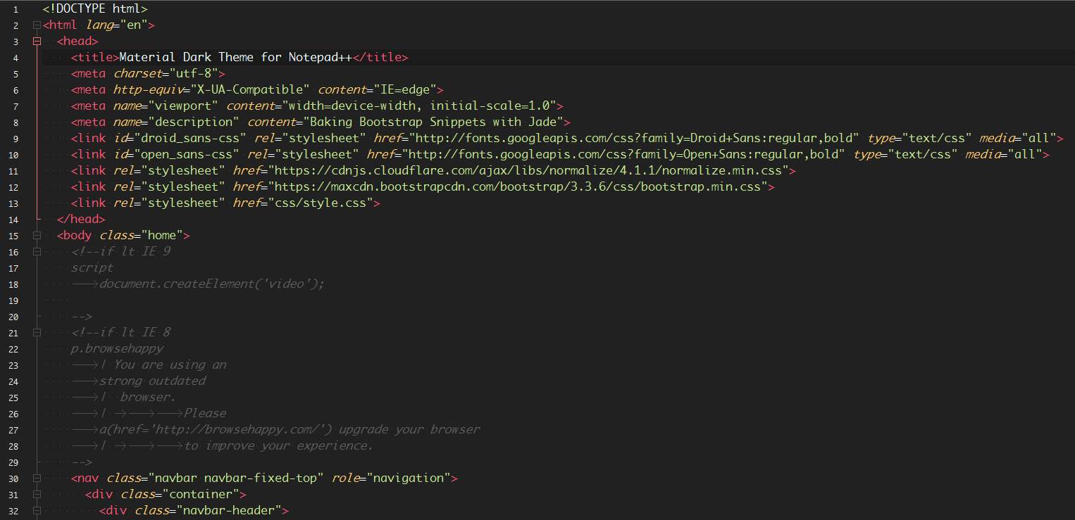
Enjoy the Material Theme Colors in Notepad++.
-
N++ is a great tool, but the UI update it needs is not a different color scheme. It’s attention to the little things that make a product more usable, not pretty color themes.
E.g., when N++ fires up for the first time, and lines in a text file are not wrapping, if the user goes to Settings -> Preferences, there’s a section entitled “Line wrap,” but nothing there to enable wrapping. There ought to be an option to enable wrapping, right there. Instead, there are several options under “Line wrap” labeled “default,” “aligned,” and “indent,” but there’s no explanation of what they’re for, and they don’t seem to actually do anything.
Worse, when the mouse cursor is hovered over the preferences/settings/options, N++ pops up… nothing. Absolutely nothing at all.
Instead of worrying about harmonizing pretty color schemes with the OS’s themes, N++ would be improved by fixing those sorts of usability issues.
E.g., put the line/word wrap feature where the user will look first, instead of where he’ll find it after several minutes of searching.
E.g., make nice, descriptive help messages that pop-when hovering over the settings/preferences/options.
E.g., add a help system so someone can type in a keyword like “wrap” and find the related settings.
Also, anonymously report the searches to the N++ developers, so they can see what people are searching for, especially what they’re searching for that they don’t find, so that the help system can be constantly improved.
Also, there’s something strange going on in this latest version of N++. It used to be very responsive. But now if I’m editing a plain text file (name ends in .txt), and I type a left square bracket and some text, the bracket turns red, a close-bracket is automatically generated, and there’s a painfully long delay before the text appears on the screen. I don’t know what N++ is trying to do, but I wish it wouldn’t do it!
-
BTW, I haven’t timed the “painfully long” delay before text typed between [brackets] appears on the screen, but today I typed an entire 142 character sentence before any of it appeared.