• Login
Community
  • Login

GUI: shortcut window graphical revamp

Scheduled Pinned Locked Moved General Discussion
guipullrequest
5 Posts 2 Posters 4.0k Views
Loading More Posts
  • Oldest to Newest
  • Newest to Oldest
  • Most Votes
Reply
  • Reply as topic
Log in to reply
This topic has been deleted. Only users with topic management privileges can see it.
  • L
    lordkrandel
    last edited by Sep 21, 2015, 9:16 AM

    GUI: shortcut window graphical revamp #942
    — A simpler and cleaner look for the shortcut window

    Let me know what you think about it.

    https://github.com/notepad-plus-plus/notepad-plus-plus/pull/942
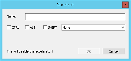
    image

    1 Reply Last reply Reply Quote 0
    • J
      Jan Schreiber
      last edited by Sep 21, 2015, 9:40 AM

      I like that a lot. Wonder if it’s possible to make the warning “This will disable the accelerator!” stand out a little more.

      1 Reply Last reply Reply Quote 0
      • L
        lordkrandel
        last edited by Sep 21, 2015, 10:20 AM

        Should I add “Note:” in bold on the left…
        How would that be translated to other languages?
        I’m not that into localization.
        Maybe someone could help?

        Anyway, trust me, that notice appears on a big blank space.
        If you change your shortcut you will notice that for sure.

        Other options would making that notice bold (maybe it’s too much) or underlined (less readable).

        1 Reply Last reply Reply Quote 0
        • J
          Jan Schreiber
          last edited by Sep 21, 2015, 10:26 AM

          I rely on your good judgment here. If you consider bold text (or a red background or something of that kind) too obtrusive, just leave the dialog the way it is.
          Your design is much cleaner than the old one.

          1 Reply Last reply Reply Quote 0
          • L
            lordkrandel
            last edited by Sep 25, 2015, 7:17 AM

            A light yellow background could make it more visible.
            Yellow is more suitable for a warning than red. Red means “error”.
            I’ll make it sure that it doesn’t look like a lemon though.

            1 Reply Last reply Reply Quote 0
            2 out of 5
            • First post
              2/5
              Last post
            The Community of users of the Notepad++ text editor.
            Powered by NodeBB | Contributors