Newbie here, a few quick questions!
-
Settings -> Style Configurator -> Global Styles -> Brace Highlight Style
Set foreground/background to your default. -
That image does not look like the normal rendering of Notepad++ for any version I remember seeing:

Even as far back as v4.0 from 2007, the tabs look like:
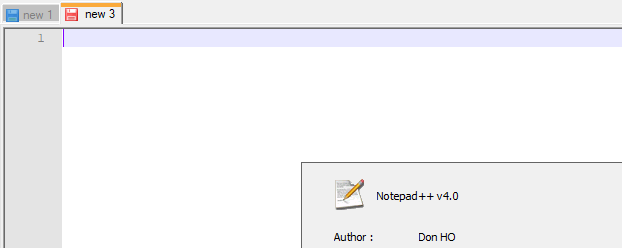
… using a disk icon to indicate saved vs not saved.Please show the ? Menu’s Debug Info entry. If your Notepad++ is too old, it might not have that menu, so if you don’t see it, then please show your ? Menu’s About dialog. To easily show us the picture, use Alt+PrintScreen when the dialog is active to copy it into your clipboard, then just use Ctrl+V to paste the image directly into your reply.
-
@PeterJones said in Newbie here, a few quick questions!:
That image does not look like the normal rendering of Notepad++ for any version I remember seeing:
I think this is what AkelPad looks like.
unlike akelpad does.
-
@mere-human said in Newbie here, a few quick questions!:
@PeterJones said in Newbie here, a few quick questions!:
That image does not look like the normal rendering of Notepad++ for any version I remember seeing:
I think this is what AkelPad looks like.
Ah, that makes sense
Back to question #1: without changing the setting that @Ekopalypse mentioned, the unedited vs edited tabs look like:
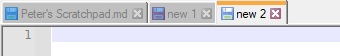
The scratchpad on the left is unedited and not active, so is a shaded blue; the “new 1” is edited and inactive, so is a shaded red. The active tab will be either blue or red as well.
With the “Alternate Icons” checkbox that @Ekopalypse pointed out, it uses a checkmark for saved, and a pencil for edited, which makes it easier to see on the inactive tabs and for people who have difficulty noticing color differences:

… which, IMHO, is much better than the asterisk from akelpad. -
@PeterJones said in Newbie here, a few quick questions!:
…which makes it easier to see on the inactive tabs
Left unmentioned was the “readonly” grey diskette icon is totally undifferentiated on an inactive tab!
My advice: Forget the old “diskette” icons. Who even remembers what a diskette was/is anyway? (of course, I happen to have an 8" floppy diskette in my collection, but I digress…)
I’ll even go so far as to say the new “alternate” icons should be the default when Notepad++ is installed. Of course, that would be a problem because then they would be the “defaults” not the “alternates”. Hmmmm… -
@Alan-Kilborn said in Newbie here, a few quick questions!:
Left unmentioned was the “readonly” grey diskette icon is totally undifferentiated on an inactive tab!
My bad.
old readonly icon:

new readonly icon:

I’ll even go so far as to say the new “alternate” icons should be the default when Notepad++ is installed.
I think that Don decided that for backward compatibility, the new would be the “alternate”/non-default, despite votes to make the new ones default. But that’s just vague memory, and I haven’t gone back to the issues/commit-history to verify.
-
@PeterJones said in Newbie here, a few quick questions!:
I think that Don decided that for backward compatibility
Hmm, I guess I understand it for some things, but for purely visual things, that are arguably better?
How many users that don’t follow the Community would even know such a better feature exists?
It would probably take them years to notice that pref setting, when they happened to be in there to adjust something else (which is probably rarely).
I would think, make it the default, and if for some reason users want their inactive tab icons to look like readonly files tab icons, they could seek out how to get that behavior back.
I think this kind of philosophy should be exercised often: give the users something better and turn it on by default. Otherwise your run-of-the-mill user never benefits.
My 2c. -
@Alan-Kilborn said in Newbie here, a few quick questions!:
@PeterJones said in Newbie here, a few quick questions!:
I think that Don decided that for backward compatibility
Hmm, I guess I understand it for some things, but for purely visual things, that are arguably better?
I don’t disagree with you. In fact, I wholeheartedly agree.
But I went digging, and found in the PR that @Scott-Sumner lobbied for making the new ones the default, but since Don is the final arbiter of design and aesthetics for the product, his preference of keeping the old disk icons as default won out – some of Don’s reasoning was given in his reply there.
-
@PeterJones said in Newbie here, a few quick questions!:
@Scott-Sumner lobbied for making the new ones the default, but since Don is the final arbiter of design and aesthetics
Ha, yea, well Scott authored the feature, so how hard could he push for that?
As we’ve seen, for some strange reason the opinions of devs and regular contributors here on the Community don’t seem to carry much weight, compared to the opinion of the one-off users. -
thank you guys for all the help and suggestions!
notepad forum is definitely better than akelpad’s in terms of being active, I hardly couldn’t expect to get answers even after a month
no regret to move on to NPP!
btw did any try the feature “remember cursor position” in this link ? https://github.com/flawiddsouza/Remember-Cursor-Position
it seems promising but I am scared of messing up my configs so I am yet hesitant to give it a go.(usually so careful when implementing a new plugins/extensions to my workstation.
-
@Alan-Kilborn said in Newbie here, a few quick questions!:
How many users that don’t follow the Community would even know such a better feature exists?
Maybe we can persuade Don to make this an option to choose from in the installer.
-
From my recent discussion with Don and as Alan mentioned, Don prefers the opinions of “normal” users and to get his attention, those users need to open issues on github.
Linking to previous discussions here in the community could
be counter productive.
Hello! It looks like you're interested in this conversation, but you don't have an account yet.
Getting fed up of having to scroll through the same posts each visit? When you register for an account, you'll always come back to exactly where you were before, and choose to be notified of new replies (either via email, or push notification). You'll also be able to save bookmarks and upvote posts to show your appreciation to other community members.
With your input, this post could be even better 💗
Register Login