Notepad++ v8 Release Candidate
-
@donho said in Notepad++ v8 Release Candidate:
Just try it, cannot reproduce it. Next time when it happen, you may check the + box on the 2nd monitor.
I found a reliable repro, at least for me:
- assign shortcut to DFM (I chose Shift+F12)
- open Preferences window and leave it open
- return to editing work in a tab
- invoke DFM via the shortcut (once in DFM the
+box does not appear) - use the shortcut to toggle in and out of DFM a few times (when in DFM the
+never appears) - close the Preferenes window
- invoke DFM via the shortcut (once in DFM the
+box appears just fine) - use the shortcut to toggle in and out of DFM a few times (when in DFM the
+appears just fine, every time)
I checked all monitors when it happens; nothing like
+appears on them when this bug occurs.Note: DFM = Distraction Free Mode
-
@Alan-Kilborn said in Notepad++ v8 Release Candidate:
I found a reliable repro, at least for me:
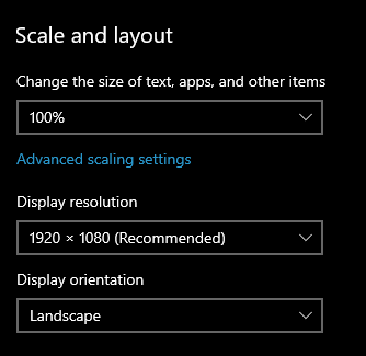
I tried and can’t reproduce. I’m using Shift-F11 as shortcut. I only have a single laptop monitor - no external display, with settings:
Cheers.
-
@Michael-Vincent said in Notepad++ v8 Release Candidate:
I tried and can’t reproduce. I’m using Shift-F11 as shortcut. I only have a single laptop monitor - no external display, with settings:
@Alan-Kilborn I cannot reproduce either as @Michael-Vincent did (also only single laptop screen) - I assign the shortcut to F9 to DFM.
-
This post is deleted! -
Be civilized please and remove all your plugins, then restore one by one for identifying the incompatible plugin.
More your report is accurate, more we can help you. -
@donho Sorry if it seemed rude. ))
Thanks for your work!
I can only share my impressions and remarks.
I think Dark Mode needs in options of customization.
1 - Need add option Disable toggling text Style
2 - Need add option Disable toggling icons
3 - When switching Mode, need make reverted to previous style, not by deafault.
4 - Replace Black on Dark fill. Or neutral gray.
Black nobody uses! )))
As an example: Photoshop, 3dsMax, XYplorer, Blender 2.9x.
Thanks again for big great update. -
Bug of Dark Mode:
Text of inactive tab is not readable. -
@Artur-Harison said in Notepad++ v8 Release Candidate:
Text of inactive tab is not readable.
Seems readable to me:
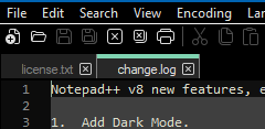
The problem with saying something like “Text of inactive tab is not readable” without showing some sort of substantiating picture is that it is hard to take you seriously.
-
@donho said in Notepad++ v8 Release Candidate:
Enjoy!
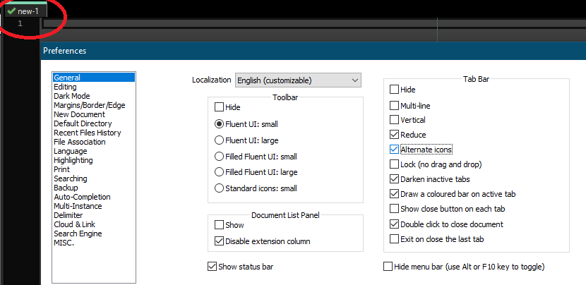
Small “bug” with switching to/from Dark Mode. I have Preferences => General => Alternate icons enabled for the tab icons (e.g., saved, edited, etc.) Now, switch to dark mode. The tab icons no longer show; however, they are still “checked”:
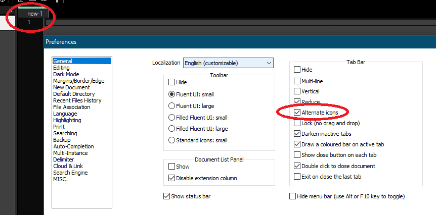
Checking and unchecking the “Alternate icons” checkbox makes them appear.
Cheers.
-
I just hate dark mode…
Please remove it or make it optional while installation.
But i want to know how you able to implement that dark UI in win32API???
Its impressive. -
-
I can also confirm the behavior reported by @Michael-Vincent with the alternative icons under Windows 7.
The others, the lack of the close button in DF mode and not being able to read inactive tabs in dark mode, do not occur here.
@donho and all involved, thanks for both features, I love them already.Edit: Forgot to mention, I do have a multi-monitor setup.
-
Seems you are using a custom theme (as opposed to DarkModeDefault)? That’s on you to adjust the Settings => Style Configurator… => Inactive tabs => Foreground colour. I too use a custom theme with Dark Mode enabled, and I had to make a few minor adjustments to my theme colors so they would look good in Dark Mode as well as with Dark Mode disabled so I can switch back and forth and not need to change my theme / theme colors.
Cheers.
-
@Michael-Vincent said in Notepad++ v8 Release Candidate:
Small “bug” with switching to/from Dark Mode
Also seems that when restarting Notepad++ in Dark Mode, even after the “correction” to show alternate tab icons, they are not shown on restart - even though they are checked in Preferences.
Cheers.
-
Yes, same erratic behavior on Win7.
-
Text of inactive tab is not readable.
Obviously you have changed the theme - you can change it back to “DarkModeDefault.xml” or use Style configurator to tune the theme you have chosen.
The tab icons no longer show; however, they are still “checked”:
Indeed, it should be unchecked when the Dark mode is switched in. It’ll be fixed.
Please remove it or make it optional while installation.
No. You can choose to not switch in.
But i want to know how you able to implement that dark UI in win32API???
Notepad++ is an open source project. Please check the implementation in Notepad++ repository on Github
-
Wow! I didn’t know (or forget) what style affects on Tabs.
Thanks everyone! -
@donho said in Notepad++ v8 Release Candidate:
Indeed, it should be unchecked when the Dark mode is switched in. It’ll be fixed.
Ok, but the “regular” icons don’t show either without some “clicking”.
- In Dark Mode, turn “Alternate icons” off by removing the check.
- close Notepad++
- open Notepad++
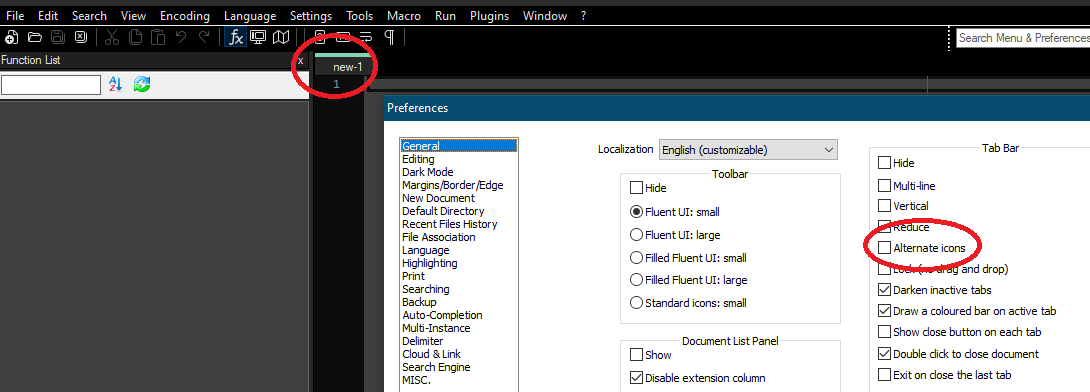
No tab icons at all. Checking “alternate icons” turns them on:
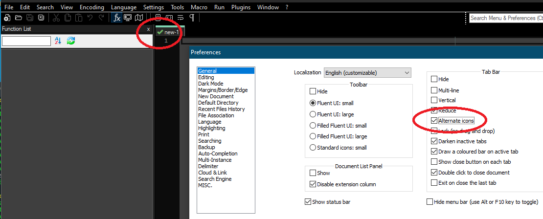
then unchecking them makes the regular ones appear:
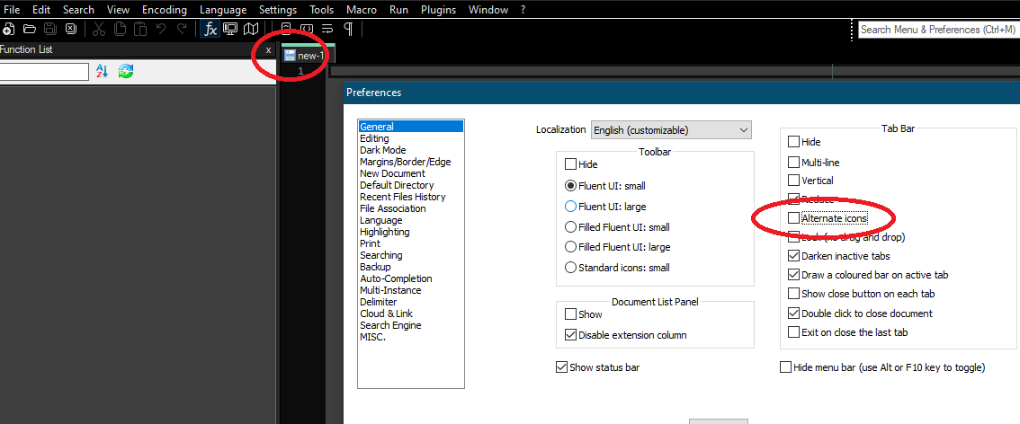
Cheers.
-
@donho said in Notepad++ v8 Release Candidate:
Enjoy
Sorry to pile on - I really do appreciate the work, but noticed an “inconsistency” in Dark Mode - maybe by design, but thought I’d ask. Early intermediate releases had some more customization on the Dark Mode preferences like keeping or coloring the menus - now it’s just on/off so don’t know if that had an effect. This is what I see:

The “top bar” is black. The status bar is not quite black - RGB=32,32,32. I actually prefer that to the complete Black RGB=0,0,0. Of course that’s my personal preference and I’m assuming “tuning” these colors is not user-configurable. Just wondering why the slight differences in the coloring for the different UI components.
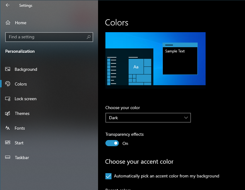
NOTE: I’m on Windows 10 with system Dark Mode enabled in case that makes a difference:
Cheers.
-
I see your points about the tab bar icons / alternate icons.
But I’d like to point out that it appears that for a “saved” file that the decision was made to have no icon at all (because it is so glaringly absent that no one would release software that way), in “dark mode” anyway.
Can @donho confirm this? If this truly is a design decision, let’s get it out there and known about, because probably hundreds of users will report it as a bug (“where’s the icon on a saved file’s tab??”).
I kind of like the cleaner look of saved files having no icon (we really only need to see the “exceptional” situations, e.g. modified, locked), but if one switches back to non-dark mode the icon comes back in that case.
Minor comment on the addition of dark mode: My first instinct is to go to Style Configurator to turn it on/off, not to a Preference page with a single item on it.
Hello! It looks like you're interested in this conversation, but you don't have an account yet.
Getting fed up of having to scroll through the same posts each visit? When you register for an account, you'll always come back to exactly where you were before, and choose to be notified of new replies (either via email, or push notification). You'll also be able to save bookmarks and upvote posts to show your appreciation to other community members.
With your input, this post could be even better 💗
Register Login