Consolas font issue
-
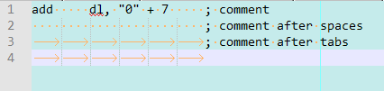
The issue is the space length of this font
Notepad++
Visual Studio
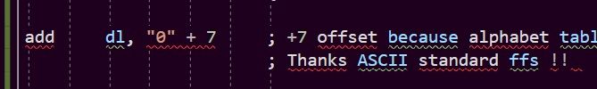
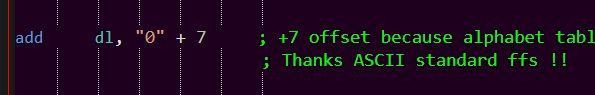
Both are using the same font name Consolas but visual studio has a better space length than NPP, the ; ; are perfectly aligned as there should be.
I think ive never seen this before, just recent update of NPP that has this space length issue.
-
This has bothered me for a while now as I like to use the Fira Code Retina font and it does the same thing.
I don’t know the reason it happens, and I don’t know of any solutions…but I’d like to have a better understanding, and possibly a solution.
BTW, it is more of a Scintilla project thing than a Notepad++ thing.
-
It may also be a bit of an OS thing (I’m on Win 7 Pro 64 bit, but Npp as 32 bit.). I use Consolas as a global font with size 11 as a global size and have never seen that misalignment.
-
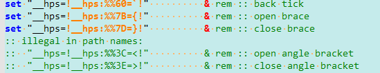
So here’s another example from my setup. In my contextMenu.xml, I like to line up vertically the closing
/>for a group of commands. All of the/in the following are in column 277: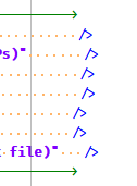
My setup is:
Notepad++ v8.1   (32-bit)
Build time : Jun 17 2021 - 01:52:11
Path : C:\............\npp.portable\notepad++.exe
Command Line :
Admin mode : OFF
Local Conf mode : ON
Cloud Config : OFF
OS Name : Windows 10 Enterprise (64-bit)
OS Version : 1909
OS Build : 18363.1679
Current ANSI codepage : 1252
Plugins : BetterMultiSelection.dll ChangedLines.dll ColumnTools.dll DSpellCheck.dll Explorer.dll linefilter2.dll MarkdownViewerPlusPlus.dll mimeTools.dll NavigateTo.dll NppConverter.dll NppEditorConfig.dll NppExec.dll NppExport.dll NppMenuSearch.dll NppToolBucket.dll PythonScript.dll XMLTools.dll
Some possibly related discussion is HERE.
-
@Alan-Kilborn
I just installed Fira Code Retina and reopened Npp. I can see the usefulness of the printed characters, but it seems to be stretching the truth if it calls itself a true mono-spaced font. To my eye, it’s over-reacting to styling hints.Consolas @ 11 points:
Fira Code Retina @ 11 points:
My setup is:
Notepad++ v8.1.3   (32-bit)
Build time : Aug 10 2021 - 00:32:53
Path : C:\Programs\Notepad++\notepad++.exe
Command Line :
Admin mode : ON
Local Conf mode : ON
Cloud Config : OFF
OS Name : Windows 7 Professional (64-bit)
OS Build : 7601.0
Current ANSI codepage : 1252
Plugins : BetterMultiSelection.dll ColumnTools.dll CustomLineNumbers.dll DSpellCheck.dll Explorer.dll ExtSettings.dll FallingBricks.dll FingerText.dll Linefilter3.dll LuaScript.dll MarkdownViewerPlusPlus.dll MenuIcons.dll mimeTools.dll NavigateTo.dll NppCalc.dll NppColumnSort.dll NppConverter.dll NppEditorConfig.dll NppEventExec.dll NppExec.dll NppExport.dll NppFavorites.dll NppHorizontalRuler.dll NPPJSONViewer.dll NppJumpList.dll NppMenuSearch.dll NppQCP.dll NppSnippets.dll NppTextFX.dll NppTextViz.dll NppUISpy.dll OpenFileInFolders.dll pork2sausage.dll PreviewHTML.dll PythonScript.dll QuickText.dll selectNLaunch.dll ZoomDisabler.dll _CustomizeToolbar.dll
As for the related discussion, I don’t think it’s a ruler issue, I think it’s a font stretching the truth issue.
-
Probably what keeps me using Fira Code font is its ligature support. You know, to turn
!=into:
and other such things…
-
@Alan-Kilborn said in Consolas font issue:
what keeps me using Fira Code font is its ligature support.
… and that’s probably what’s causing your difficulty, since I assume it would use the
::ligature instead of two:, among other things. (The green!__is a different width than the orange!__) -
Yea, I don’t know, it’s a minor complaint.
Really only out at the high column numbers…Fira Code font is supposed to be a “programmer’s font”, meaning I suppose fixed-pitch (because don’t all programmers want fixed-pitch). But even with all these suppositions…sigh.
It kind of all goes to hell even with Courier New (about as uniform width columns as you can get in a font) when you start using some fancy UTF+8 characters.
Perhaps true even column-widths as a concept is on its way out.
-
@Alan-Kilborn
You could always dig up an ASR-33 and use ed or vi. <grin> I realize that’s close to heresy in this forum, but once glass teletypes became a thing, variable width characters weren’t far behind.IIRC: I tried Fira and other ligature supporting fonts a few years back, and decided that I’d spent TOO many years in the 80 column world where everything was always lined up, and I couldn’t handle the “improvements”.
-
 L Laurie Stearn referenced this topic on
Hello! It looks like you're interested in this conversation, but you don't have an account yet.
Getting fed up of having to scroll through the same posts each visit? When you register for an account, you'll always come back to exactly where you were before, and choose to be notified of new replies (either via email, or push notification). You'll also be able to save bookmarks and upvote posts to show your appreciation to other community members.
With your input, this post could be even better 💗
Register Login