Poll: Find in Files Hits Position
-
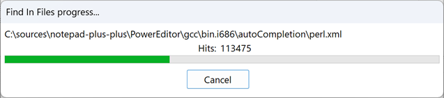
A. Left bottom
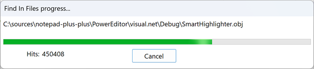
B. Right bottom
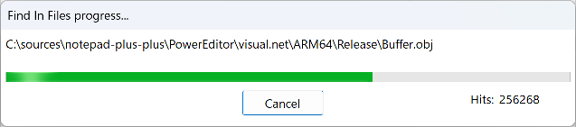
C. Center upper place
-
D donho referenced this topic on
-
@donho is it possible to see the effect with a different language where the word is bigger and it could be cut? (like Italian, French or Spanish: the label was cut)
-
@conky77
All 3 solutions above enlarge the current translation length. -
As long as you’re changing it anyway… maybe:
Hits: n in n files (aligned to the left)
Scanned: n of n files (aligned to the right)would offer more complete progress tracking (assuming all four of those accumulators are available where the dialog is updated). Personally, I like the text better on a separate line than on the same line as Cancel, but I would put it below the progress bar and above the button, rather than above the bar.
-
@Coises goes with choice “D”. :-)
I coded the
Hits:thing, and my memory may be weak and it isn’t worth looking up, but I believe doing anything more than what’s there now was rejected.This poll is only concerned with positioning, not content enhancement (if I’m interpreting it correctly).
93 views (so far) and only 6 votes (so far).
Even a @donho authored poll can’t get viewers to participate. :-( -
@Coises said in Poll: Find in Files Hits Position:
I would put it (the hits) below the progress bar and above the button, rather than above the bar.
Since there are more votes for “C” now, I’ll add that I agree with @Coises that it would be nicer to see the progress bar between the pathname and the
Hits: -
@Alan-Kilborn said in Poll: Find in Files Hits Position:
I coded the Hits: thing, and my memory may be weak and it isn’t worth looking up, but I believe doing anything more than what’s there now was rejected.
Not necessarily.
As far as there’s no performance issue, and it doesn’t make the code more complex, I’m OK with it.
You can create an issue after checking the feasibility, and ping me - I will assign to you the issue. -
Damn! I’m losing!
We need a special edition: “Stand with Don”! -
@donho said:
…and it doesn’t make the code more complex, I’m OK with it.
I think maybe it was the “complexity” that was the problem. <Lazy>I should look it up though</Lazy>.
You can create an issue after checking the feasibility, and ping me - I will assign to you the issue.
It sounded like maybe @Coises was more interested in pursuing that type of change, although as a user I would like to have it. :-)
-
@Alan-Kilborn,
Sticking by my choice. If it was there before, and wasn’t noticed, no need to move it now, except to put it back in the place it was before the regression. :-) -
Thank you for your votes. C. Center upper place solution has been merged, and it will be in the next release:
https://github.com/notepad-plus-plus/notepad-plus-plus/commit/6cbb1273a3bda3887232117b056aace724004570 -
A is 1000% better! As the original bug whisperer, I hereby invoke my “First Reporter Privilege” and decree that my vote should count as 10! 🎉✨
Hello! It looks like you're interested in this conversation, but you don't have an account yet.
Getting fed up of having to scroll through the same posts each visit? When you register for an account, you'll always come back to exactly where you were before, and choose to be notified of new replies (either via email, or push notification). You'll also be able to save bookmarks and upvote posts to show your appreciation to other community members.
With your input, this post could be even better 💗
Register Login