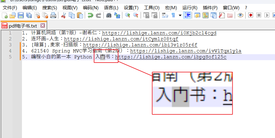
门这个字显示有问题
-

不知道为什么在输入门的时候,显示的字有毛病。 -
不知道为什么在输入门的时候,显示的字有毛病?
门 is Unicode U+95E8 and @lishige is correct in that the font Notepad++ is using has the wrong glyph there. A while back someone posted a script that would show how a character such as U+95E8 would be displayed in all of the fonts installed on a machine but I can’t find that post at present.
Once a better font is identified then switching is easy.
Settings->Style Configurator
Select Global Styles
Select Global override
Choose Font name and Font size
Check Enable global font
Check Enable global size
Save & Close -
Select Global override
Why do you suggest Style Configurator > Language:
Global Styles> Style:Global overrideinstead of suggesting Style Configurator > Language:Global Styles> Style:Default Style(which is the intended way to set the font throughout the styler/theme) ?I double-checked, and none of the themes that ship with Notepad++ override the font for any particular style entry, so all the themes that ship with Notepad++ will 100% honor the font chosen in Default Style. So I cannot see a reason for choosing the “override” instead of the “default”.
(Going forward, it looks like my suggestion was listened to, and there is an active PR to de-emphasize Global Override – per the PR, it will become the last entry in the Global Styles page instead of the first, and the checkmarks will change their text to “Force XXXX for all styles” instead of “Enable Global XXX”)
----
update: by “will 100% honor”, I meant with regard to individual styles not being set to a specific font, so they inherit the font choice from Default Style; whether any specific glyph is displayed in a certain font (as the OP was about) is dependent on the font and OS-font-alternative ability and the DirectWrite setting in N++ -
@PeterJones I had picked “override” it seemed a more reliable choice at the time, once a font is identified.
I am wondering though what the font picking logic is. On my machine Notepad++'s style configurator says to use Courier New but I’m not sure what font is used when something like U+95E8 is not in the Courier New font file. The Windows Character Map thing shows that Courier New has a gap from U+2E17 to U+A717 and yet Notepad++ displays a glyph rather than ▯ or some other indicator that a glyph could not be located.
I turned DirectWrite off but got the same glyph for U+95E8.
I assume some font on my machine has the correct glyph for U+95E8 as this forum’s web page is displayed correctly by Firefox. It’s also possible than Firefox developers knew the glyph is wrong in all of the Microsoft provided fonts and Firefox is generating the correct glyph on its own.
-
I am wondering though what the font picking logic is.
Black magic on the part of the OS. It’s influenced by the Direct Write setting, but it can still sometimes pick an alternate font for certain glyphs, even with DW off (as you showed).
Unfortunately, I don’t know the behind-the-scenes stuff.
I thought there was a discussion a few years ago, where I had some knowledge then than I do not now have [it was research done at the time, but the details are long since forgotten], but
I cannot seem to find the post(s) I’m thinking about for the moment–update 1: ah, there it is: I was thinking about the posts dealing with “CompositeFont” – so read the discussions from that search for more…
—
update 2: I searched the internet for “what characters look similar to U+95E8”, and though the first SO question I found didn’t answer what looked similar, it did show a screenshot from something else that shows that the glyph that Notepad++ displays is not unheard-of for U+95E8, even outside of Notepad++.—
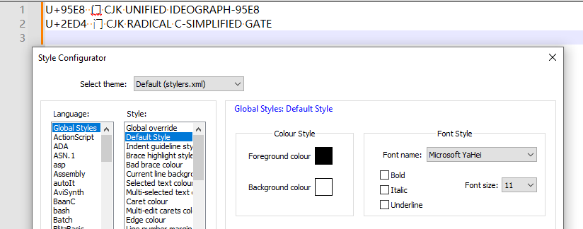
update 3: per this, it looks like the alternate glyph we’re seeing might be the Japanese Kanji / Ryakuji form. Ooh, and that page also looks like U+2ED4 might give the glyph you are looking for (though I cannot comment on meaning or implication of using one Unicode codepoint vs the other.)The two compared in Notepad++:

—
update 4: MS Notepad has the same issue with that character:

And looking through my
C:\Windows\Fonts\GlobalMonospace.CompositeFont(see the “CompositeFont” search link, above), which lists some alternate fonts that support CJK Unified range:

If I change to “Microsoft YaHei” as the font for Notepad++ (or MS Notepad), I can get Notepad++ to show the glyph you expect for U+95E8:

… but it’s not a monospaced font, and every once in a while (on Notepad++ display refresh, maybe?), it seems to have to do some complicated re-drawing.But if you can find a monospace font with the appropriate unicode slots populated that you’re willing to have as your Notepad++ font, that might work for you.
—
Caveat: I don’t deal with such characters or glyphs in my personal nor professional life; I just find myself drawn in when the unexpected happens in Notepad++, and I’m trying to be helpful, based on what I can find with some research on the internet that might shed light for me or those who bother reading my posts…