Auto-Completion settings are just plain odd
-
In Settings menu > Preferences > Auto-completion
From here I wonder why nothing happens when I click on the
3: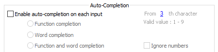
Then I notice that I need to enable the entire option first:
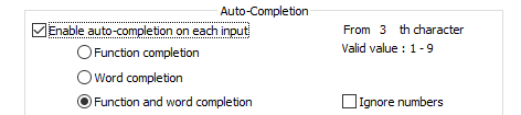
But now the
3doesn’t even give any indication that it is editable.But if I do point to the
3my mouse cursor changes to a pointer finger and then clicking the3yields: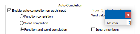
which is strange because it looks chopped off. And one presumes that
Nbmeans “number” – really?Could this have been done better? I’m not really complaining because I don’t use Auto-completion anyway, but just poking around the UI I was stunned to see this much oddness in one place. :-)
-
Yes, I think it makes more sense that the underlined number shows up when the auto-completion options is enabled. So it looks as if they are functionally inverted now.
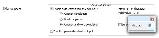
However, concerning the last picture, it looks fine in my laptop (Windows 7, Notepad++ v7.8.5, 64-bit):
-
I’ve always thought it was weird the number opened an entire dialog to input a number when a simple spinner would be sufficient.
-
This post is deleted! -
Sorry for that last (deleted) reply. On re-read, I think it came across as rude, not the joke it was intended as.
-
Yes, that makes sense. As I said in my earlier post, the picture looks fine… but not nice.
Hello! It looks like you're interested in this conversation, but you don't have an account yet.
Getting fed up of having to scroll through the same posts each visit? When you register for an account, you'll always come back to exactly where you were before, and choose to be notified of new replies (either via email, or push notification). You'll also be able to save bookmarks and upvote posts to show your appreciation to other community members.
With your input, this post could be even better 💗
Register Login