Notepad++ v8 Release Candidate
-
Notepad++ v8 Release Candidate is available here:
http://download.notepad-plus-plus.org/repository/8.x/8.0.RC/Notepad++ v8 new features, enhancements & bug-fixes:
- Add Dark Mode. (Implement #9183 & #7692)
- ARM64 build is available. (Implement #5158)
- One button to build them all - build Notepad++ with Scintilla static lib and Boost RegExpr headers. (Implement #9594)
- Add new Fluent UI icons for toolbar. (Implement #9742)
- Add new feature “Distraction Free Mode” (Menu “View->Distraction Free Mode”).
- Add ability of changing select text foreground color (optional). (Fix #3397 & #1314)
- Allow Replace to stop after replacement (optional). (Implement #4437)
- Add ability to reverse line order. (Implement #9837)
- Add ability to style only current instance of text. (Fix #9263)
- Fix duplicated entries in Auto-Completion pop-up window. (Fix #9711)
- Fix Python Function List not showing functions in some circumstance. (Fix #9844)
- Enhance Folder as Workspace performance while adding/removing files in bulk. (Fix #9203)
- Add Ada, Fortran, Fortran77 & Haskell in function lists. (Fix #9698)
- Improve performance of “Open all” command in Search results. (Fix #9819)
- Add “Copy Pathnames” command to Search results context menu. (Fix #9821)
- Catch regex search exceptions and show exception message. (Fix #9565)
- Add MarkAll Preference settings for case and word. (Fix #9751 & #5148)
- Fix regression: Handle “Default Directory” setting correctly in Open/Save File Dialog. (Fix #9767)
- Fix a special character in UTF16 file crash issue (regression). (Fix #9797)
- Add “Append extension” checkbox to Save As dialog. (Implement #9515)
- Fix Copy command in Search result is available as there’s no selection. (Fix #9757)
- Add padding ability in the edit zone. (Fix #2323)
- Make new tab name translatable. (Fix #2837)
- Improve character case handling in RegEx. (Fix #9636)
- Fix dragged out UDL file is not applied to UDL in the new instance. (Fix #3451)
- Add command line parameter for adding specified string to app title bar. (Implement #9539)
- Fix Auto-Completion ignoring case issue. (Fix #3997, #4833 & #4998)
- Fix “Match Whole Word” option being enabled in RegEx Search. (Fix #9766)
- Fix sort with column key selection that appears after tab characters. (Fix #9682)
- Fix “Reload Workspace” menu command not working issue. (Fix #9350)
- Fix view file in Edge browser failure issue if name contains spaces. (Fix #9313)
- Add ability to avoid accumulating multiple search results. (Fix #8777)
- Fix UTF-16 decoding/encoding for code points above U+FFFF. (Fix #9597, #3747 & #5754)
- Fix “Save As” command removing original path from recent files history issue. (Fix #9673)
- Fix function List button tool tips mixed up issue. (Fix #9804)
If you test ARM64 installer & zip packages, please confirm here if they work fine.
Enjoy!
-
IMO not a real serious problem, but in Dark Mode the Transparency of the Find dialog doesn’t change. But…it does in the Style Configurator dialog. So two minor problems (the inconsistency being the 2nd problem). :-)
-
I took a look at Distraction Free mode and my first thought was, this would be great for my log files, which are kind of “wide”. So I pulled one into it, and I guess I was disappointed that I couldn’t see more of the “width” of the lines of my file. I sure did see a lot of whitespace on either side of my truncated file lines, though. This isn’t really a “complaint”…more of a “am I misunderstanding this feature?”
Truly I would like something like this (because it gets rid of Search results panel, Function List, etc. – where Full Screen Mode does NOT) but can’t more of the screen width be utilized for the text?
Oh, and after a bit of playing around, it didn’t take much before the little boxed
+sign disappeared and I didn’t know what to do to get it back. So… no way out of Distraction Free mode in this case? Luckily this mode isn’t remembered after a restart so I could Alt+F4 quit and restart and whew–back to normal. Time to assign a keycombo for the next time this occurs, Shift+F12 is open – DONE! -
So I pulled one into it, and I guess I was disappointed that I couldn’t see more of the “width” of the lines of my file.
You can tune “Distraction Free” in “Margin/Border/Edge” of Preferences dialog to make the display zone wider.
Oh, and after a bit of playing around, it didn’t take much before the little boxed + sign disappeared
+shouldn’t disappear. Could you provide the instructions to reproduce this bug please? -
Dark mode is not really dark and plugin toolbar icons are missing:
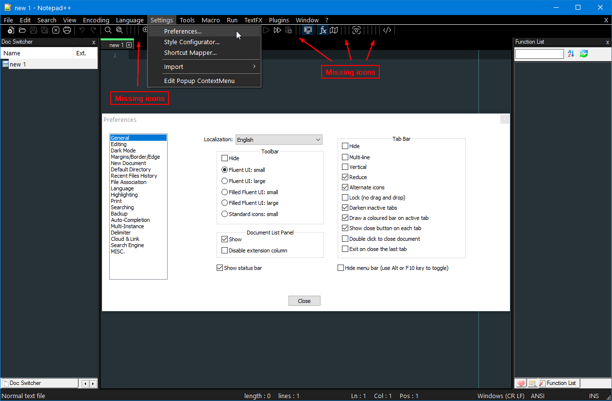
I guess the current state of dark mode will not really excite fans of this UI paradigm.
-
Indeed.
All (fluent UI) icon sets don’t support Plugins’ icons on toolbar, but it’s not regression.
I will find a way to make it work (in the future versions). In the meanwhile, users can setStandard icons: smallfor the walkaround.
Dark mode will be improved also in the future version. -
@donho said in Notepad++ v8 Release Candidate:
You can tune “Distraction Free” in “Margin/Border/Edge” of Preferences dialog to make the display zone wider.
Yes, but even setting Distraction Free Padding to its maximum value of 9 IMO there is still a lot of “wasted” space on the left and right in a file with long lines. Maybe like 25% of the vertical size of the window is not used.
+shouldn’t disappear. Could you provide the instructions to reproduce this bug please?I was going to say I could not because I didn’t know how to repro it, but in having the Prefs window up while in DFM and adjusting Distraction Free Padding value dynamically I see the
+box has disappeared from the upper right:
@dinkumoil said:
I guess the current state of dark mode will not really excite fans of this UI paradigm.
On the contrary, I like it a whole lot, so far. :-)
Anyway, it can rarely be hit 100% with the first try.
Great work whomever the big “dark mode” developer is. -
@Alan-Kilborn said in Notepad++ v8 Release Candidate:
Yes, but even setting Distraction Free Padding to its maximum value of 9 IMO there is still a lot of “wasted” space on the left and right in a file with long lines. Maybe like 25% of the vertical size of the window is not used.
Putting the text in the middle of the screen is the whole point of Distraction Free mode. Let’s see if other users want to decrease more the padding of 2 sides then I’ll adapt it.
I was going to say I could not because I didn’t know how to repro it, but in having the Prefs window up while in DFM and adjusting Distraction Free Padding value dynamically I see the + box has disappeared from the upper right:
Just try it, cannot reproduce it. Next time when it happen, you may check the + box on the 2nd monitor.
BTW, I just made Notepad++ crash by switching to
Distraction Free mode+Dark mode. The culprit is HexEditor plugin. After removing HexEditor plugin, the crash is gone - just FYI. -
@donho said in Notepad++ v8 Release Candidate:
Putting the text in the middle of the screen is the whole point of Distraction Free mode
Hmm, IMO the point of a “distraction free mode” would be to eliminate “distractions” and let me focus on my text. Something that gets in the way of that, e.g. such whitespace, is a distraction in itself, because my text is obscured.
Sure, it’s your product, I’ve just been hoping for such a feature for a long time, and to get it and have my feeling be “OK, I tried it, now I’ll never use it because it isn’t useful” is somewhat of a downer.
-
@donho said in Notepad++ v8 Release Candidate:
Just try it, cannot reproduce it. Next time when it happen, you may check the + box on the 2nd monitor.
I found a reliable repro, at least for me:
- assign shortcut to DFM (I chose Shift+F12)
- open Preferences window and leave it open
- return to editing work in a tab
- invoke DFM via the shortcut (once in DFM the
+box does not appear) - use the shortcut to toggle in and out of DFM a few times (when in DFM the
+never appears) - close the Preferenes window
- invoke DFM via the shortcut (once in DFM the
+box appears just fine) - use the shortcut to toggle in and out of DFM a few times (when in DFM the
+appears just fine, every time)
I checked all monitors when it happens; nothing like
+appears on them when this bug occurs.Note: DFM = Distraction Free Mode
-
@Alan-Kilborn said in Notepad++ v8 Release Candidate:
I found a reliable repro, at least for me:
I tried and can’t reproduce. I’m using Shift-F11 as shortcut. I only have a single laptop monitor - no external display, with settings:
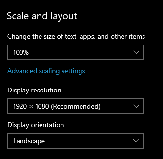
Cheers.
-
@Michael-Vincent said in Notepad++ v8 Release Candidate:
I tried and can’t reproduce. I’m using Shift-F11 as shortcut. I only have a single laptop monitor - no external display, with settings:
@Alan-Kilborn I cannot reproduce either as @Michael-Vincent did (also only single laptop screen) - I assign the shortcut to F9 to DFM.
-
This post is deleted! -
Be civilized please and remove all your plugins, then restore one by one for identifying the incompatible plugin.
More your report is accurate, more we can help you. -
@donho Sorry if it seemed rude. ))
Thanks for your work!
I can only share my impressions and remarks.
I think Dark Mode needs in options of customization.
1 - Need add option Disable toggling text Style
2 - Need add option Disable toggling icons
3 - When switching Mode, need make reverted to previous style, not by deafault.
4 - Replace Black on Dark fill. Or neutral gray.
Black nobody uses! )))
As an example: Photoshop, 3dsMax, XYplorer, Blender 2.9x.
Thanks again for big great update. -
Bug of Dark Mode:
Text of inactive tab is not readable. -
@Artur-Harison said in Notepad++ v8 Release Candidate:
Text of inactive tab is not readable.
Seems readable to me:
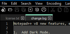
The problem with saying something like “Text of inactive tab is not readable” without showing some sort of substantiating picture is that it is hard to take you seriously.
-
@donho said in Notepad++ v8 Release Candidate:
Enjoy!
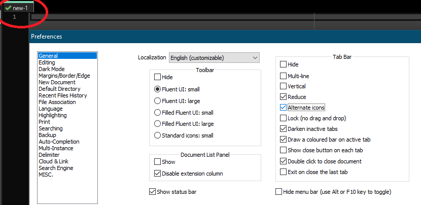
Small “bug” with switching to/from Dark Mode. I have Preferences => General => Alternate icons enabled for the tab icons (e.g., saved, edited, etc.) Now, switch to dark mode. The tab icons no longer show; however, they are still “checked”:
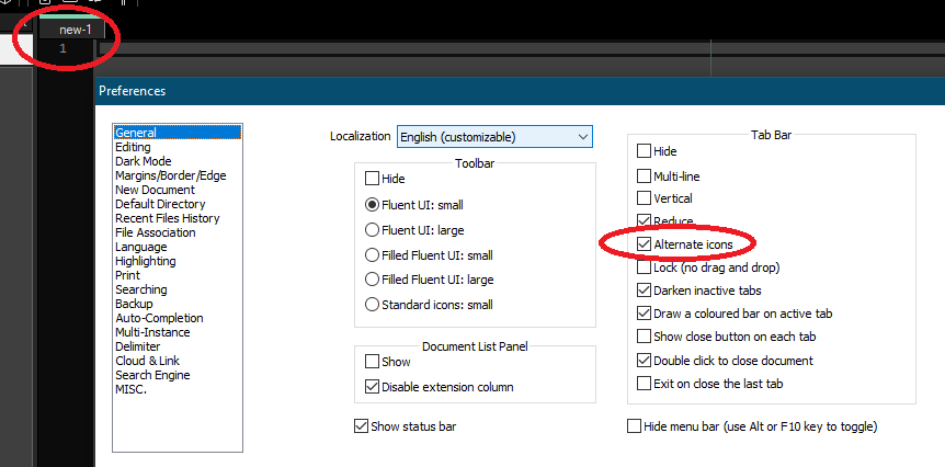
Checking and unchecking the “Alternate icons” checkbox makes them appear.
Cheers.
-
I just hate dark mode…
Please remove it or make it optional while installation.
But i want to know how you able to implement that dark UI in win32API???
Its impressive. -
