Notepad++ v8.1.2 Release Candidate
-
Notepad++ v8.1.2 Release Candidate is available here:
http://download.notepad-plus-plus.org/repository/8.x/8.1.2.RC/- Make dark mode restartless. (Fix #10121)
- Activate dark mode in Windows 11. (Fix #10136)
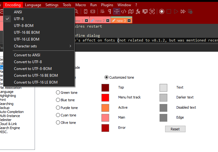
- Make Notepad++ dark mode colors customizable: add 6 more color tone choices. (Implement #10128)
- Add customizing dynamically dark mode colors capacity (Implement #10145)
- Add command line flag -udl=“UDL name” to open a file by applying an existent UDL via its name. (Implement #10102)
- Use always current file directory in File Rename dialog. (Fix #10095)
- Fix “Remember last used directory” unexpected behaviour. (Fix #10115)
- Fix corrupted encoding text on status bar if shortcut assigned to encode command. (Fix #10146)
- Add a Save all confirm dialog. (Fix #2124, #9931)
- Improve JavaScript auto-completion. (Fix #9858)
The release will be out in a few days if there’s no critical bug found.
-
@donho
Color for Tabs (Active) has an inversion in the search menu.
“Disabled text” needed more informative. Maybe “Inactive option” or “Text of Inactive option” or “Text of Disabled option” -
@Artur-Harison said in Notepad++ v8.1.2 Release Candidate:
Color for Tabs (Active) has an inversion in the search menu.
By “Search menu” I guess you mean “find dialog”. Indeed. But I cannot find another better description.
“Disabled text” needed more informative. Maybe “Inactive option” or “Text of Inactive option” or “Text of Disabled option”
I try to make it shorter for the sake of translation.
If you have any suggestion, you’re welcome.
-
@Artur-Harison / @donho ,
Given the desire to keep the names short, I think you made reasonable choices. And for me, “Disabled text” is more useful than “Inactive option” (since I think of those elements as “greyed out or disabled”), but I can see that some might find “Inactive option” a better description (and it’s about the same length).
I have started to work on documenting those new preferences for the next rev of the npp-user-manual.org, as I experimented to see what they affected, the names chosen made as much sense to me as any other.
Here are my descriptions so far:

My question while going through that was what UI elements are affected by the
Errortone? I thought it was going to affect the Find Dialog’s “Find: Can’t find the text…” color, but that text isn’t influenced by the setting; and I cannot think of other error indicators that it might refer to.And more in the possible bug report for the Dark Mode tones: the Find/Replace/Mark dialog uses the “Main” tone as its background, but I cannot see other dialogs that use it: Preferences, Style Configurator, User Defined Languages, Debug Info, About, the Column Mode info dialog, Column Editor, Plugins Admin, and the Run>Run dialog all keep the non-dark-mode background, as do the standard Windows dialogs (open, save, directory finders, etc). So as far as I can tell, the Find family of dialogs are the only dialogs that use the Dark Mode tone settings. @donho , Was that intentional, or did you expect the dark mode tone to affect any dialogs other than Find/Replace/Mark?
-
@PeterJones said in Notepad++ v8.1.2 Release Candidate:
And more in the possible bug report for the Dark Mode tones:
Oh, and the menu pull-downs aren’t influenced by Tones, either – just the top menu-bar:

-
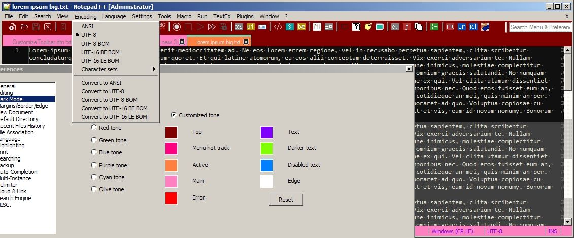
Things look a little different in Win7 land.

(colors chosen to provide noticeable contrasts, NOT pleasurable usage) -
@PeterJones said in Notepad++ v8.1.2 Release Candidate:
Here are my descriptions so far:
They are quite fair description.
My question while going through that was what UI elements are affected by the Error tone?
On the Search text field of Incremental Search bar (Ctrl+Alt+I), while typed text not found.
I thought it was going to affect the Find Dialog’s “Find: Can’t find the text…” color, but that text isn’t influenced by the setting
No. The green text and red text are hard coded and cannot changed, at least so far.
but I cannot see other dialogs that use it: Preferences, Style Configurator, User Defined Languages, Debug Info, About, the Column Mode info dialog, Column Editor, Plugins Admin, and the Run>Run dialog all keep the non-dark-mode background, as do the standard Windows dialogs (open, save, directory finders, etc). So as far as I can tell, the Find family of dialogs are the only dialogs that use the Dark Mode tone settings. @donho , Was that intentional, or did you expect the dark mode tone to affect any dialogs other than Find/Replace/Mark?
So far, the most important things (to me) are make all the components attached on Notepad++ main frame dark-modable. Find-replace dialog is almost always launched so it’s dark-modable. The other dialogs I’m not sure to make them in dark mode because it’s time consuming job.
Oh, and the menu pull-downs aren’t influenced by Tones, either – just the top menu-bar:
The title bar, the menu items and scroll bar are not customizable. They are drawn by system.
-
@donho said in Notepad++ v8.1.2 Release Candidate:
By “Search menu” I guess you mean “find dialog”. Indeed. But I cannot find another better description.
Suggestion:
Active - >Tabs Color or fix find dialog inversion of tabs.
Disabled text -> Disabled option
Edge -> Separators
Top -> Panel bar)))
Hello! It looks like you're interested in this conversation, but you don't have an account yet.
Getting fed up of having to scroll through the same posts each visit? When you register for an account, you'll always come back to exactly where you were before, and choose to be notified of new replies (either via email, or push notification). You'll also be able to save bookmarks and upvote posts to show your appreciation to other community members.
With your input, this post could be even better 💗
Register Login