Doc Switcher panel has changed its appearance (not a pleasant update)
-
Hello community! First time posting here.
One of the recent updates during the 8.1 cycle has changed the appearance of one of the Doc Switcher elements. The element in question is the chosen document highlighting frame. See the screenshots:
before (NPP 8.1):
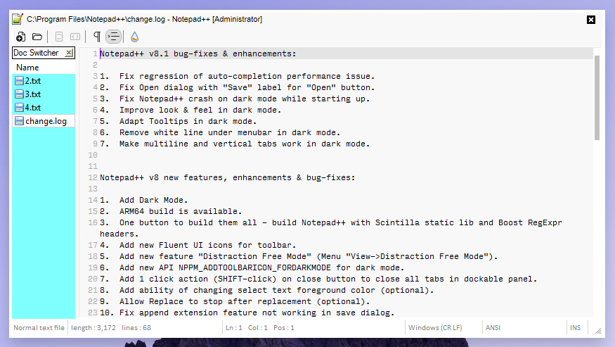
after (NPP 8.1.4):
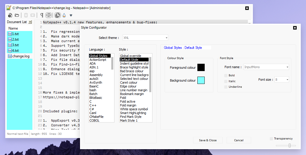
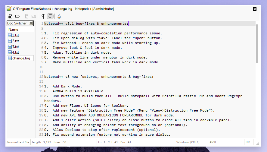
I have set the blue color to see the elements better. The problem is that the after the update the highlight color started to mingle with my regular background color so it became difficult to differentiate the active document. This is how my environment looks in real life:
before (NPP 8.1):
after (NPP 8.1.4):
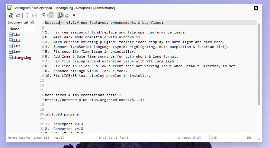
As you can now see the highlight is as if invisible. The easy “fix” would be changing the background color but I would like to preserve the color I use to match the overall look.
Would it be possible to revert the element back? Or is there a way I can manually do that in the application?
-
Just a bit more visual comparison of the change:
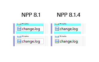
-
-
@Alan-Kilborn the problem is the element itself has changed. In 8.1.4. me and you have the same solid color line as the highlight for the active document. If you look at my comparison picture you will see that in 8.1 it was a different element.
-
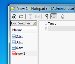
I have switched my Windows theme to yet again show the difference.
In 8.1. the highlight looks like this:
In 8.1.4 the highlight is already different:
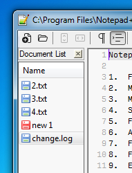
You can clearly see that the devs just changed what kind of element to draw as the highlight in the newer version.
-
Out of the box, the 8.1.4 provides more contrast than 8.1

The difference is that before, the highlight color was the same, irrespective of style configurator / theme settings. Now, it better respects the current style settings for the Default Style:

Previously, in 8.1, it used the background color for the background of the panel, it used black for the text, and grey for the highlight; the text and highlight wouldn’t change no matter what colors you used. With 8.1.4, it uses the background color for the background of the panel, the foreground color for the text of the panel, and a highlight that tries to be darker than the existing background color.
This becomes somewhat annoying in Dark Mode, because with a dark background, there isn’t much room for it to get “darker” for the highlight, so my eyes can barely see it.

Personally, I wish they would use the “Current Line Background” style color as the background for the currently-selected file in the Document List panel (and for the selected function in the Function List panel, and other active selections in the various panels).
Maybe if a “normal” user (someone like you – the dev believes that suggestions by known “power users” like those of us who stick around in the Community Forum helping others in the forum don’t reflect the needs/desires of “normal” users) were to put in a feature request, asking that the active-file background in the Document List panel (and other panels) would be configurable, either using the “Current Line Background” or some new style added specifically for “Panel Highlight Background”, then maybe just maybe it would be added.
-
@peterjones Thanks for the detailed answer.
I’m trying to set a dark theme for N++ but I’m a bit stuck with this limitation.
Would it be possible to make the back color of the selected file in the doc Switcher “a little lighter” when using dark mode instead of “a little darker” when using normal mode. -
@remduv said in Doc Switcher panel has changed its appearance (not a pleasant update):
Would it be possible to make the back color of the selected file in the doc Switcher “a little lighter” when using dark mode instead of “a little darker” when using normal mode.
As Notepad++ is currently implemented, no. There is no way of specifying that.
If you made a feature request, and if that feature request were implemented, then it would be possible.
Hello! It looks like you're interested in this conversation, but you don't have an account yet.
Getting fed up of having to scroll through the same posts each visit? When you register for an account, you'll always come back to exactly where you were before, and choose to be notified of new replies (either via email, or push notification). You'll also be able to save bookmarks and upvote posts to show your appreciation to other community members.
With your input, this post could be even better 💗
Register Login