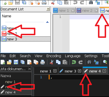
v8.4.8 Dark Theme Icons are forced to minimalist
-
@PeterJones Can I somehow grab the icon set from the Light Theme and copy them into a Dark Theme set that can override the default?
-
@mikegonzalez2k said in v8.4.8 Dark Theme Icons are forced to minimalist:
Can I somehow grab the icon set from the Light Theme and copy them into a Dark Theme set that can override the default?
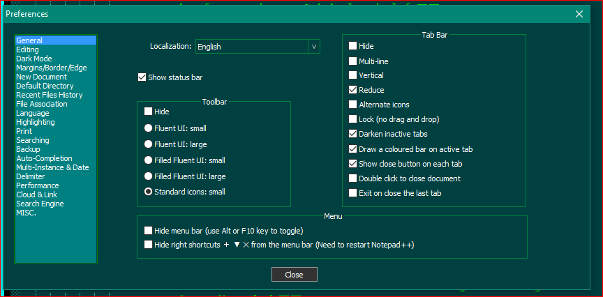
You can pick the “standard icons: small” set in the options I mentioned.
The 5 default icon sets are compiled in to Notepad++, and you cannot change those. Your choices are to either use the options provided, manually changing the icons to “standard icons: small” once after you install (at which point, that option gets saved, and unless you are ping-ponging back and forth between light and dark, you should never need to set it on that computer again); or you can define the custom icon set, as defined in the toolbar customization feature that I already linked you to.
-
Peter gave you the answer, but since 1 picture is worth a thousand words, here is the setting in the Preferences Dialog that you want to click and turn on:

-
@Lycan-Thrope Found it thanks!
-
I still can’t have ALL standard icons back. Am I missing something?

There is “Alternate icon” option. But that is not I want.

-
The developer chose to always use the more-meaningful empty/pencil/lock icons rather than the archaic colored-disk-icons when in Dark mode, because in the dark mode, there isn’t enough contrast to tell the difference between the different colored disks (or didn’t like the looks of the color combos in dark mode) (and because an icon indicating a 3.5" floppy has very little meaning to a generation that has never touched such an archaic piece of technology). He intentionally made Dark Mode not make a significant difference between “alternate icon” and non-“alternate icon”, and that is not user configurable. Sorry.
-
@Arczi008TV
Technically it is possible to change any icon in Notepad++ to any other icon (including icons from outside sources). See my post here for an explanation of how.I do this pretty routinely to change the red save-disk icon to a pencil (so the opposite of the change you might want to make), because I change between Notepad++ versions a lot and so the alternate approach of changing a setting isn’t very reliable.
-
@Mark-Olson Oh yes, that helps, thanks.
I see no issues with these icons in dark mode…

@PeterJones said in v8.4.8 Dark Theme Icons are forced to minimalist:
(and because an icon indicating a 3.5" floppy has very little meaning to a generation that has never touched such an archaic piece of technology).
Why then floppy icons are default for white mode. :D
-
@Arczi008TV said in v8.4.8 Dark Theme Icons are forced to minimalist:
Why then floppy icons are default for white mode. :D
Good question.
-
@PeterJones said in v8.4.8 Dark Theme Icons are forced to minimalist:
Why then floppy icons are default for white mode. :D
Good question.
Because… they always have been.
When new features are introduced, old stuff is made the default. If you want the new behavior, you have to change something. -
@Alan-Kilborn said in v8.4.8 Dark Theme Icons are forced to minimalist:
When new features are introduced, old stuff is made the default. If you want the new behavior, you have to change something.
… except when he feels otherwise or someone convinces him otherwise. :-)
For examples of “new feature” that at least eventually got changed to a default behavior:
- DirectWrite checkbox was eventually changed default status.
- Multi-editing was an option defaulting to off through 8.5.8, then always-on or only-off-via-file for 8.6-8.6.2, and back to being an option but default-on starting in 8.6.3.
And, even if those don’t count, because they were a “long time” before they changed:
- in that same v8.6.3, the related new feature and its corresponding option Enable Column Selection to Multi-Editing was turned on by default, even though it was a new feature.
So default settings can be changed, when he feels like it or is convinced. And new features can and do get shipped turned-on, when he feels like it or is convinced.
Hence, my statement that it was a “good question” why those floppy-disk anachronisms are still the default icon in Light Mode but not in Dark Mode. (And the “good answer” is because “he didn’t feel like it, or no one convinced him, so he went with new-option-keeps-status-quo-behavior-by-default”.)

-
Of course, my statement was a generalization – it is what usually happens.
Another big contradiction was when “change history” was introduced – it was defaulted to on.
Typically, though, if a new alternative to an old behavior is introduced (disk icons to alternate icons is a perfect example), the old behavior is favored (defaulted) over the new.
Hello! It looks like you're interested in this conversation, but you don't have an account yet.
Getting fed up of having to scroll through the same posts each visit? When you register for an account, you'll always come back to exactly where you were before, and choose to be notified of new replies (either via email, or push notification). You'll also be able to save bookmarks and upvote posts to show your appreciation to other community members.
With your input, this post could be even better 💗
Register Login
