New Forum Interface. I hate it.
-
Just inserting my $0.02, about the look and functioning layout of the new Forum format. It looks like it was designed to be used with a phone, like Windows 8.0 was, and I almost threw that computer out the window and not the OS type.
Anyway, I guess others can either jump on the hate bandwagon of this new forum face, or discuss their POV. :)
-
I’ve changed the theme to something much more like the previous. I hope it’s less hateful to you now.
-
@Lycan-Thrope said in New Forum Interface. I hate it.:
Anyway, I guess others can either jump on the hate bandwagon of this new forum face, or discuss their POV. :)
It certainly was a sudden shock.
I did prefer the row of icons across the top, complete with a count of unread messages on a little red badge, to the (in my opinion) less functional three-lines menu.
Being able to see the original post and comments and the formatted version of a comment in progress while writing a comment seems more in line with other contemporary forum software. I’ll reserve judgement on that until I see how it works in practice. I think it might be a net improvement.
-
@Coises ,
Is it still “weird” to you? Because I changed the behind-the-scenes theme, it went back to having the one toolbar along the top…
-
-
@Coises said in New Forum Interface. I hate it.:
@PeterJones I’m still seeing this:
I cleared cookies and logged in fresh, just in case.
Weird. Because that’s what I was seeing before I made the change. But my screenshot above was taken minutes ago, and I’ve tried logging in as a different user and as no user, and in a different browser, and they all show it with it reset back to the correct theme.
-
@PeterJones said in New Forum Interface. I hate it.:
Weird. Because that’s what I was seeing before I made the change. But my screenshot above was taken minutes ago, and I’ve tried logging in as a different user and as no user, and in a different browser, and they all show it with it reset back to the correct theme.
EDIT - SOLVED: It’s browser window width. I had magnification set to 133% (for my old eyes), which made the overall window width in CSS pixels small enough to trigger what is probably mobile layout. Reducing magnification or making the window a little wider gives the result you described.
Still seeing this:

and now, when I click on the three lines, this:

so Categories is there, but it’s still a menu, not a toolbar. Is it possible that the forum is running through some sort of cache (like Cloudflare) and I just need to wait for the server to which I’m assigned to catch up?
None of this is a “big deal,” you know… we’ll all chill with it, however it turns out. ;-) Thanks for taking care of things.
-
@Coises said in New Forum Interface. I hate it.:
Is it possible that the forum is running through some sort of cache (like Cloudflare) and I just need to wait for the server to which I’m assigned to catch up?
Maybe on your end there’s something like that… because I’ve tried on my home network, on my cell network, and my work network, on multiple browsers, and
allmost of them are showing it updated to the top-row-without-hamburger, as I showed here:
update: I take it back: my phone shows with the hamburger menu, but it always has, even before yesterday’s update. But between the update and when I made the change yesterday, the hamburger was on the bottom, and now it’s back to the top. so it’s properly using the updated theme.
-
@Coises said in New Forum Interface. I hate it.:
Reducing magnification or making the window a little wider gives the result you described
Yes, I can confirm: if I resize my browser window on a PC, I can get it to collapse into the hamburger menu.
-
Is the hovering blue
Quotebutton broken for anyone else?When I select a range of text in a forum message a blue “Quote” button used to hover into view. It still does.
It used to be that I could then click the blue button and it would open the reply window all set up as a reply to the person with the previously selected text marked-up/down. Now when I press the blue Quote button “nothing happens.” There is no reply window. To reply with quoting I now need to click the “Quote” link below the message that is to the right of “Reply” and then manually edit out all of the junk I was trying to evade by doing a select and then clicking the hovering “Quote.”
I’m using Firefox on a Win11 desktop.
-
@mkupper said in New Forum Interface. I hate it.:
It used to be that I could then click the blue button and it would open the reply window all set up as a reply to the person with the previously selected text marked-up/down
I just used that feature to reply to you for this post. So it’s still working for me. Then again, I’m using Chrome or Edge, not Firefox.
update:
To reply with quoting I now need to click the “Quote” link below the message that is to the right of “Reply” and then manually edit out all of the junk I was trying to evade by doing a select and then clicking the hovering “Quote.”
BTW: selecting text and hitting the “Quote” link next to the “Reply” link has historically quoted just the selected text for me, and still does as well. At least in Chrome or Edge.
update: verified in Edge as well; well, actually, I verified in Chrome, because I forgot that I was currently in Edge not Chrome
-
@PeterJones said in New Forum Interface. I hate it.:
BTW: selecting text and hitting the “Quote” link next to the “Reply” link has historically quoted just the selected text for me, and still does as well. At least in Chrome.
Thank you. That version of selected quote is also still working in Firefox.
-
@mkupper said in New Forum Interface. I hate it.:
I’m using Firefox on a Win11 desktop.
Firefox 117 on Windows 10, the Quote button is working, for me.
-
Thank you @Coises. I also am on Firefox 117. I discovered the issue is a Firefox plugin, enable-selection which I use to deal with a couple of web sites that actively block attempts to select and copy text.
I’m now wondering if the hovering blue “Quote” button was working before. I can’t imagine the forum code in that area changed enough that it now intersects with whatever the enable-selection plugin deals with.
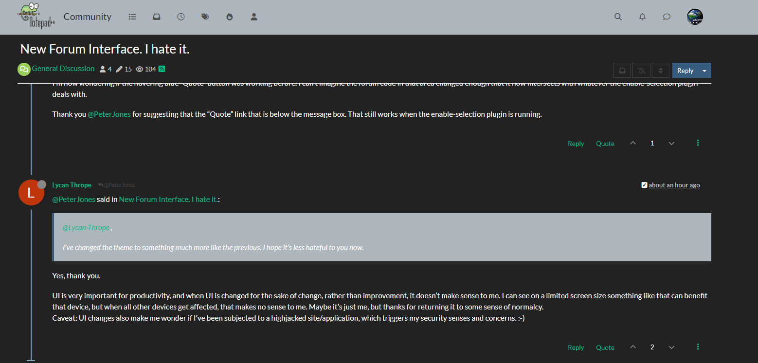
Thank you @PeterJones for suggesting that the “Quote” link that is below the message box. That still works when the enable-selection plugin is running.
-
@PeterJones said in New Forum Interface. I hate it.:
I’ve changed the theme to something much more like the previous. I hope it’s less hateful to you now.
Yes, thank you.
UI is very important for productivity, and when UI is changed for the sake of change, rather than improvement, it doesn’t make sense to me. I can see on a limited screen size something like that can benefit that device, but when all other devices get affected, that makes no sense to me. Maybe it’s just me, but thanks for returning it to some sense of normalcy.
Caveat: UI changes also make me wonder if I’ve been subjected to a highjacked site/application, which triggers my security senses and concerns. :-) -
@Lycan-Thrope said in New Forum Interface. I hate it.:
Yes, thank you.
UI is very important for productivity,
Agree.
The new UI is still very different for me:
The grey strips are awfully bright when they used to be darker in the dark mode preference I have. Likewise, when composing this reply:
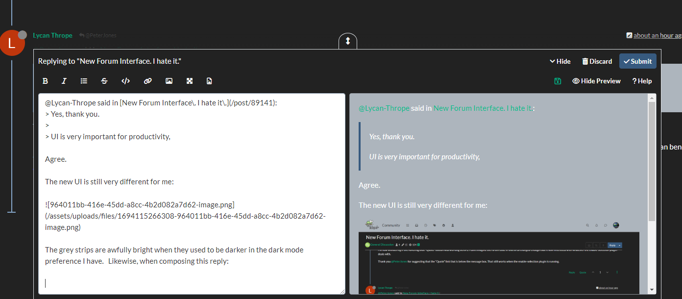
My edit window is not light instead of white text on black background as it used to be.
Not a big fan of the new theme.
Cheers.
-
@Michael-Vincent said in New Forum Interface. I hate it.:
My edit window is not light instead of white text on black background as it used to be.
Not a big fan of the new theme.
Colors are set by your “skin”, which is in the user preferences/settings (Settings > Select a Skin). It may be that the “skin” that you had previously chosen isn’t maintained as well (the same thing happens with N++ themes, for that matter: if a lexer gets new styles, not all themes are updated to include it) – so you might want to try some of the other “skins” to see if they have colors more to your liking.
–
the changes that had been talked about above were the differences betweenaccidental current in the “accidental”, all the GUI elements – navigation controls, etc – were all completely rearranged, in different places and with “tiles” and other such win8-style features.
-
@Michael-Vincent said in New Forum Interface. I hate it.:
My edit window is not light instead of white text on black background as it used to be.
Colors are set by your “skin”, which is in the user preferences/settings (Settings > Select a Skin).
The culprit is the
bg-lightclass selector: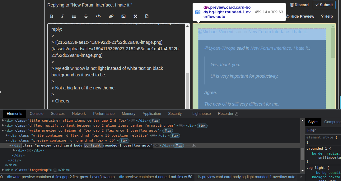
If your browser supports user style sheets, you just need to add this rule:
.bg-light { background-color: inherit !important; } -
@PeterJones said in New Forum Interface. I hate it.:
Colors are set by your “skin”, which is in the user preferences/settings (Settings > Select a Skin). It may be that the “skin” that you had previously chosen isn’t maintained as well
Thanks, wasn’t aware of that. I did not change my skin, I just saw these visual changes starting yesterday - about the same time this original topic was started - I assumed they were related as I have not switched my theme.
I cycled through the other themes, none to my liking. I’m using “Darkly” currently.
Cheers.
-
Can the normal light background default skin be put back? I hit refresh on the forums and it’s now I guess what people call dark mode? The text box for entering messages such as this one at least are still dark text on a white background.