Find & Replace & Mark re-organization proposal
-
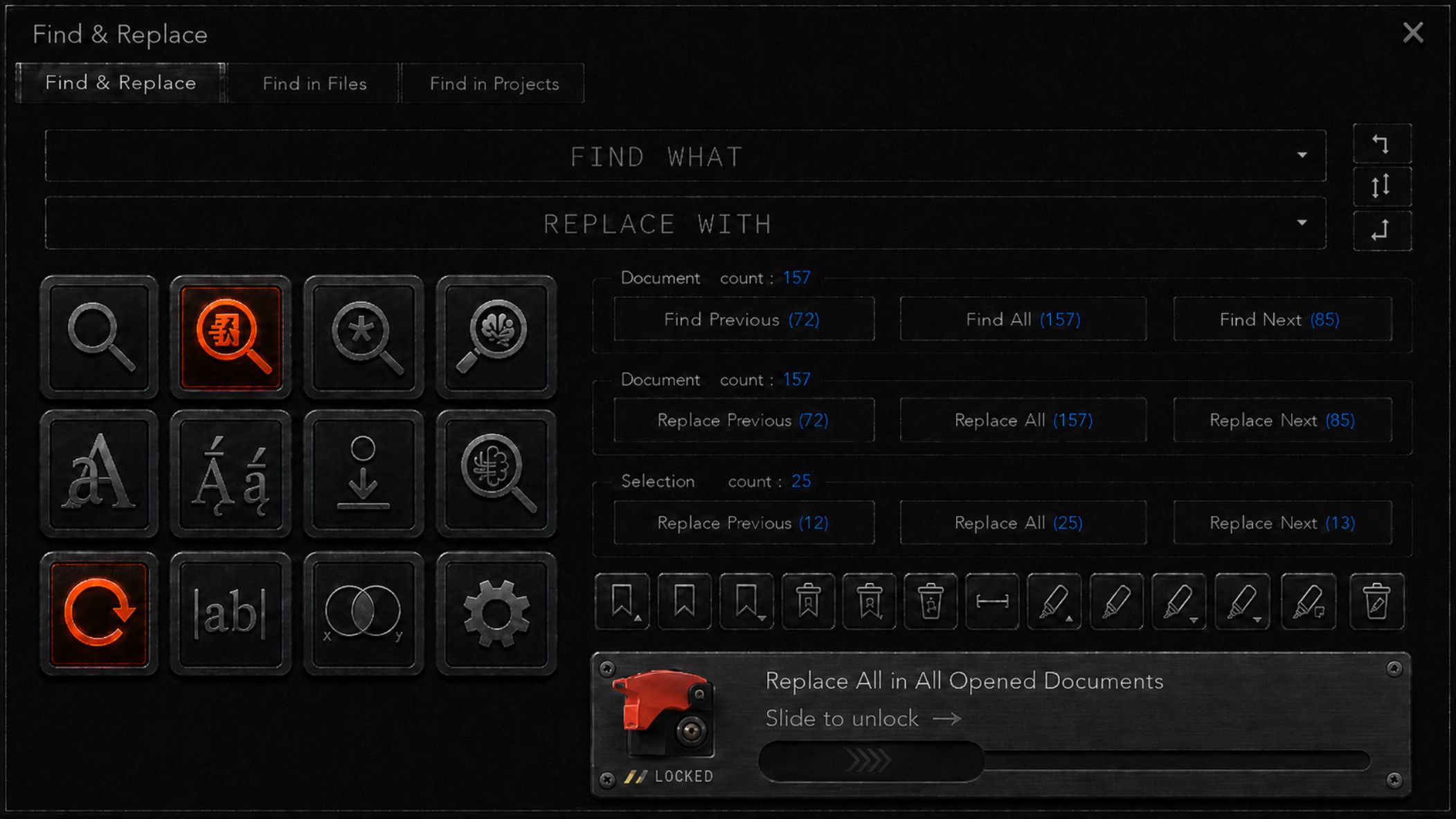
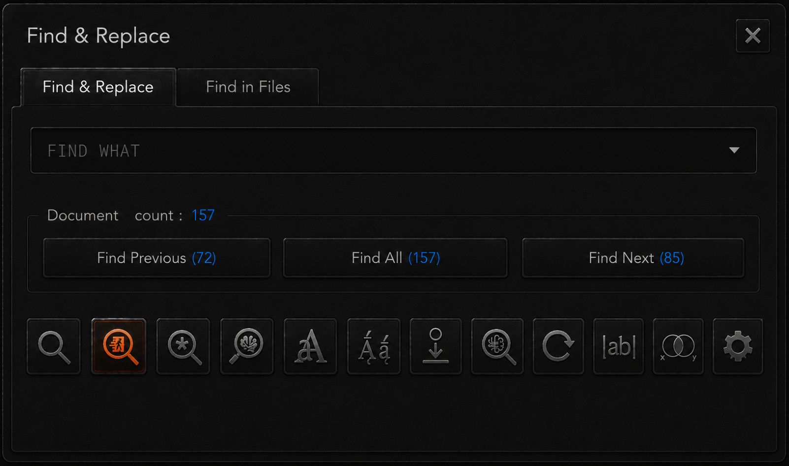
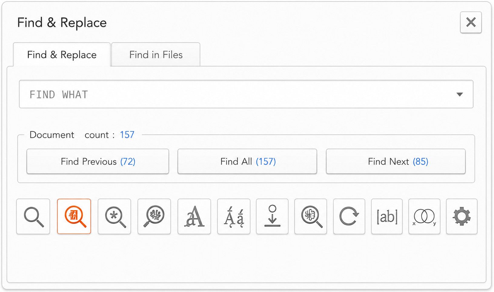
Hello here is my proposal for an improved Find & replace dialog

Most of this is self-explanatory
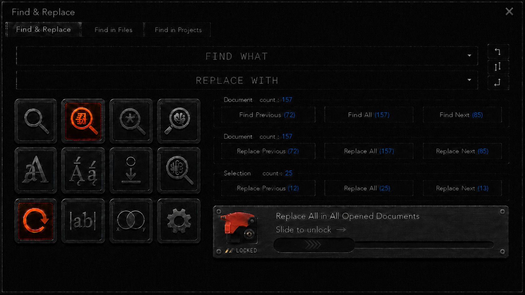
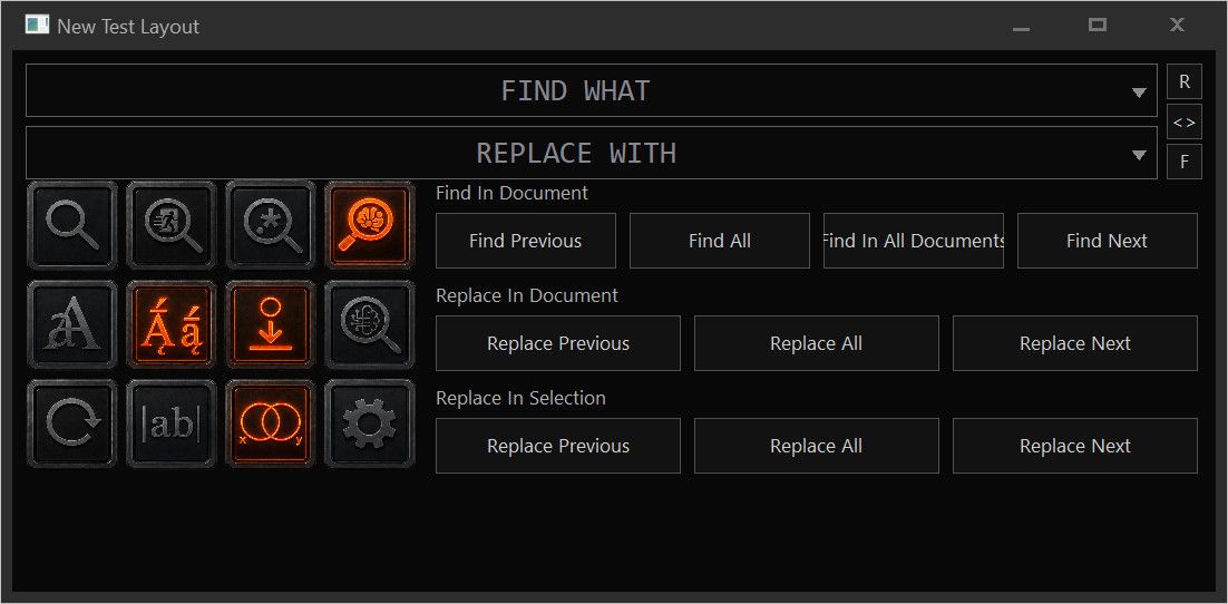
If you think about it you can probably figure out what everything means but here is my explanationThis icon section means as follows

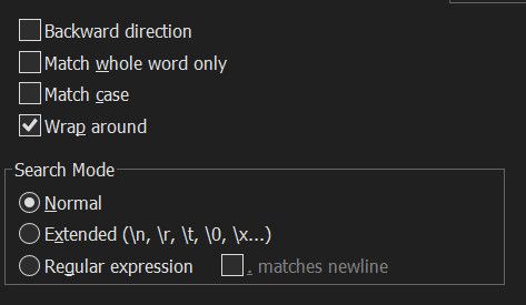
Top row is search mode, this is “radio style” button only one can be enabled at once.
The modes are like current, but with one addition.Literal search (normal mode)
Escaped Literal search (extended mode)
Regex Search (regex search)
Semantic search (no current equivalent, what would be a 250MB offline/local llm direct search module)the rest are all toggle switches

Case sensitive search
Diacritic sensitive search (that is accents and special characters, example whether e matches é è ê ë and so on)
dot includes newline (this toggle only means something in regex mode)
fuzzy logic search ( this allows for instance “boat~” to find stuff like bat, boar, bost, oat, coat, goat, bots, boats, boating and combined with semantic search, it allows synonym search such as canoe, ship, ferry, yacht, vessel and off course, scooner )
wrap around
word search (match whole word only)
boolean search
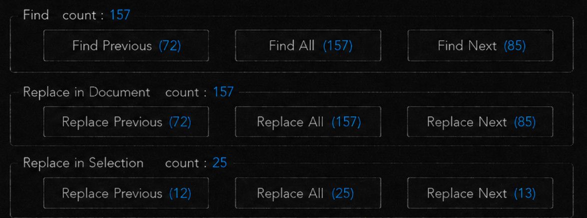
and settingsNext we have the search and replace operators
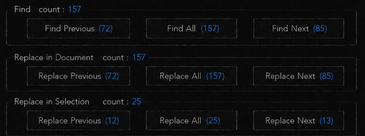
These are fully spelled out, and because we have separate buttons for “in document” and “in selection” we never have to care about checking “In Selection” ever again, that setting is simply made redundant !! Yay, my biggest pet peeve and worry and the impetus for making this proposal !
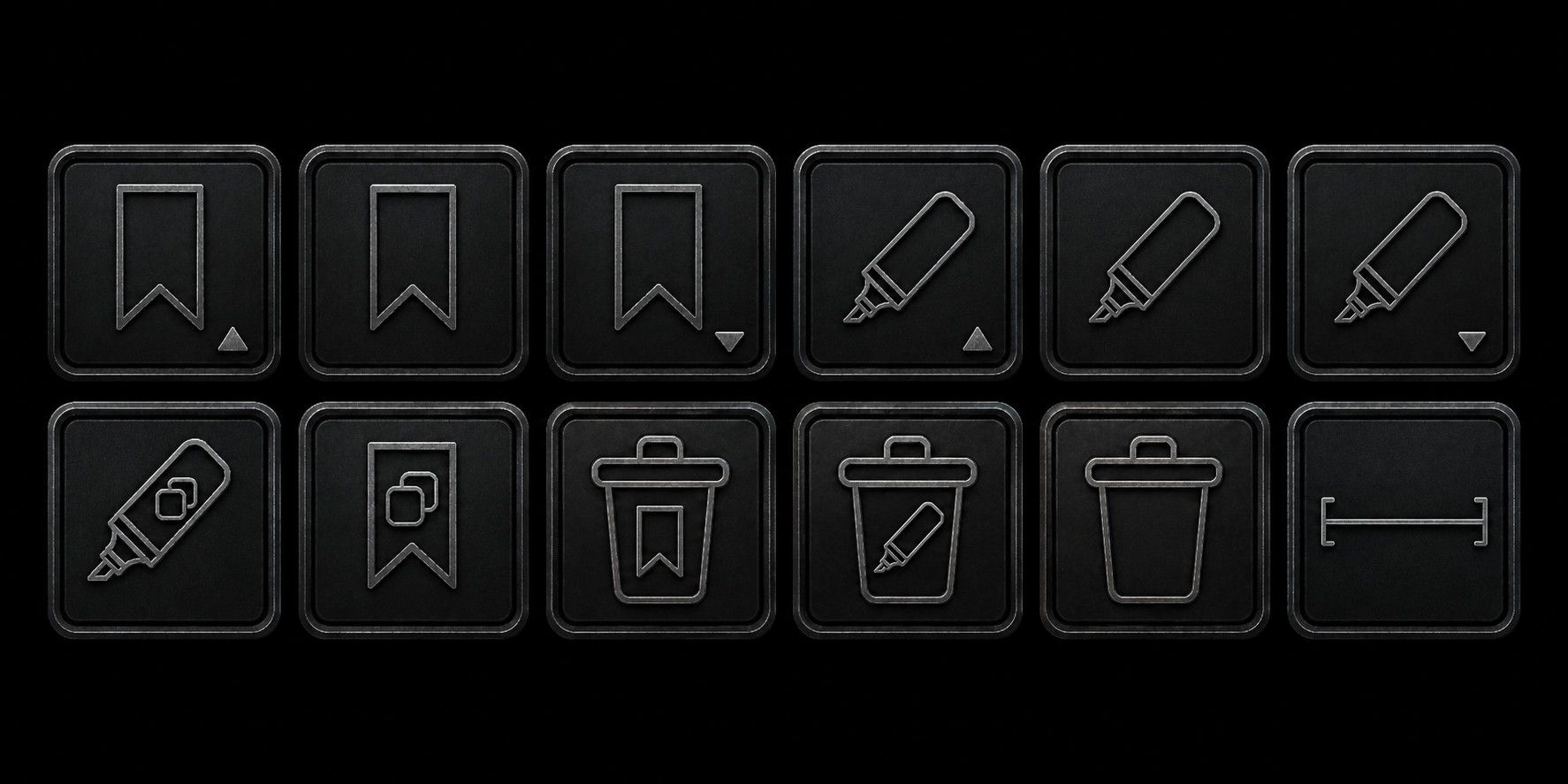
And this last line of controls, represents the Mark operation, which I never remember exist when i need them and I won’t go to another tab to use (instead I just double click the word and that’s all I use the mark function, but this would be useful if it were more ergonomic to use)
So here is what the symbols mean

Highlight previous
Highlight ALL
Highlight next
bookmark previous
bookmark ALL
bookmark next
Copy highlights
Copy bookmarks
Delete bookmarks
Delete highlights
Delete ALL(I have reached limit of images here, I will continue message as a reply once this post is out of the moderation queue)
-
I have two questions:
What would this look light in light mode?
What are the limitations in the existing Find … dialog that this improves or fixes?
-
it’s a followon to issue #16229 by the same user, who suggested some changes last year, it was rejected, there was more conversation, then that user disappeared from that conversation for over a year before answering the last question posed of them in that discussion. This icon-based dialog was posted in that reply, then a few hours later, duplicated as a follow on issue #6010, an even older rejected proposal by a different username (which had eventually gone on to propose a huge monstrosity of a dialog, which would be unusable by any human, except maybe the one who proposed it).
This icon-based proposal has the benefit over the monstrosity in that it’s not as much a “wall of text” proposal. But looking at this icon-based proposal, I don’t see what the benefit is over the current find/replace dialog. Given that all the other dialogs in the app are text based, I think that an icon-based dialog for search/replace would tend to confuse rather than help users (but that’s just my opinion)
-
Hi,
To answer
“What are the limitations in the existing Find … dialog that this improves or fixes?”
The benefits are
- elimination of the “in selection” toggle which is extremely irritating and the impetus for creating this. Having to keep track of this at all times when using the replace function has always been a sore point, and it took me a really long time to realize that it was toggling itself based on selection length! With this, it is just GONE !

- no longer having separate Find/Replace/Mark. Now each of those functions are immediately available (in particular the much more obscure mark function, but mostly it just eliminates the constant tab-switching between find and replace)

If I did not believe that this is entirely a waste of time, I would have probably integrated the other, also very similar functions into it.
-
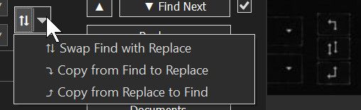
Makes the input copy/swap function a single click operation
-
Provides just more of the dialog window width in use for the textbox
-
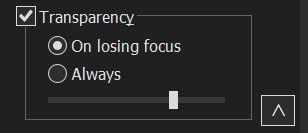
Eliminates transparency settings from main interface (it was just clutter)
-
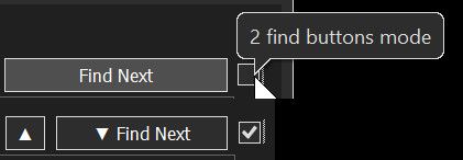
Eliminates “split find next” checkbox toggle, which only exist to quiet opposition to change which has long ceased to exist (it is a vestigial feature, ~everyone~ uses a split find prev/next except the people who haven’t realized what the checkbox is for and therefore simply can’t find previous)
-
I think my system is ultimately a smaller learning curve than the original
-
Provide live counts for search, that update as you type, eliminating the need for the Count button entirely as well as providing prev/all/next counts
-
Suggests future features, semantic search, fuzzy logic search and boolean search which are common components of serious knowledge management systems.
-
Protects (and clearly advertises that it cannot be accidentally activated) against accidental triggering of “replace all in all documents”, which is of course devastating if triggered by accident
-
Proposes a more granular version of the mark system, I forgot to add “highlight colour” and “show highligth list” but that was already a lot
-
Makes search setting immediately accessible from the Find/Replace/mark dialog
-
Suggests diacritic sensitivity, in addition of the current case sensitivity and “whole word” search parameters
I think that is all.
And to answer
“What would this look light in light mode?”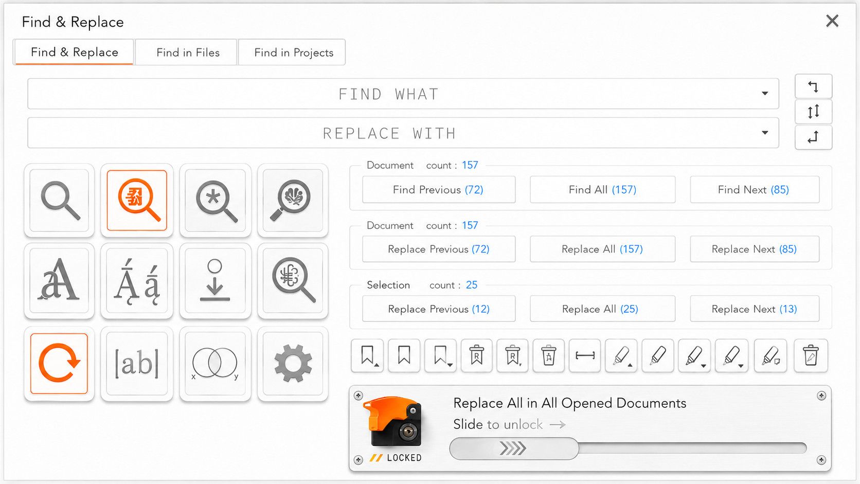
It burns my retina with its intolerable brightness !
-
Note, the message above is incomplete
I could not complete it due to hitting the image posting limit.
And now the edit window as passed
So I have to finish the original message as a reply
and last is a toggle switch
This means “copy whole line” I should add the “copy” symbol as well.
What this does when active, is when you click Copy Highlights, instead of copying only the exact highlight, which is just your find string with various case, it will copy the whole lines which contain highlights, which I think is more useful.
That one might not even be a toggle. I thought it would be a toggle because it could affect bookmark as well, but actually, “copy bookmarks” already copies the entire bookmarked lines. So probably this should just be a separate action“copy entire lines that include highlights”

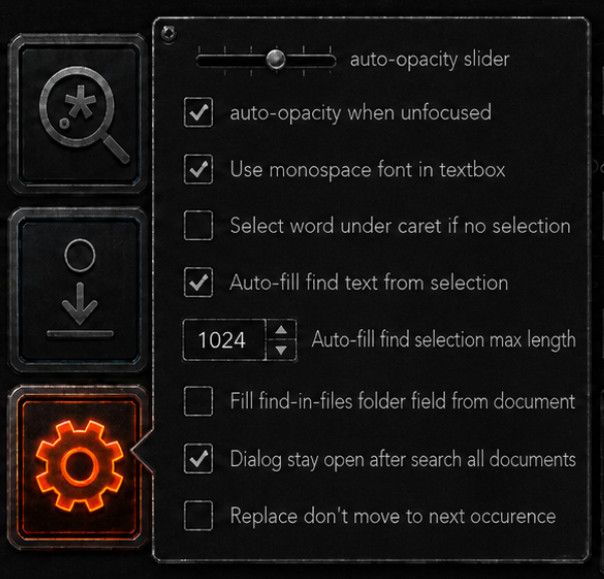
Ah and the setting button, would serve to hide the important settings that we don’t need to interact on a day-to-day basis, but easier to get there than going to preference->whatever->etc…
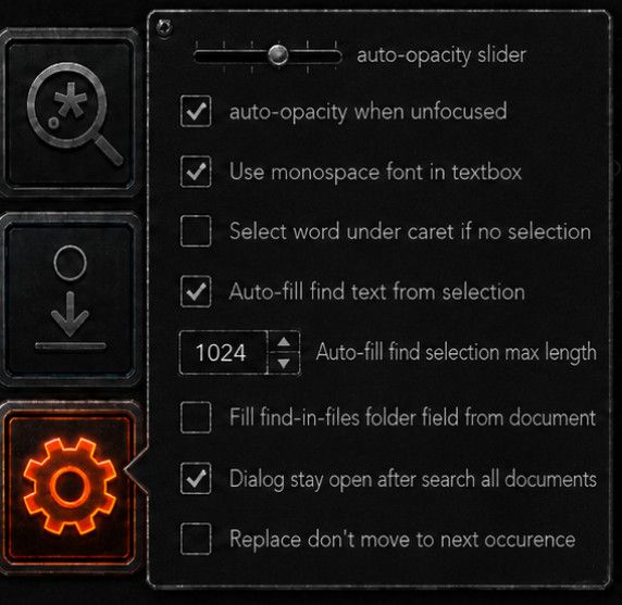
And of course, once we have a single layout like this, it’s easy to put a layout toggle in the settings menu
Example hiding the Mark/Bookmark section
Also, didn’t have the time to include it and I have no more credits to make images but I would add a button to change the colours of “highlight/marks” so you can have multiple sets of highlighted terms with different colours. (Also I would make these sets independantly copiable/deletable from a list somewhere else)
hiding replace all in all documents
Hide replace functions
Here are lightmode versions of the reduced versions
Reduced (minus replace all in all document, minus Mark function )
Find only variant
And here are the suggested layout switches, in the setting/gear icon popup dialog
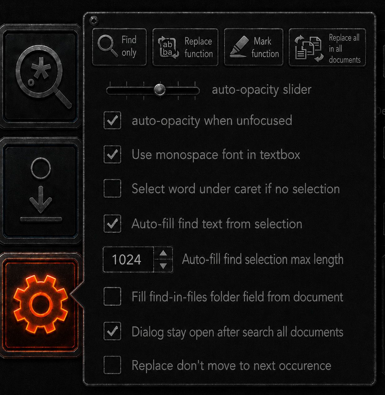
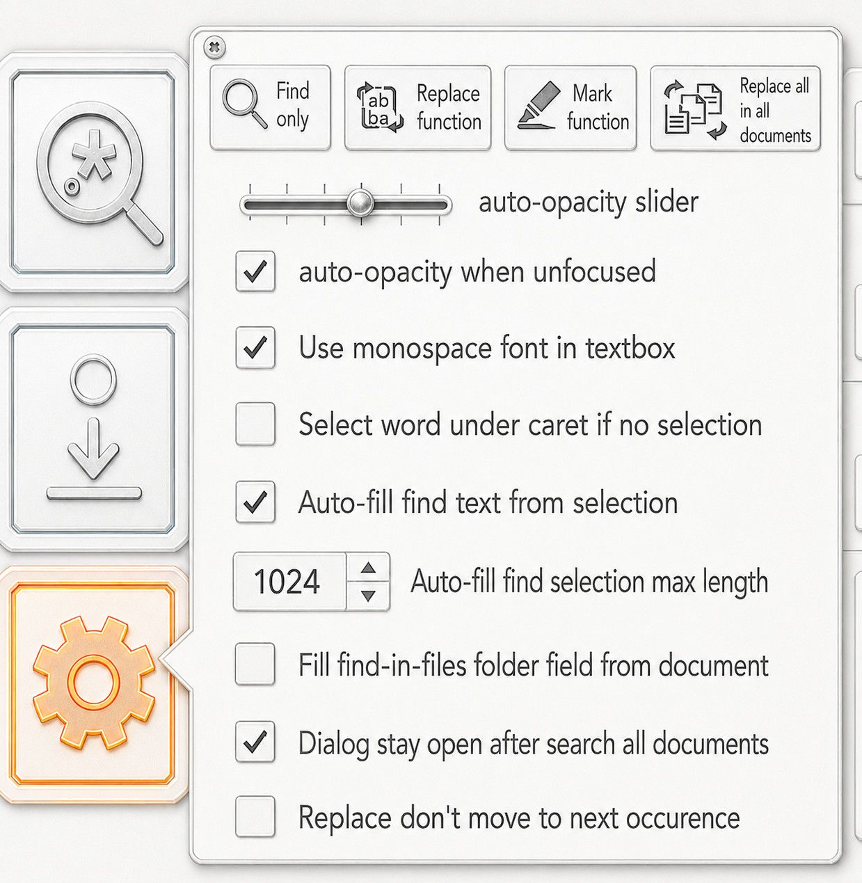
And of course, you tell the user what each button does via the use of button tooltip text
I would also put clickable yellow (?) buttons that you can click to open information page about the use of this dialog
-
- Provide live counts for search, that update as you type, eliminating the need for the Count button entirely as well as providing prev/all/next counts
Yikes! You apparently don’t use large files and/or exceedingly complex regular expressions. Even I have very-rarely needed to run searches that take minutes to run (and some unfortunate users must do that much more frequently than I do). The search engine can only run one search at a time, so every time I updated the regex, it would have to wait minutes to update the “live” count(s) before I could run the replacement I wanted. No thank you.
-
Thanks for info and I think we can all agree that the monstrosity should only be seen on the first of April, if THEN.
I’ve read issue 16229 and it was quite informative. I may have at one time been aware of the search settings in preferences, and the arrow to switch between compact and extended view. But I had forgotten all that.
I was NOT aware of the selection checkbox, which started the whole thing, even though it’s in front of me every time I do a search or replace. It’s a sign of my not using the feature. but now that I see it, I have opinions
Inside selection is kind of meaningless if I’m searching all opened documents or within files. Rather than a separate dimension, I think it should be part of the hierarchy of search scope: Find, Find All in Selection, Find All in Document, Find All in All Opened Documents etc.
@shodanx2
Thanks, the dark mode was difficult to make out on a smaller screen. and thanks for a list of things-
In Selection Toggle: as noted above, I don’t like the way it is currently implemented. and an auto toggle seems confusing.
-
Find / Replace / Mark Tabs: Honestly, this doesn’t bother me here. In general, I think I lean towards liking a tabbed interface
-
Input Copy/Swap Function: I so rarely swap and never copy, that having a drop down doesn’t bother me. I’m neutral on this sort of change
-
Wider Search and Replace fields: I am not hampered by the size right now. If we could rearrange and make larger, great! If not, great!
-
Transparency Settings: If I had single monitor and my search window was over the editor I’d make use of this. I don’t see a need to keep it. If we could use that space for something else, fine.
-
Split Find Next Toggle: meh. It it were up to me, I’d make the the bidirectional buttons the only option, or at least move the choice to Preferences.
-
Live Counts: I Like putting the counts in the text of the buttons. I’m not sure how hard it would be to implement, but pretty
-
Locking Replace All. No. If we have the option set in Preferences, we’re already confirming the change. that’s just extra room.
-
Diacritics: Sure if there’s space, why not?
Light Mode: I use a dark theme with my light Mode, so dialogs are a nice gentle gray, not blazing white.
- Smaller Learning Curve:
I really don’t think so. There’s a lot on that screen that I don’t want or need to know. which brings me to
It’s too cluttered. A row of buttons on the right became a larger grid of buttons, but mostly, the icons
You’ve got two sets of icons in two different layouts and sizes. The search dialog is dominated by the icon grid on the left.
There are circumstances where icons are the best GUI element (toolbars) or are best in combination with text (the tabs in Notepad++ for example) But in a number of the cases you described, I think the best element would be a checkbox with explanatory text.
-
-
@PeterJones said:
The search engine can only run one search at a time, so every time I updated the regex, it would have to wait minutes to update the “live” count(s) before I could run the replacement I wanted. No thank you.I do occasionally open big files, I have one open right now.
That doesn’t seem like much of a problem to me ?
Here is how to do it
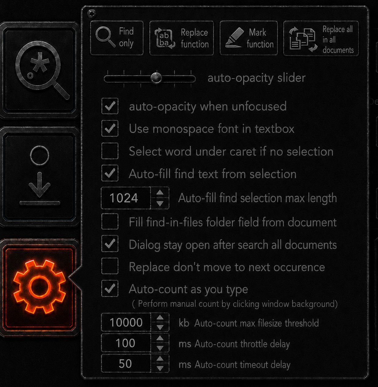
- Put a filesize guard on the auto-count algorithm, so it just doesn’t fire for files beyond threshold.
- Put a throttle delay so it can’t fire again until a delay has passed, I think 100 millisecond / 10 hertz would still feel responsive while leaving ample room from 99% of files to search through.
- run the auto-count algorithm in another thread so it doesn’t freeze the UI on especially big files (or, just reduce max file threshold)
- don’t trigger auto-count algo until it returned
- Give auto-count algo a timeout value
- Give user disable auto-count toggle
- Manual count trigger by left click window background
I just checked how long the count algo actually takes.
On my 156 megabytes file that is 39 milliseconds.Let the user fiddle with the values you like, I suggest these default values. Use this layout.
-
- In Selection Toggle: as noted above, I don’t like the way it is currently implemented. and an auto toggle seems confusing.
For me it was brutal, I thought I was going crazy, somehow that toggle was always the opposite of what I needed ! And … it took me a loooooong time to discover that it changes on its own !!
1024 bytes it a selection threshold I am very often on either side of !
I understand the idea, “in selection if it’s big enough” but then you have to keep in mind where that threshold it, but counting 1024 character really is not obvious. I’m not sure if it only enabled but I think it would also disarm when you’re under threshold.I have PTSD from that damn toggle ! My thousand+ steps windows configuration checklist has a line about disabling this feature. Separate buttons for replace in selection and replace in document solves that problem. Now where you click always does what you want.
- Find / Replace / Mark Tabs: Honestly, this doesn’t bother me here. In general, I think I lean towards liking a tabbed interface
As I studied this dialog box, I realize that many many times I would have benefited from the highlight feature, but not if it’s an other tab. I need it but not often enough to remember it exists. Also having multiple highlights with different colour, having those highlights in a list, and preserving those highlight over np++ restarts as permanent highlighting of the text would be really nice.
- Input Copy/Swap Function: I so rarely swap and never copy, that having a drop down doesn’t bother me. I’m neutral on this sort of change
I didn’t notice it was there, it was interface noise, I think I might use swap, if I remember it exists. Not a fan at all of a two click operation.
- Wider Search and Replace fields: I am not hampered by the size right now. If we could rearrange and make larger, great! If not, great!
I often paste long, really really long searches in there. I’d like to see more of it, I also would like side-scroll to work on this textbox (currently side-scroll does horizontal scroll on it, that’s a bug)
- Transparency Settings: If I had single monitor and my search window was over the editor I’d make use of this. I don’t see a need to keep it. If we could use that space for something else, fine.
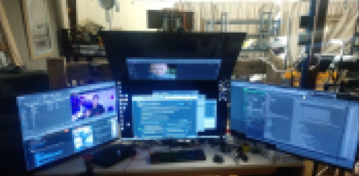
I have 4x40" monitors
I always leave it translucent and it’s always absolutely all over the place. But I never needed to adjust it after the first time, it belongs in settings, but there should be a gear icon for settings on the search dialog.- Split Find Next Toggle: meh. It it were up to me, I’d make the the bidirectional buttons the only option, or at least move the choice to Preferences.
I don’t see why not always have prev/next, I use both extensively, only reason the toggle is there, in my opinion, is in case someone complains about it, to pre-emptively quiet them. But I don’t think those people really exist. That’s why I call this a vestigial feature.
- Live Counts: I Like putting the counts in the text of the buttons. I’m not sure how hard it would be to implement, but pretty
I really would like that, even if it does it 1 per second. Being able to just type and see how many results you got sounds soooo useful. You get an immediate look at what is going on. And with prev count and next count, you kind of can orient with it, like I type a function name, and at a glance I can tell if I’m before of after it.
- Locking Replace All. No. If we have the option set in Preferences, we’re already confirming the change. that’s just extra room.
This signals that button is not dangerous. You know how sometimes UI have buttons that if you click them something bad will happen. This happenned to me too often, I have PTSD about it. Even if there’s a guard, it makes me nervous. I have never used it, but I see how it might be useful but I always have a bazillion files open in my session so that button is never safe, even though, I know there’s a guard. But have you even misclicked something and then also bumped space by accident ? That would do it ! Aaaaaahahhhhh !
Light Mode: I use a dark theme with my light Mode, so dialogs are a nice gentle gray, not blazing white.
On my HDR oled monitor, it is so bright it lights up the room.
- Smaller Learning Curve:
I really don’t think so. There’s a lot on that screen that I don’t want or need to know. which brings me to
It’s too cluttered. A row of buttons on the right became a larger grid of buttons, but mostly, the icons
Decluttering the layout is easy, just add more layout buttons in settings.
I would like either a “advanced mode” toggle. Or “layout change on resize” where the bigger you make the dialog, the more buttons it adds. What just a find bar, shrink it until that is all there is.
You’ve got two sets of icons in two different layouts and sizes. The search dialog is dominated by the icon grid on the left.
Yes there is many other ways to do this. Once you know what the icons mean, like the regex symbol and case sensitive, you can make them much smaller and be able to pick them up very quickly. This layout feels right to me. I would really like a (?) hover help screen for the dialog.
In particular, having common regex expression like matching empty lines, matchin end of line, matching beginning of line. The perfect version would have a regex builder and the complete set of escape sequences ready to drag and drop into the textbox
I think symbols are more legible once you can recognize them.
-
- run the auto-count algorithm in another thread
Multi-threaded search has been rejected on the grounds that it breaks other features:
https://github.com/notepad-plus-plus/notepad-plus-plus/issues/8329
https://github.com/notepad-plus-plus/notepad-plus-plus/issues/3562#issuecomment-2242694908(That might be in just the context of a separate thread for each file searched during multi-file searches… but I believe that other ‘background threading’ of searching has also been rejected, though I cannot immediately find an example.)
If your live-count solution relies on one or more new threads, don’t count on it being accepted.
I think (but am not sure) that all your suggestions for “timeouts” and the like would also require threads, which would probably make them a no-go as well.On my 156 megabytes file that is 39 milliseconds.
normal-search=
hrefis not a complicated regular expression, and thus you have a 39ms strawman there. As I said, I have seem minutes pass while searching. If you haven’t experienced that, be thankful. But understand that freezing other people’s search dialogs for minutes before they can search, just because you want automatic “live” count, is not going to be accepted. (If that auto-count were limited to mode=normal searches, maybe, just maybe, it would be safe enough. But I’m still doubtful.) -
That might be in just the context of a separate thread for each file searched during multi-file searches… but I believe that other ‘background threading’ of searching has also been rejected, though I cannot immediately find an example.
From what I’ve seen, all search in Notepad++ runs through the Scintilla search interface. That by itself makes it impossible to separate search from the GUI thread without re-engineering how search works.
I did, somewhat, re-engineer search for Search++ and for Search in Columns++; for regular expressions, I use the raw data pointer from Scintilla and search it directly with Boost::regex. It might be possible to multi-thread Find in Open Documents that way, but probably not Replace (unless every document were duplicated in memory in the GUI thread, processed in a worker thread, then the whole document replaced in the GUI thread). One of the big hurdles I still have in Search++ is how I’m going to do Find in Files. I do not want to open each file in an off-screen Scintilla control (which I’m pretty sure is what Notepad++ does). The searching sounds simple until you consider code pages and how to locate the match in a Scintilla window if the user asks to see it by clicking in the search results. If I can design that (I just haven’t had the mental space to take on the challenge recently), doing it multi-threaded sounds like it should be possible.
Another frustrating thing is that Boost::regex doesn’t have any sort of progress callback while it is searching. It’s easy enough to do periodic callbacks after finding one instance and before finding the next (each is a separate call to Boost::regex); but often the big delays happen while searching large spans of text where nothing is found. I hope, someday, to take on the challenge of modifying Boost::regex to do a callback instead of the dreaded “too complex” message. That will be a ways down the road.
But any of this is way too much change, and way too likely to cause new bugs, for me to even think of suggesting it as a change to the base program. If anything, I think it would have to be a “parallel” feature, rather than a replacement, which would have to prove itself viable over time… which is, I’d say, appropriate for a plugin.
@shodanx2, if you’re able to code a plugin to show your concept in action so people can try it and actually demonstrate its value and reliability in real world use, that would be the way to go. If you’re throwing all this massive re-design out and thinking “somebody else” will implement it, it’s not likely; consider smaller suggestions that can be integrated without disrupting the interface with which people are familiar or the battle-tested processing of the existing program.
-
-
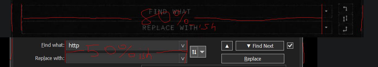
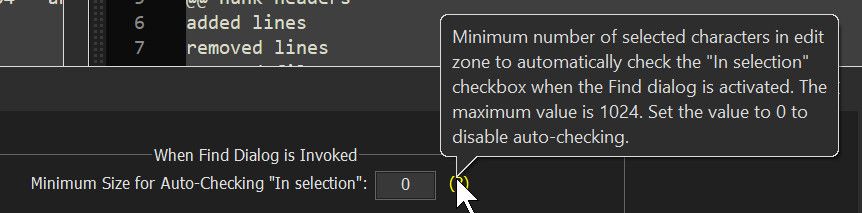
but counting 1024 character really is not obvious
Notepad++ counts for you:
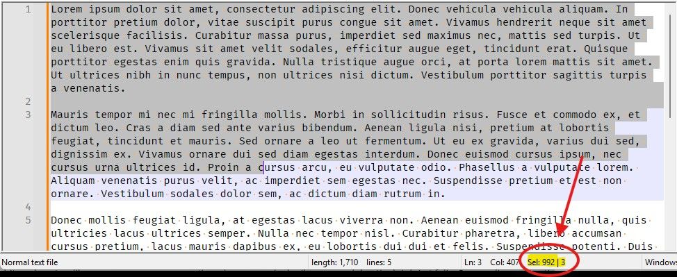
The pictured selection is 992 characters, and thus not quite past the threshold.
-
Today I Learned. 😀
-
Notepad++ counts for you
This is true; my point about “feel” was that, at least for me, if I select a “bunch” of characters with a search in mind as the next action, of course I want it to be within that selection. Again, everyone’s “bunch” could be a different number (which is why the option is configurable), and it isn’t a hard number in your mind, but there has to be a definite number for the software.
TL;DR: I have never watched the
Sel:item in the status bar when making a selection for this purpose. -
it isn’t a hard number in your mind, but there has to be a definite number for the software.
Of course. And so you select what you “feel” is about right for your limit, and use the
Selnumber (rounded appropriately) to set the hard number for the preference entry. -
@PeterJones
I agree with Alan, to make this intuitive you have to be able to go by feel.Consider the following two selections
One of these is In Selection the other one is not.
And you don’t usually get a side-by-side and one of these two will wreck your file if you don’t notice what mode you were when you press Replace All.
One easy way to make this intuitive, would be to flip the text on the button and also to change the button’s colour, so you don’t have to read it, you will feel it.
On the other hand, separate buttons for “in selection” and “in document” will not even need you to feel it, it will move to intent in your muscle memory. Both of these could exist as different layouts that you can toggle.
As for the “auto-count” algorithm.
There is a way to make this work.
I understand that you call by 39 millisecond search on a 156 megabyte file a “strawman” but you have to understand that, you can make arbitrary long regex time if you want.
There is a single thread solution to make this work.
You call the count algorithm but every 4 or 8 millisecond you call whatever the equivalent of DoEvents is in scintilla.
Combine this with the circuit breakers I described above and I think it’s very feasible and won’t freeze the UI. I think some other long running features in notepad++ could benefit from this. Because when I had this 156MB file loaded in np++ earlier, there was a lot of misbehaviour. Lots of freezing when simple moving the window, even though nothing changed on screen, just a simple translation.
Also this is just a particularly crunchy bit of the problem, the rest of the layout redesign doesn’t have any difficulties except for some the new proposed features (boolean, fuzzy and semantic search are each their own can of worms).
-
There is a single thread solution to make this work.
You call the count algorithm but every 4 or 8 millisecond you call whatever the equivalent of DoEvents is in scintilla.
Scintilla calls Boost::regex. Boost::regex does not return until it either finds a match, exhausts the input, or trips its internal “this looks like it might be an infinite loop” flag.
There is nowhere to put that “DoEvents” call (which wouldn’t be a call to Scintilla, it would be a return from a dialog or window procedure with a zero-length timer set to call the procedure again after Windows updates).
You can (as in my linked example) do a periodic return between one search and the next, but you can’t interrupt a single, long-running search. That’s annoying in my application, but would be fatal as proposed in this dialog.
-
the rest of the layout redesign doesn’t have any difficulties except for some the new proposed features
You and I will have to disagree on that statement, because I know I cannot convince you, and don’t feel like arguing with you anymore (hence the post that was live for a few minutes before I deleted it; it’s just not worth the effort).
But at this point, I want to emphasize @Coises’ earlier suggestion: Make it a plugin at first. Try it out, take it round the block, learn the difficulties with the extra features you want, get it better, get it bulletproof. All the mockups in the world will count as nothing compared to such real-world proof. If people like it, maybe it will be to the 2020s what TextFX was to the 2010s: a plugin that a huge population of users installed, and that they still ask about a decade after the author abandoned it.
But if you want suggestions
- start simple, with just reworking the “look and feel”, without trying to add the extra features like the live count
- redo your icon design: the industrial/bolted-plate design looks/feels nothing like anything else in Notepad++, so it doesn’t seem like it’s part of the same app. Design some icons similar to the Fluent toolbar icons, and it would at least fit in with one of the existing GUI options.
-
@PeterJones I have been having a crack at it.
I think I can put … everything in it. If I don’t burn out.
Absolutely everything, including what you call the “ridiculous proposal”. (Which mostly just adds a preset system for common searches)I have taken care not to use any API after GDI+.
And it’s only alpha borders on icons that keep this from being simple win32 GDI.
Hello! It looks like you're interested in this conversation, but you don't have an account yet.
Getting fed up of having to scroll through the same posts each visit? When you register for an account, you'll always come back to exactly where you were before, and choose to be notified of new replies (either via email, or push notification). You'll also be able to save bookmarks and upvote posts to show your appreciation to other community members.
With your input, this post could be even better 💗
Register Login