How to Make Fonts Bolder in Notepad++?
-
While using Notepad++, I noticed that no matter which font I select, the editor always displays text in the thinnest available weight. When I enable “Bold,” it switches to the thickest weight instead. However, neither extreme is ideal—I need a regular-weight font.
So how can I make the font slightly bolder in Notepad++?
-
You can read more in this post , but, in short, the library that Notepad++ uses under the hood (called Scintilla) doesn’t do everything it can to allow Notepad++ to request the different weights of the fonts (don’t ask me for more details; i don’t fully understand it).
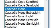
If your font has the separate names – like one of the families on my computer is called “Cascadia Mono”, and has variants likw of “…ExtraLight”, “…Light”, “…SemiBold”:
 – it might not show some of those (in fact, it seems to pick some random other font when you pick one of the weight variants).
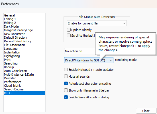
On most versions of Notepad++, if I have Settings > Preference > MISC > Use Direct Write set to the default “ON”, it only shows the primary and messes up when any of the other variants are picked. But if I switch to OFF, then picking one of the weighted variants of the font does change the weight within that font family.
On the newest release (v8.7.8, which isn’t yet available to the updater, but you can download from the official website at https://notepad-plus-plus.org/downloads/v8.7.8/ ), there are now four options for the DirectWrite setting (which is now a pulldown instead of a checkbox, but still on the MISC preferences page). When I originally read that post , I got the impression that the mode#3 (“DirectWrite (draw to GDI DC)”) might be able to make the weighted fonts work right, but it didn’t seem to help for me (once again, I only saw any difference if I turned off DirectWrite (“GDI (most compatible)” is the phrasing in v8.7.8)
Maybe @xomx can confirm whether I had just misinterpreted the previous discussion (most likely), or whether the new modes were supposed to be sufficient to make the weighted fonts work despite no update on the Scintilla end, and/or add some more clarity to this discussion.
-
@PeterJones said in How to Make Fonts Bolder in Notepad++?:
DirectWrite (draw to GDI DC)
No, this one does not help here, but the good old
GDI (most compatible).
Exactly as someone already answered that in the created GitHub issue. -
@PeterJones @xomx
When I switched the rendering mode to “GDI (most compatible),” the font display ended up looking even stranger than before, especially with Chinese fonts. It felt like I’d been transported back 60 years.
Hello! It looks like you're interested in this conversation, but you don't have an account yet.
Getting fed up of having to scroll through the same posts each visit? When you register for an account, you'll always come back to exactly where you were before, and choose to be notified of new replies (either via email, or push notification). You'll also be able to save bookmarks and upvote posts to show your appreciation to other community members.
With your input, this post could be even better 💗
Register Login