[New Plugin] ExtSettings
-
@dinkumoil I think I have found a small issue regarding the plugin’s settings and about windows. When I open any of them, and then switch to a different program in Windows, it is impossible to go back to Notepad++ by clicking its taskbar button. I can only go back by using Alt+Tab. Just for reference, as I have not checked other Windows versions, this is happening in Windows 7 Enterprise x64 with Classic Theme enabled.
-
@tomasz1986 said in [New Plugin] ExtSettings:
found a small issue regarding the plugin’s settings … When I open any of them, and then switch to a different program in Windows, it is impossible to go back to Notepad++ by clicking its taskbar button.
Thank you, I will have a look at that.
-
another one :-) (npp doesn’t use it at all as far as I can see)
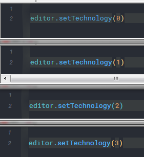
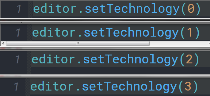
The differences, between 0 and 1, are more visible on the display as
in the image but I guess still noticeable.my default font size

max font size

-
Which “technology” do you prefer? I don’t see much if any difference.
-
the most difference, on my machine, is between 0 and 1.
And SC_TECHNOLOGY_DIRECTWRITE (1) is the one I used for some time now
and I like it with Roboto Mono font.
Between 1 and [2, 3] the changes are only visible, again, on my machine, when
zooming in as much as possible.
But I understand, that this might, depending on your directx settings and usage, be a different experience compared to mine.
If I change from 1 to 0 everything is MUCH thinner and harder to read.
(Everything means, of course, within scintilla only) -
I did some testing using NppExec plugin to send the Scintilla events. The only differences between
SC_TECHNOLOGY_DEFAULT(value0) and the other technology modes are:- Characters get slightly wider and higher
- It is possible to use
SCI_INDICSETSTYLE 29 INDIC_GRADIENTandSCI_INDICSETSTYLE 29 INDIC_GRADIENTCENTREto set search match highlighting to these gradient modes.
I even don’t see the slight difference in font weight between
SC_TECHNOLOGY_DEFAULTand the other modes that I can see in your first set of screen shots above. I use Source Code Pro font.All in all, I have to thoroughly think about whether it’s worth to include this setting in my plugin.
-
just to make it clear - it is all up to you to decide what you want to include into
your plugin and what you don’t want, I appreciate EVERY decision.
I come across of those settings just because of testing my scintilla wrapper
and see that there is something new or old, and remember that I’m actually
using it, and thinking it might fit into your plugin but as said,
those are ALWAYS just proposals. -
@dinkumoil said in [New Plugin] ExtSettings:
I even don’t see the slight difference in font weight between
SC_TECHNOLOGY_DEFAULTand the other modes that I can see in your first set of screen shots above. I use Source Code Pro font.All in all, I have to thoroughly think about whether it’s worth to include this setting in my plugin.
Just for the record, font rendering is very heavily dependent both on the operating system, the monitor, the font, the user himself, and possibly many other variables. Just as an example, the exact same font, with the same type of rendering, may still look very different depending on the screen (e.g. CRT vs LCD, or TN vs IPS vs VN, etc.) which is being used.
Also, some people are simply more susceptible and notice even slight differences like that much more easily. I have personally experimented with different font rendering in Windows, and find the old GDI rendering much better for my eyes, while DirectWrite rendered text looks fuzzy to the point that I start to feel dizzy when trying to read it for a longer period of time. But again, this is just my case, and the situation may be totally reverse for someone else.
-
Hi, @dinkumoil, and All,
Thank you very much, @dinkumoil, for this very useful plugin, with numerous options ;-))
Some points concerning the options ( From top to bottom and from left to right ! ) :
-
Backspace unindents : Seems very useful when coding, but more accessory with simple text
-
Indentation guide lines : I could not be able to see the difference between the
Python styleandStandard styleoptions ! -
White space style : IMO, the term
Everywhere visiblewould be more appropriate thanAlways visible, in the drop-down list. But , don’t bother about this ! -
White space size : To my mind, only sizes from
2to4seem practically exploitable ! Of course, a click on the Show All Characters icon, in the Toolbar or selection of the optionsView > Show Symbol > Show White Space and TABorView > Show Symbol > Show All Charactersresets the size of the space symbol to the default2value -
Upper line spacing and Lower line spacing : I did some tests with the line below, containing some underscore characters (
\x5f), followed with some macron characters (\xaf)
____________________¯¯¯¯¯¯¯¯¯¯¯¯¯¯¯¯¯¯¯¯And it happened that, with the Courier New default font :
-
-
Any size <
-2, for Upper line spacing, does not display the macron characters -
Any size <
-1, for Lower line spacing, does not display the underscore characters. However, depending of the zoom factor, even the-1value may not display the_.
-
Conclusion : the suitable values, whatever the zoom factor, seem to be :
-
-
Any value
>= -2for upper line spacing -
Any value
>= 0for upper line spacing
-
-
Now, the vertical lines new feature is really interesting ;-)) Of course, if, after defining some of them, with your plugin, you enable the Vertical Edge Settings in
Settings > Preferences... > Editingor switch from optionLine ModetoBackground modeor vice-versa, it deletes all the previous vertical lines defined and displays the classical vertical edge line ! -
Wrap mode : Again, I did not see any difference between the options
Word boundariesandWhitespace characters, of the drop-down list :-( -
Line number margin : Didn’t know this particularity. Nice !
-
Wrapping markers close to text may interest some people. I, personally, prefer that these marks remain at each extremity of the window, for better readability !
-
To be analog to the Notepad++ description, may be the
Mark Highlightingtitle of the section should be renamedSmart Highlighting -
-
Now, the numerous styles proposed to show the Smart Highlighting are valuable. I particularly like the
3styles
Straight box,Underlined (2px, inset)andColorized text, rather visible and easily identifiable from other N++ highlighting styles ! -
However, note that if you’ve changed the color of the Smart Highlighting, as soon as you switch for an other opened document, and switch back, immediately, to your initial document, any smart Highlighting zones is colored with the default green color :-(( I don’t even know, if this issue could be easily coded ?
-
Strangely, if you disable and re-enable the Smart Highlighting in
Settings > Preferences... > Highlighting, while not changing current document, does keep the modified color of the Smart Highlighting !
-
-
Cursor beyond line endings : For adepts of the Virtual Space feature. Can be interesting if you need to easily write very far from current line ending !
-
Wrap cursor at line start : Seemingly, when your file contains lines of very different length and some very long lines, this feature prevents you from moving to the end of the previous line. However, why not use, instead, the Down and
Uparrows keys to navigate, while keeping the same columns visible ? Just tell me what I miss, here ! -
Select full line : Again, I don’t see an immediate advantage to that feature !
-
Selection alpha : I spent more than a month to study color, in many aspects and how calculate the blending of two colors, involving the
αfactor, as well as some practical results relative to our beloved editor ! Refer below :
https://community.notepad-plus-plus.org/post/47895
So, if we consider, in
RGBmode :-
-
The default current text foreground color
(0,0,0) -
The default current text background
(255,255,255) -
The default selection color
(192,192,192) -
The default current line background color
(232,232,255)
-
The alpha option allows you to change, both, the color of background and foreground ( text ) of the resulting selection, according to the two general formulas :
RESULTING Selection Background = α x SELECTION Background + ( 1 - α ) x CURRENT Background    with α in range [0,1]

RESULTING Selection Foreground = α x SELECTION Foreground + ( 1 - α ) x CURRENT Foreground    with α in range [0,1]
In other words, with
α, transposed in range[0-255], we get :Resulting Bg Red = ( α x 192 + ( 255 - α ) x 255 ) / 255 for part of selection NOT in CURRENT line Resulting Bg Green = ( α x 192 + ( 255 - α ) x 255 ) / 255 for part of selection NOT in CURRENT line Resulting Bg Blue = ( α x 192 + ( 255 - α ) x 255 ) / 255 for part of selection NOT in CURRENT line Resulting Bg Red = ( α x 192 + ( 255 - α ) x 232 ) / 255 for part of selection in CURRENT line Resulting Bg Green = ( α x 192 + ( 255 - α ) x 232 ) / 255 for part of selection in CURRENT line Resulting Bg Blue = ( α x 192 + ( 255 - α ) x 255 ) / 255 for part of selection in CURRENT line And : Resulting Fg Red = ( α x 192 + ( 255 - α ) x 0 ) / 255 = α x 192 / 255 WHATEVER the selection location Resulting Fg Green = ( α x 192 + ( 255 - α ) x 0 ) / 255 = α x 192 / 255 WHATEVER the selection location Resulting Fg Blue = ( α x 192 + ( 255 - α ) x 0 ) / 255 = α x 192 / 255 WHATEVER the selection location-
-
As
αvalue increases towards255, the gray colors of selected text and the background converge, reducing contrast between them and, whenα=255, color of Fg = color of Bg =(192,192,192), leading to an invisible selected text !! -
On the contrary, as
αvalue decreases towards0, the selection background becomes more and more transparent and, whenα=0, color of Fg =(0,0,0)and color of Bg =(255,255,255), except for the part within current line where color of Bg =(232,232,255) -
So, in the end, only values between
120and150and, of course,256seem interesting ! Value130seems a good compromise !
-
-
The Multi Paste and Convert EOL on paste seems rather useful and I see very few interest in unchecking them :-))
-
To conclude, although I can’t test printing, presently, the Magnification feature is surely valuable, as I don’t see anything about it, in the
Settings > Preferences... > Printpanel !
Now, @Dinkumoil, more generally :
-
I think that the
Closebutton should be selected, by default, in order to close while hitting theEnterkey . May be, the possibility to close, while hitting theESCkey would be nice, too ! -
Could you give the user the opportunity to get multiple configurations ? For instance, regarding the vertical lines, we could have a configuration
1with some vertical lines, a configuration2with other vertical lines starting at other columns and having other colors, and so on…
Probably, your
.inifile could memorize ( Be sensible ! ) up to5completely different configurations. Just my idea ! Of course, your new window would give us the choice of the configuration to activate ;-))-
Could you consider adding the
SCI_SETCARETSTICKYfeature (2458). Do you know it ?-
Let’s suppose the caret is at column
c, linen, in current N++ window -
Then, you type in some text
-
Now, hitting the
Down/Uparrow, the caret is automatically located linen+1/n-1, at the same columnc -
You may decide, afterwards, of an other location column
c1and/or in an other linen1, with either a mouse click or a keyboard action -
Type in, again, some chars, from column
c1 -
As soon as you use the
Down/Uparrow, the caret is moved on next / previous line, at the samec1column
-
Note the
3possibilities :0=> Disabled,1=> Always enabled and2Enabled only after typing Tab and Space charsOf course, this feature is useful only when inserting different text, on the consecutive lines reached. Indeed, when text, to be inserted, is identical throughout all lines, the built-in column mode is more intuitive ;-))
- More anecdotal, you could, also, consider the
SCI_SETMARGINLEFT(2155) andSCI_SETMARGINRIGHT(2157) settings, which set the width of the blank margin, on both sides of text, in pixels ?
As always, just propositions ! Do as you like ;-))
Best Regards,
guy038
-
-
Thank you for your detailed response and your suggestions.
In general I can say that many of the settings depend heavily on personal taste, the use case (e.g. simple text editing or coding), the used theme, the used font and its size, and many other factors which don’t come to my mind at the moment. Whether somebody wants to use a certain setting or whether he finds it useful or not depends on all these factors. I’m only the guy who makes these settings accessible to the normal user who doesn’t want to deal with scripting plugins and sending Scintilla events to configure them, though they are not available through the Notepad++ user interface.
I could not be able to see the difference between the Python style and Standard style options !
To see the differences in Python and C++ code have a look at >>> these comments <<< where I talked about the different styles with DonHo.
the vertical lines new feature is really interesting. … if, after defining some of them, with your plugin, you enable the
Vertical EdgeSettings inSettings > Preferences... > Editingor switch from optionLine ModetoBackground modeor vice-versa, it deletes all the previous vertical lines defined and displays the classical vertical edge line !The single vertical line (provided natively by Notepad++) and the multiple vertical lines features are exclusive in Scintilla, you can only activate one of them. There is nothing I can do about that.
Wrap mode : Again, I did not see any difference between the options Word boundaries and Whitespace characters, of the drop-down list :-(
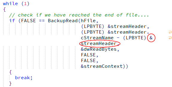
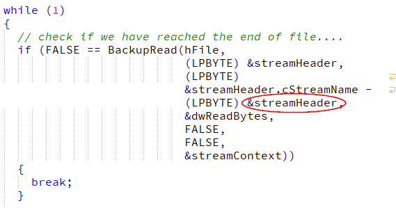
The differences are mostly remarkable when watching source code, e.g. in C or C++:
Wrap mode “At word boundaries”:

Wrap mode “At spaces”:

may be the
Mark Highlightingtitle of the section should be renamedSmart HighlightingThat’s a good point, I’ll put it on my list.
if you’ve changed the color of the Smart Highlighting, as soon as you switch for an other opened document, and switch back, immediately, to your initial document, any smart Highlighting zones is colored with the default green color
Seems like setting the smart highlighting color has to be done whenever a tab has been activated. I will put it on my list.
Strangely, if you disable and re-enable the Smart Highlighting in
Settings > Preferences... > Highlighting, while not changing current document, does keep the modified color of the Smart Highlighting !Nothing strange, toggling the smart highlighting feature and setting its color are two different Scintilla commands.
Wrap cursor at line start … Just tell me what I miss, here !
You miss nothing, its a question of personal taste. I’m a Delphi developer, thus I mostly use the Delphi IDE for coding. There I’m used to have no cursor wrapping at line start.
Selection alpha …
Thank you for providing these formulas, they could become handy for me at some time. But again, if and how someone uses this setting is up to him. It’s like always when telling a computer what to do: Garbage in -> Garbage out. I’m not a friend of the approach to fight human dumbness by technology, provided a certain setting can not cause serious damage or injuries.
I think that the Close button should be selected, by default, in order to close while hitting the Enter key . May be, the possibility to close, while hitting the ESC key would be nice, too !
and
Could you give the user the opportunity to get multiple configurations ?
I will think about it.
Could you consider adding the SCI_SETCARETSTICKY feature
I didn’t know that feature, but it could be useful. I will put it on my list.
More anecdotal, you could, also, consider the
SCI_SETMARGINLEFT… andSCI_SETMARGINRIGHT… settingsI already thought about it but considered it to be “anecdotal” as well. But since
Select full lineis anecdotal too, I will think about includingSCI_SETMARGINLEFTandSCI_SETMARGINRIGHT- equal rights for all anecdotal settings. ;-) -
Hi, @dinkumoil, and All,
Many thanks for your ( long !) comments, examples and for considering some of my requests !
So, ok, the difference between Wrap mode options
Word boundariesandWhitespace charactersare rather particular and relative to languages !
Regarding the Indentation guide style, I’m, now, able to easily see the differences between the
3styles :Real indentation,Python styleorStandard styleI tested with the very small piece of
Ccode :while (1) { if (result == None) test = 'OK' break; result = 2 }and an analog
Pythoncode :while 1: if result = None: test = 'OK' break result = 2For both, there are
3pure blank lines, before and after theifblockI assumed that default indentation is a tabulation char of size
4and Python one is a4spaces stringOf course, @Dinkumoil, if I temporarily disable your plugin, by renaming the
..\Plugins\ExtSettingsfolder, we get the N++ default behavior, about Indentation guide lines ! That is to say :-
Standard style, if current file is not aPythonfile -
Python style, if current file is aPythonfile
So, may be, it would be worth to add, in your plugin, a
Defaultoption, for the Indentation guide lines feature, which would let N++ decide, by itself ! What is your feeling about it ?
This make me think of an other improvement. If, you ready to add multiple configurations, you could consider a default one, which leave all the N++ options unchanged. That is to say, with the values :
-
Backspace unindents :
No -
Folding lines :
Yes -
Indentation guide lines :
Default( New option ) -
White space style :
Invisible -
White space size :
2 -
Upper line spacing :
0 -
Lower line spacing :
0 -
Vertical Lines :
None -
Wrap mode :
No line wrapping -
End of Subline :
Yes -
Start of Subline :
No -
Line number margin :
No -
Subline end near text :
No -
Subline start near text :
No -
Highlighting style :
Filled rounded box -
Color :
Green -
Filling alpha :
100 -
Outline alpha :
50 -
Cursor beyond line endings :
No -
Wrap cursor at line start :
Yes -
Select full line :
No -
Selection alpha :
256 -
Multi Paste :
Yes -
Convert EOL on paste :
Yes -
Magnification :
0
Cheers,
guy038
-
-
@guy038 said in [New Plugin] ExtSettings:
So, may be, it would be worth to add, in your plugin, a Default option, for the Indentation guide lines feature, which would let N++ decide, by itself !
I think about to remove the whole indentation guide line feature from my plugin. As you already noticed, Notepad++ now (since v7.8) switches to Python style by itself when it detects that the current active tab contains a Python code file and it switches to Standard style when it detects a non-Python file. Since this Scintilla setting has global scope, Notepad++ does this decision at every tab switch. I figured out that it does that even when changing the theme. So my plugin virtually has “to fight” against the build-in Notepad++ logic and, like when changing the theme, there are cicumstances it “looses” that fight. Since I don’t like non-robust features and I don’t want to fiddle around in Notepad++ too much, it’s likely to be the best to remove that feature.
you could consider a default one, which leave all the N++ options unchanged.
I think that’s not a good idea because the defaults of Notepad++ could change over time, thus I would have to synchronize my plugin with the changes in Notepad++. If a user wants a default configuration he only has to delete the settings file.
-
First, thank you for your work on this plugin, I’ve found it very useful!
I would like to report two small issues. The first is with adding vertical lines.
Expected Behavior: I enter a column, I click “Add”, I get a new vertical line in that list in the bottom left.
Actual Behavior: I enter a column, I click “Add”, and I get no response. I need to select a color first, even though the color picker implies that it’s defaulting to black.This behavior led me to believe your plugin was bugged until I looked into it more. Making this a bit more user-friendly by actually having it default to black (or grey if you’re worried about people using dark themes) would help.
The second issue. With the Extended Settings menu open, when I alt-tab out of Notepad++, I cannot alt-tab back in.
Expected Behavior: Open ExtSetting Menu. Alt-tab onto a window that covers Notepad++. Alt-tab back to Notepad++. Notepad++ should be the top-level window graphically and in the alt-tab menu.
Actual Behavior. Open ExtSetting Menu. Alt-tab onto a window that covers Notepad++. Alt-tab back to Notepad++. Notepad++ is not the top-level window graphically, but IS the top-level window in the alt-tab menu. -
Thank you for your issue reports. You are absolutely right with both of them. Unfortunately I’m very busy in my job for the next months. So, don’t expect a short-time fix, sorry.
-
@dinkumoil
Thanks for this nice plugin.
Is it possible to add on the UI a button to apply the configuration ?Thanks
-
You mean applying the settings without closing the dialog? I already thought about it. I agree it would be useful.
But as I said, currently I’m so busy in my job that I’m happy to be off-keyboard late in the evenings and even at the weekends.
-
@dinkumoil yes that’s it. You perfectly got my point ;-)
Are you on github ? Any chance that someone else can contribute ?
-
The plugin is hosted at SoureForge in an SVN repository and is written with Delphi XE2. If you have an SourceForge account we can talk about collaboration. Another possibility would be to exchange *.patch files.
-
@dinkumoil said in [New Plugin] ExtSettings:
Delphi XE2
It would have been nice but I don’t know anything in Delphi XE2
sorry -
This post is deleted!