"Function List" current function highlighting is too light?
-
I wonder if this color under discussion is chosen by some setting in Windows?
-
@Alan-Kilborn
Personalization
Window color
Additional design options
Highlighted menu item
-
@Alan-Kilborn Inactive highlight color #F0F0F0. I can’t find how this color can change.
-
@andrecool-68 said in "Function List" current function highlighting is too light?:
Inactive highlight color
Yea, that’s the one that I’m concerned with.
In the Function List, it’s just too hard to see to be useful at a glance.
Sure, if you’re really putting in effort to see it, you can…but that seems to somewhat defeat the purpose. -
@Alan-Kilborn Tested with all the color settings, but I can’t determine anything))
-
Hi, @alan-kilborn, @andrecool-68 and All,
Yeeeeah, I found the right parameter ! At least…, in
Win XP! Starting with the @andrecool-68 indications :-
Right-click on an empty zone of screen and choose the
Poprertiesoption -
Click on the penultimate tab
Appearance -
Click on the
Advanced Settingsbutton, at the bottom right of the dialog -
In the drop-down list Element, select the item
3D Objects
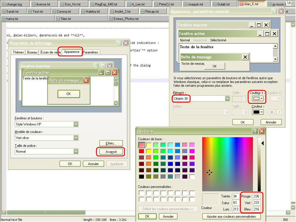
- The present and default
color 1has RGB values 236, 233, 216, which are, exactly, the hex valuesECE9D8, given in my previous post !
IMPORTANT : I don’t know if the
3D objetsitem is still present in Windows7,8and10!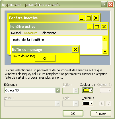
Best Regards,
guy038
-
-
@guy038 ,
Win 10 got rid of that dialog completely (it may have been Win8 that did it – but I confirmed via SO that it was a change sometime between Win7 and Win10).
However,
\HKEY_CURRENT_USER\Control Panel\Colorsis where at least Win7 stored the results of that dialog. I cannot identify any from that key which might correspond to3D objects.
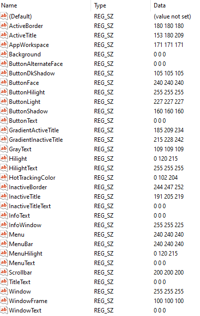
Could you look in the registry at that location and see whether you have entries that don’t exist in the Win10 screenshot, and/or whether you can see which entry changes when you change the
3D Objects > color 1? (it will probably require refreshing the registry view, or reloading regedit between changes)Looking at the numbers, 240 is 0xF0, so for my system, where that is shaded grey, it might be one of the ButtonFace, Menu, or MenuBar colors… but I don’t know for sure. The SO article mentioned that you might have to reboot for changes to the registry-only version to take place (though log out/in might do it). However, I make no guarantees whether or not it will. I have changed those three to red, green, and blue, respectively; when I hit a stopping point in a few minutes, I’ll probably reboot to see what happens – and whether I can see those change or not.
-
So, after starting the reboot, then playing a game of Scrabble with my family, I came back to see this pretty picture:
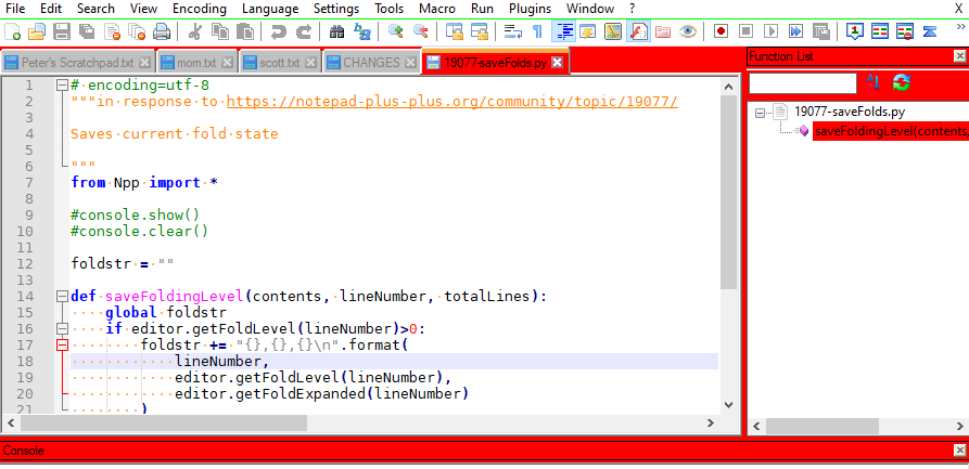
I had changed
ButtonFacefrom240 240 240(grey, above) to255 0 0(bright red). The green underline came from changingMenuto0 255 0(bright green). I cannot see what has been changed byMenuBarbeing changed to0 0 255(bright blue).Oh, there,
MenuBarappears to affect the “active button” highlight color:
In the SaveAs, it appears to be the main highlight:

But other dialogs (like Plugins Admin) seem to use their normal colors, I think.Unfortunately, changing the
ButtonFaceseems to be a pretty drastic change for @Alan-Kilborn’s purposes, especially with the number of items it affects – many of which you really want a light background. You might be able to get away with making it dark enough to be more visible, without ruining other things… but no guarantees. -
No, the blue active-button highlight was the wrong shade, and persisted even after I changed
MenuBarto255 0 0(bright red).The good news is, it just took logging out and back in – rather than a full reboot – to change
ButtonFaceto224 224 224for a slightly darker grey, andMenuback to default240 240 240(don’t need the green underline)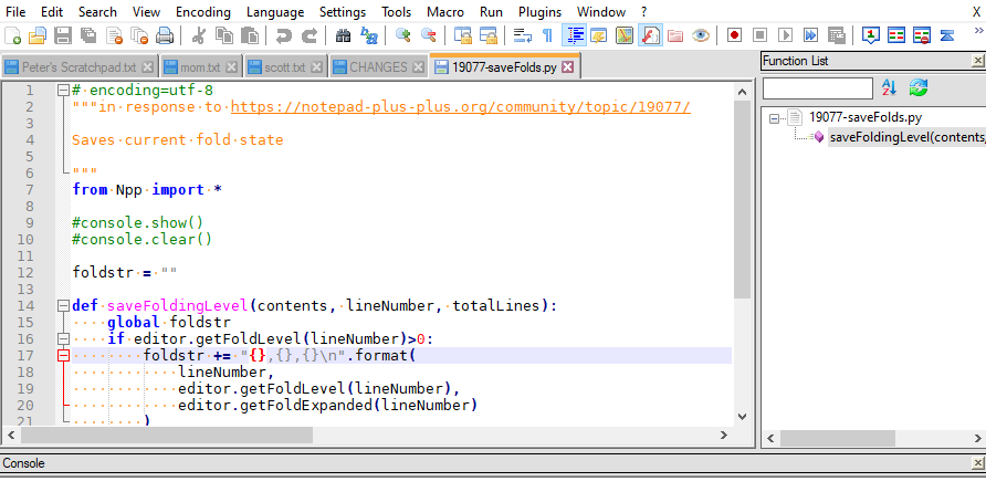
The
ButtonFace=224 224 224looks like it’s more noticeable, while not being annoyingly darker on the other instances than it usually is. But it’s still noticeably darker in those instances, like the save dialog.I’ll stick with normals. Whether @Alan-Kilborn wants to go that route is up to him.
(And I will justify this as still Notepad++ related rather than just Windows related because we were trying to figure out specifically which color setting in Windows was affecting that aspect of Notepad++ :-)
-
@PeterJones
Try to call this window with this command:
rundll32.exe shell32.dll,Control_RunDLL desk.cpl,Advanced,@Advanced -
Hi, @alan-kilborn, @andrecool-68, @peterjones and All,
Peter, you’re right ! The color of current function, in the
Function Listpanel, seems to be controlled from the colors of theButtonFacekey !Here is my
\HKEY_CURRENT_USER\Control Panel\Colors, on my Win XP laptop :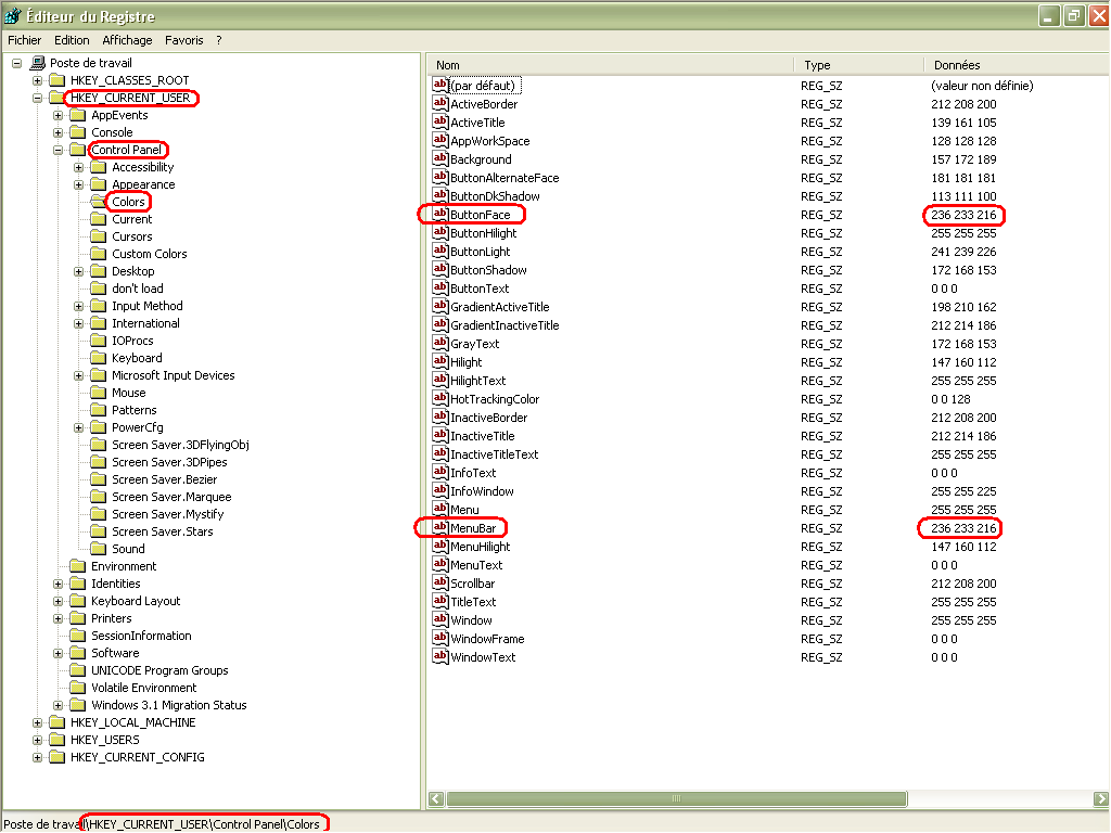
As you can see, Peter, only two keys ( ButtonFace and MenuBar ) have colors
236,233,216, in my Win XP configurationWe can see that the different keys are always the same, between
win XPandWin 10!! But, strangely, no reference to a3D Objectskey, seems to be visible in registry ?Best Regards,
guy038
-
Nope, that just launches
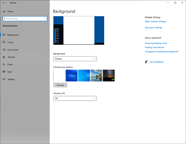 , which doesn’t allow setting the individual colors.
@guy038 ,
Nice to know that same key works on both WinXP and Win10 for controlling it. My guess is that the “button” is the default “3d object” in old windows nomenclature, and they just stuck with that naming convention, even as things changed through the decades.
-
@PeterJones said in "Function List" current function highlighting is too light?:
Nice to know that same key works on both WinXP and Win10 for controlling it.
I guess having WinXP still around does indeed have some usefulness! :-)
-
-
by using a dark theme
Well now, THERE’s some contrast!
But I’m confused, is that your display when you’ve just clicked on something in the Function List, or is that merely the function you are in as you are navigating the editor window? (Neither appears to be the case from the data shown?)
-
In this screenshot the focus was at the editor and I was moving the caret.
This is how it looks like when the function list has the focus and an item is selected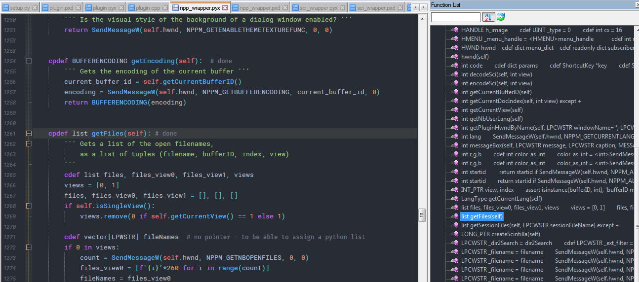
-
I finally got some time to look deeper into the responses here. Thanks to everyone for their input.
Peter said:
I’ll stick with normals. Whether @Alan-Kilborn wants to go that route is up to him.
I took Peter’s “advice” and changed my ButtonFace to (224, 224, 224). This indeed makes the “inactive-but-inside” function in the list have better noticeability, without having any other negatives elsewhere in the Notepad++ (or Windows) UI.
I’m keeping that setting! :-)
-
This post is deleted! -
More on the topic of this thread is found HERE.
