Problem with cursor position
-
This post is deleted! -
Afaik a newer scintilla release >= 4.4 is needed.
DonHo, the author of npp mentioned that he wants to update scintilla in one of the next releases. -
Just to give yo an impression of what I mean:
Standard settings:

changed High DPI settings:

-
I’m not 100% sure but it could be that this issue is covered by that
conversation/patch. This patch has been introduced in scintilla 4.4 -
I don’t see a difference in those two screenshots.
-
take a closer look at the space sign - hard to see.
-
What is a “space sign”?
Really, I’m confused here.
The amount of horizontal spacing?
This thread started out talking about a caret/cursor.
I see one in neither of the screenshots. -
@Alan-Kilborn said in Problem with cursor position:
What is a “space sign”?
The sign used to visually represent a space char.
Really, I’m confused here.
The amount of horizontal spacing?
This thread started out talking about a caret/cursor.
I see one in neither of the screenshots.In the first screenshot there is one, but, yes, the 2nd and third do not contain any but from the discussion I thought it is clear that the problem is about the visual representation if using high dpi monitors.
-
Hmmm, I see visual whitespace in both screenshots.
I guess things can look different on different monitor types, but different is “okay” I suppose, if there is no usability problem, which I have yet to see evidence of from this discussion.
Hopefully if someone reports a bug they do a better job of describing it than is taking place in this discussion.
I’m not adding anything to this convo, so I’m out. :-) -
@Alan-Kilborn said in Problem with cursor position:
I see visual whitespace in both screenshots.
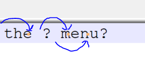
Sorry I can’t help but when I enlarged the High DPI screenshot I see this:

The “visual space” characters (aka red period) are sliding along the lines from their intended position… As being different from the standard monitor screenshot the High DPI seems the cause of the issue. Hopefully a solution will be in hand sooner rather than later.
Terry
-
@Alan-Kilborn Look at the icon bar and you will see the difference. ;)
-
icon bar
Yes, different but “usable”?
The toolbar icons for one of the plugins, on the far right, are much smaller in one case.More disturbing is what @Terry-R pointed out with the whitespacing dots.
It’s probably just a “legacy app” issue that isn’t going to get fixed soon, if ever.
But thanks to all who pointed specifically what is different in the images. It would have been great to have a short textual list with the first posting of the screenshots, to save anyone who cared the time spent doing “Where’s Waldo”.