Scollbar contrast / color
-
Hello everyone,
I’m about to change software, because the scroll bar is very difficult to see.
I have tried many solutions, change the color in the registry, change the theme, change the windows theme etc… I have read that you have to use the high contrast of windows 10… but then it just becomes horrible.
There is no solution? to have a different color or a stronger contrast?
Thanks in advance
Translated with www.DeepL.com/Translator (free version)
-
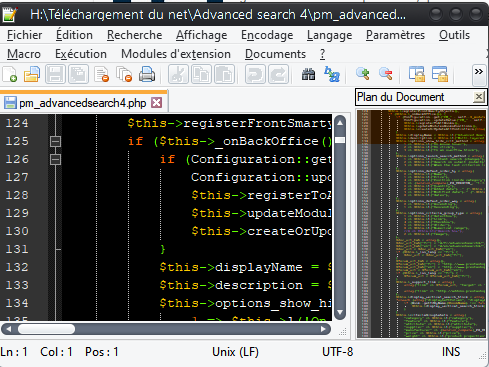
If you mean these
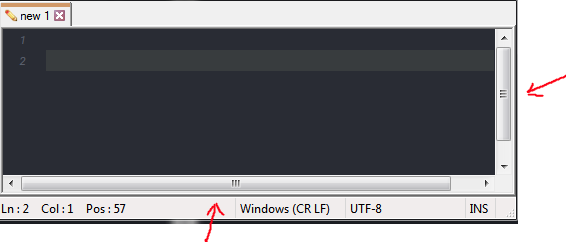
then I’m afraid to be the one with the bad news. Afaik you can not change the color easily.
The only option is to change it system-wide.
-
@Ekopalypse said in Scollbar contrast / color:
then I’m afraid to be the one with the bad news. Afaik you can not change the color easily.
The only option is to change it system-wide.Yes, that’s the one, except that at home they are not like that!

-
I still use Windows 7, while your Windows 10 prefers the flat style.
-
@Daspremont-Terence said in Scollbar contrast / color:
Yes, that’s the one
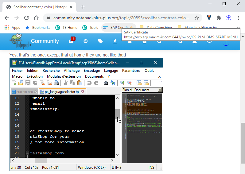
Please note that’s the same scrollbar color that Win10 uses throughout. Here’s a screenshot of my chrome browser in Win10 which has the same scrollbar color/design:
It’s Windows-determined, and cannot be changed by configuring Notepad++. Sorry.
-
Hmmm, my N++ scrollbars actually look “more contrasting” than, for example my Microsoft Office program scrollbars (on Win10).
N++:

Microsoft Outlook:

-
@PeterJones
Yes you are right, but I was thinking that maybe a solution could be found.
Some software use their own scrollbar, it would be nice if notepad++ could think about it :=)After that, the display of the “plans” is not bad to counter this problem.
Oh yes, my screen uses HDR, which increases the brightness a lot since my theme is black. That’s probably why it’s even harder to see the scrollbar.
-
@Daspremont-Terence said in Scollbar contrast / color:
Some software use their own scrollbar, it would be nice if notepad++ could think about it :=)
The scrollbars are part of Scintilla, the underlying control that does the coloring, so it’s unlikely that Npp is tampering with this.
-
@Daspremont-Terence said in Scollbar contrast / color:
Oh yes, my screen uses HDR, which increases the brightness a lot since my theme is black. That’s probably why it’s even harder to see the scrollbar.
There’s some talk of Win10 Dark Mode coming to Notepad++, so that, if it happens, might interest you (and possibly provide increased contrast in the scrollbar area).
Actually, why haven’t you pasted a screenshot of what you’re complaining about, on the computer that has the “problem”?
-
@Alan-Kilborn said in Scollbar contrast / color:
pasted a screenshot of what you’re complaining about,
I thought the
reply to me(editor’s note: first reply, to eko, not to me) basically had that. The horizontal scrollbar doesn’t have huge contrast (compared even to the selected vertical scrollbar), and depending on your eyes, and your monitor contrast, etc, it might be harder to see in real life than it may appear in gif form to you or me. -
The line above that screenshot said:
except that at home they are not like that!
So I presume he was showing the “home” one.
And indeed that screenshot DID have a nice contrast on the bars.
So one presumes his complaint is against a “work” N++, which I don’t believe he’s shown a “dark themed” screenshot of. -
@Daspremont-Terence said in Scollbar contrast / color:
because the scroll bar is very difficult to see.
This has been discussed before.
Cheers.
-
@PeterJones said in Scollbar contrast / color:
I thought the reply to me (editor’s note: first reply, to eko, not to me) basically had that. The horizontal scrollbar doesn’t have huge contrast (compared even to the selected vertical scrollbar), and depending on your eyes, and your monitor contrast, etc, it might be harder to see in real life than it may appear in gif form to you or me.
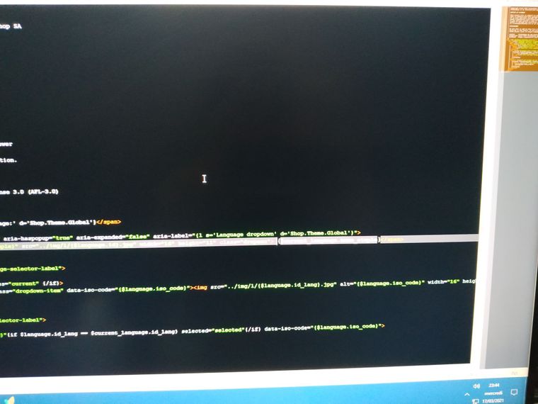
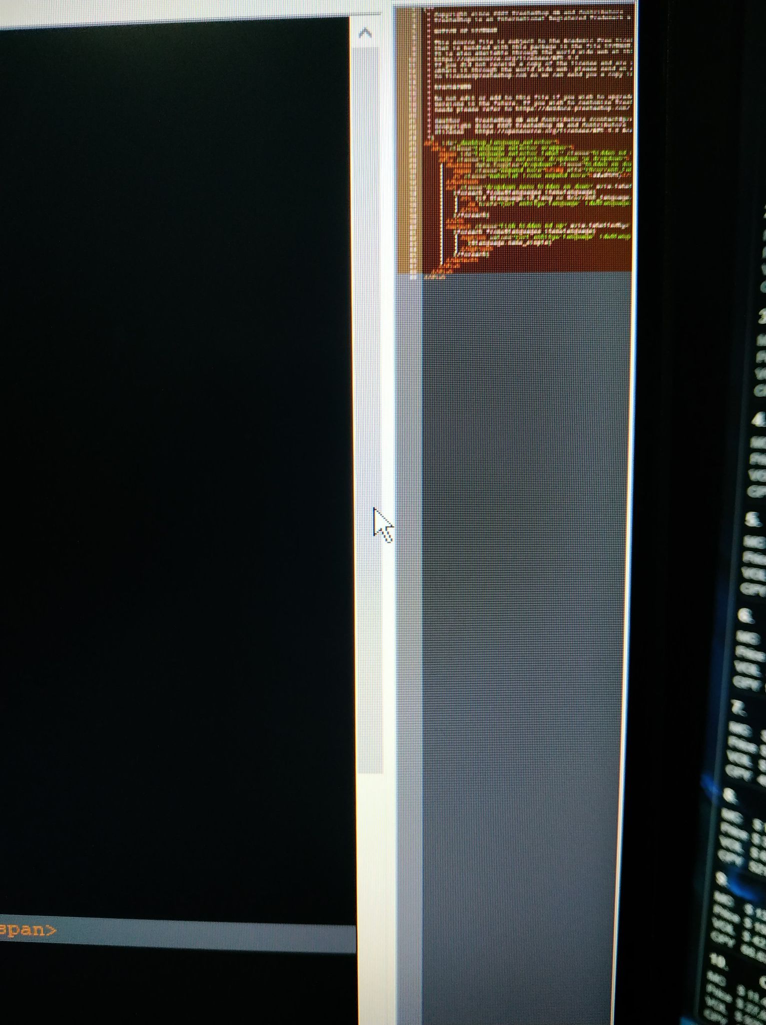
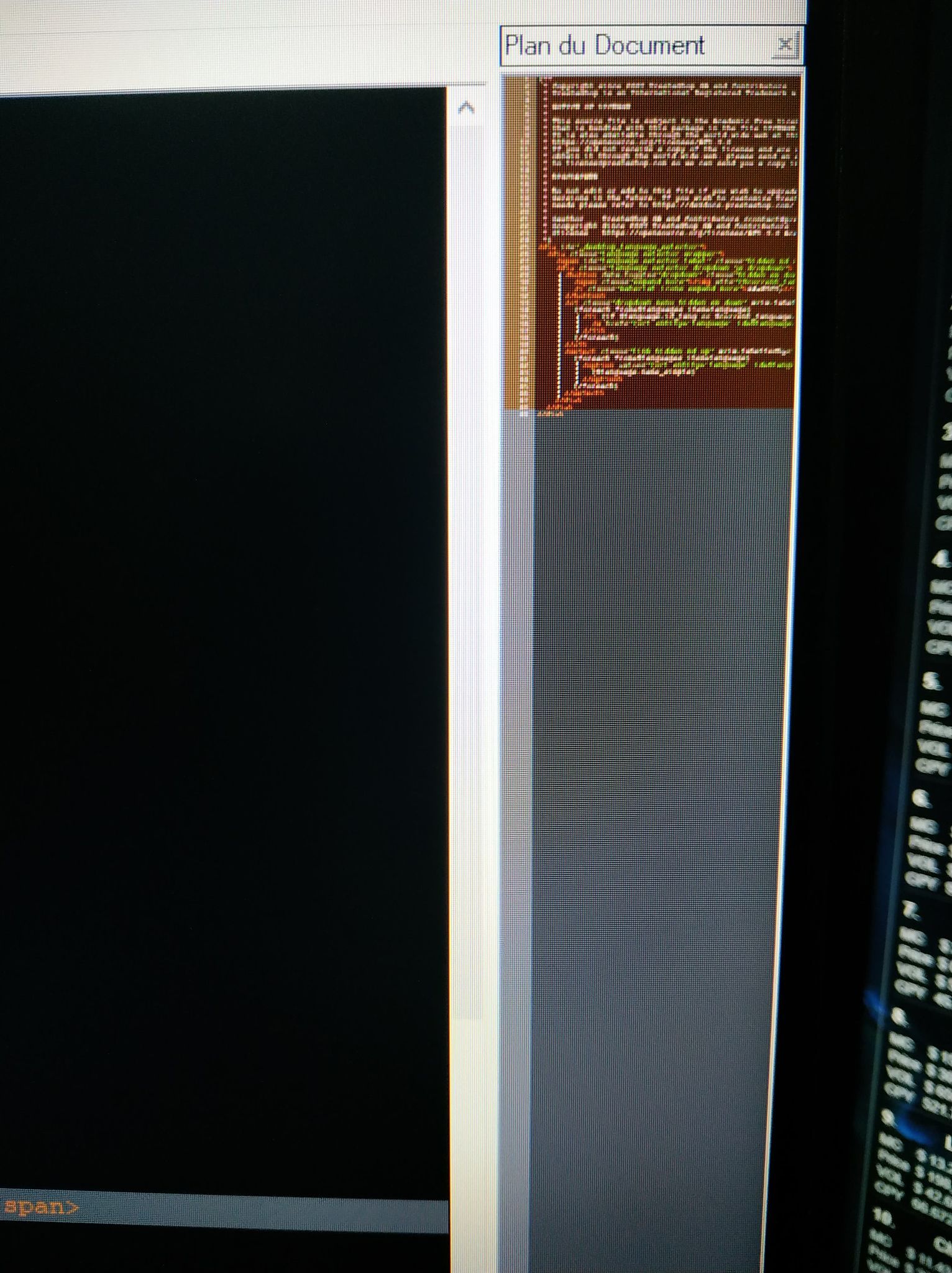
If I take a screen you will see it with your screen, the only way I find it is with my phone but it’s not quite the same.
-
yep, that’s not great contrast on your monitor for that. Did you look at the thread that @Michael-Vincent linked to? It had some workarounds that might help you.
-
Hello, thanks for your help, I tried to follow Michael-Vincent’s post but I didn’t understand anything^^
I opted for WindowBlinds which is not free but I am very satisfied.
Hello! It looks like you're interested in this conversation, but you don't have an account yet.
Getting fed up of having to scroll through the same posts each visit? When you register for an account, you'll always come back to exactly where you were before, and choose to be notified of new replies (either via email, or push notification). You'll also be able to save bookmarks and upvote posts to show your appreciation to other community members.
With your input, this post could be even better 💗
Register Login