Dash and Hyphen - no visible difference
-
I was trying to debug something which appeared did not appear to have any issues, but it actually contained two very different characters. A dash ( - ) and a hyphen ( – ) which caused my script to fail because of the use of the hyphen. They appear the differently on here as I am writing this, but was using trusty Notepad++ as the text editor, which is where I came unstuck as they looked identical. Is it possible to make these two look more obviously different as they do in other text editors?
Many thanks,
Rob
-
Isn’t the simplest answer is to choose a font in Notepad++ where these two characters appear differently?
-
@Alan-Kilborn Thank you for that suggestion and yes it does work well! I was not aware of this limitation with the default “Courier New” font after doing a default installation in Windows until I was using a different editor. Many thanks.
-
Hmmm, it isn’t easy to immediately “pick up” visually, even in a font that does have an “obvious” difference for the characters. You’d almost have to see them both near each other to know which was which.
This is actually a rather “tough” problem. :-)
Maybe a visual effect like this is more desirable?:

If that’s acceptable, I can go more into how to achieve it.
-
@Alan-Kilborn Thank you for that. I have had a look at why I picked it up in Notepad rather than Notepad ++ and found that yes the font may be the key. I have now updated to use “Consolas” instead of “Courier New”, which displays the difference far more clearly and is still has very clearly different 1 and lower case L characters. I will never forget this though, just in case the “Consolas” font has it’s own quirks - you just don’t know until you know. Thanks for your time.
-
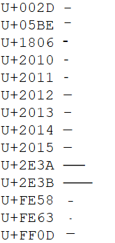
It appears there are a fair number of Unicode dash/hyphen/thingies that appear similarly; I found them here: https://www.compart.com/en/unicode/category/Pd
And I show how they appear in Notepad++'s default Courier New font, with their U+xxxx notation:

Ok, so not all would be hard to distinguish, but there’s enough of them with a common “look” that this might be a “problem”, in any font.
-
@Robin-Tyers said in Dash and Hyphen - no visible difference:
“Consolas” instead of “Courier New”
Consolas is indeed a good choice.
I oscillate between liking Consolas and Fira Code.
Deja vu sans mono might be a good one as well. -
@Alan-Kilborn said in Dash and Hyphen - no visible difference:
It appears there are a fair number of Unicode dash/hyphen/thingies that appear similarly; I found them here: https://www.compart.com/en/unicode/category/Pd
And I show how they appear in Notepad++'s default Courier New font, with their U+xxxx notation:

Ok, so not all would be hard to distinguish, but there’s enough of them with a common “look” that this might be a “problem”, in any font.
Wow, I never knew there were that many variations. Thank you for taking the time to highlight that and for the font suggestions.
-
Hi, @alan-kilborn,
Again, as for the https://graphemica.com link, many thanks for pointing us to the https://www.compart.com/en/unicode/ site !
Just for information, the main sections are :
https://www.compart.com/en/unicode/ : Home https://www.compart.com/en/unicode/charsets : List of Character Sets https://www.compart.com/en/unicode/block : List of Unicode Blocks https://www.compart.com/en/unicode/category : List of Unicode Categories https://www.compart.com/en/unicode/scripts : List of Unicode Scripts https://www.compart.com/en/unicode/html : List of HTML Entities https://www.compart.com/en/unicode/search?q : List of Unicode Characters INPUT Examples in the "Search" zone : - Char => Character ITSELF - U+10180 or 𐆀 => Character U+10180 ( Character : GREEK FIVE OBOLS SIGN ) - ⟄ => Character U+27C4 = U + Hex(10180) ( Character : OPEN SUPERSET )Cheers,
guy038