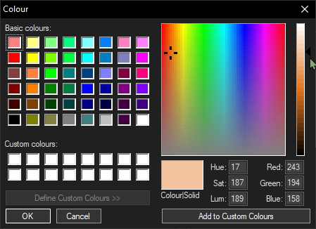
Can't see arrow on style configurator- too dark
-

I’m using N++ on dark mode. I can’t see the arrow next to the Luminosity gradient in the style configurator- it is too dark for me to see clearly. I am wondering if there is a way I can make this more visible?
Thanks! -
if there is a way I can make this more visible?
Not that I know of. I’ve never really paid attention to that ◀ triangle – I pay more attention to RGB – so the few times I’d been in that screen in Dark Mode, I hadn’t even noticed that it was difficult to see.
I would suggest reading the FAQ instructions for how to submit a bug report. As a note: when you were describing the problem, I originally thought you meant your mouse cursor, not the ◀ triangle. To avoid that confusion in your bug report, you might also include a screenshot in light mode, and use the ◀ character when you describe the “arrow” or “triangle”, to make it more obvious. (When making the suggestion, I would say that the ◀ triangle should use the same color as the foreground color for that dialog.)
-
Excellent bug report: https://github.com/notepad-plus-plus/notepad-plus-plus/issues/12451
Hello! It looks like you're interested in this conversation, but you don't have an account yet.
Getting fed up of having to scroll through the same posts each visit? When you register for an account, you'll always come back to exactly where you were before, and choose to be notified of new replies (either via email, or push notification). You'll also be able to save bookmarks and upvote posts to show your appreciation to other community members.
With your input, this post could be even better 💗
Register Login