Font Linking to display glyphs not in font
-
@Alan-Kilborn
Yes. I am using it. No change in behavior I can see. -
@Terry-R
Thanks for the link. I didn’t find it in my search.
The posts there are saying use a font that has the character you want so it doesn’t display the rectangle char. I’m way past that.
Notepad++ is already doing the font-linking or setting the fall-back font so it finds the character, just not in the font I want.
NotePad is doing it just fine.
Oddly, I just check how Chrome does- in this forum, the purple version is displayed, in the google.com search bar, its the glyph I want. -
Have you tried direct-write on . . . ?
In this particular case, a better recourse may be disabling DirectWrite. At least the filled background disappears without it.
The GIF below uses the SciTE text editor for demonstration (since modified settings have immediate effect); Notepad++ uses the same editing component and should behave identically, mutatis mutandis:
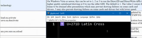
-
In both apps, the default font is set to Consolas.
Try
DéjaVu Sans Mono: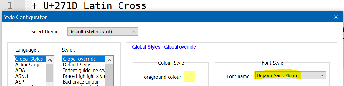
Don’t forget to also turn off DirectWrite.
-
@me,
Don’t forget to also turn off DirectWrite.
On a second look, it seems DirectWrite has no effect on
DejaVu Sans Mono(maybe because it’s open source?). By contrast, every Microsoft font displays the “emoji” style with D2D switched on. It’s most likely a quirk in Scintilla (the editing component). -
@Richard-J-Otter said in Font Linking to display glyphs not in font:
In both apps, the default font is set to Consolas.
I’m pretty sure that the cross character is not in the Consolas font, so there must be “font linking” going on.I use the Source Code Pro font in Notepad++ and it also does not have the cross character. I do have Font Linking set up for that font. I’m running Win 7 and my registry has font linking for many fonts already set up at:
Computer\HKEY_LOCAL_MACHINE\SOFTWARE\Wow6432Node\Microsoft\Windows NT\CurrentVersion\FontLink\SystemLinkFor Source Code Pro I have the REG_MULTI_SZ value:
DejaVuSansMono.ttf,DejaVu Sans Mono
cour.ttf,Courier New
MSGOTHIC.TTC,MS Gothic
GULIM.TTC,DotumChe
Symbola_Hinted.ttf,Symbola
This displays almost every language set and many symbols I have come across in Notepad++, with the caveat that some characters sets won’t align as monospaced, and the registry order may affect which font a given character is actually taken from.
Notepad apparently uses Windows Font Fallback internally, whereas Notepad++ doesn’t. Font Linking happens outside of Notepad++, so it doesn’t need to know. I think…
I don’t know if these FontLink entries exist beyond Win 7.
-
@Richard-J-Otter
Actually, the behavior is different-(I’ve used that setting for quite awhile.) Turning it off gives me the a different glyph, still not the one notepad is displaying, but at least it’s not purple !
Still has the spacing issue, but sort of an improvement. -
@astewart77 My understanding was that those registry settings were deprecated in later Windows versions. But the whole area seems badly documented in MS literature.
-
@rdipardo Thanks for testing this.
I was going to install SciTE myself, but you saved me the trouble.
I also noticed turning off DirectWrite makes the character look better. But my guess is that the same font is being used to display the character.
Now the question remaining is how to change that fall-back font. -
@Richard-J-Otter said in Font Linking to display glyphs not in font:
Now the question remaining is how to change that fall-back font.
We are not necessarily Windows OS experts, because this is a Notepad++ forum, not a forum of super users of Windows OS. However, this discussion from July might give some insight into how to edit fallbacks (or, since it’s single glyphs in the font, “font linking”). You might also want to see this discussion from 2019 and this from 2018 which talk about the
c:\windows\fonts\*.CompositeFontfiles (though those 2018-2019 discussions may make outdated claims about Notepad++) -
@Richard-J-Otter said in Font Linking to display glyphs not in font:
@astewart77 My understanding was that those registry settings were deprecated in later Windows versions. But the whole area seems badly documented in MS literature.
Here is a fresher link, dated Nov 2022, to a MS doc page for font fallback / fontlink. No mention of deprecation.
I have seen instructions on Google successful in Windows 10. On the other hand, this github bug report for Notepad++ says it stopped working after a Windows 11 release, for certain conditions. Apparently, it was still working in Windows 11 prior to that.
Using something that’s deprecated doesn’t make you a bad person. If your registry has font linking enabled, there will already be some entries there. No harm in adding an entry.
-
T Terry R referenced this topic on
Hello! It looks like you're interested in this conversation, but you don't have an account yet.
Getting fed up of having to scroll through the same posts each visit? When you register for an account, you'll always come back to exactly where you were before, and choose to be notified of new replies (either via email, or push notification). You'll also be able to save bookmarks and upvote posts to show your appreciation to other community members.
With your input, this post could be even better 💗
Register Login