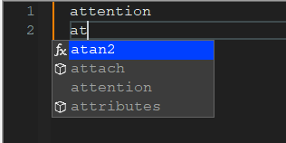
Auto completion dropdown look
-
Hello!
This is my first post on this community so first of all I want to thank all the people who contributed to this so useful utility Notepad++ is.
I just upgraded from v8.2.1 to v8.4.9.
I use auto-completion a lot and I’m annoyed by this new space at the beginning of the auto complete dropdown.


After reading the manual, I found that this is caused by a new feature introduced in v8.3.1 :
As of v8.3.1, the completion list will use the fx icon to help the user tell the difference between the “Function completion” items (keywords and functions from the configuration file will get the fx icon) and “Word completion” items (words from the active document will not have the icon).I understand the purpose of this feature, but I’m not interested by it, and I have not found a new option to disable it.
Is there any way for me to restore the old auto-completion dropdown look (no margin on left side and/or no icons) in the last version of Notepad++?
Thank you for your help.
-
@btuxb said in Auto completion dropdown look:
Is there any way for me to restore the old auto-completion dropdown look (no margin on left side and/or no icons) in the last version of Notepad++?
No, there isn’t.
Cheers.
-
@Michael-Vincent said in Auto completion dropdown look:
No, there isn’t.
That being said, I’d just advise @btuxb to attempt to “get used to it”. I mean, well, I had to go over to my N++ and actually try it to see it – and that means, to me, that I’ve “gotten used to it”.
I have not found a new option to disable it.
New features don’t always come with a way to restore old behavior. This complicates the code, the user manual, and the user interface of the software. No one wants a Preferences panel that resembles this:

-
@Michael-Vincent said in Auto completion dropdown look:
No, there isn’t.
Cheers.
Thank you.
@Alan-Kilborn said in Auto completion dropdown look:
That being said, I’d just advise @btuxb to attempt to “get used to it”. I mean, well, I had to go over to my N++ and actually try it to see it – and that means, to me, that I’ve “gotten used to it”.
I tried a few hours, and as I said, I’m annoyed with this empty space, so I’m not yet used to it, but eventually it will come. Anyway I know now I have no choice, get used to it or downgrade, which doesn’t sound like a good idea.
New features don’t always come with a way to restore old behavior. This complicates the code, the user manual, and the user interface of the software. No one wants a Preferences panel that resembles this:

I perfectly understand this, it is OK. I just wasn’t sure if I eventually missed a possible option to adjust this.
I also maybe expected a possible adjustement was possible with some nppexec command.
There is not, so there is not.
I will get used to it!
Thank you both for your answers.
Long life to Notepad++.
-
@btuxb said in Auto completion dropdown look:
I will get used to it!
I’m not sure how I lived without it for so long (actually had a hand in adding it - don’t hate me ;-) ). It certainly works better when coding in a language other than “Normal Text” where you could have functions, keywords and previous document text all showing at once (using Perl as example):

Cheers.
-
@btuxb said in Auto completion dropdown look:
I perfectly understand this, it is OK.
There is not, so there is not.
I will get used to it!Thank you for your understanding attitude.
-
@Michael-Vincent ,
I certainly don’t hate you. :)
I liked the feature as I think I mentioned once I had trouble not knowing when I was developing the UDL package, which were which, and ended up shutting down the “Words” option, using Functions only. I may have to turn it back on now that I can tell what’s what now. :)