colors seem washed out
-
I’m new to notepad++. I have a new work laptop and it has notepadd++ already installed and I can’t install sublime that I used to use. I was trying to get my color scheme from sublime similar but it looks like notepad++'s colors are washed out. I got the RGB value from my sublime settings but they look different in notepad++
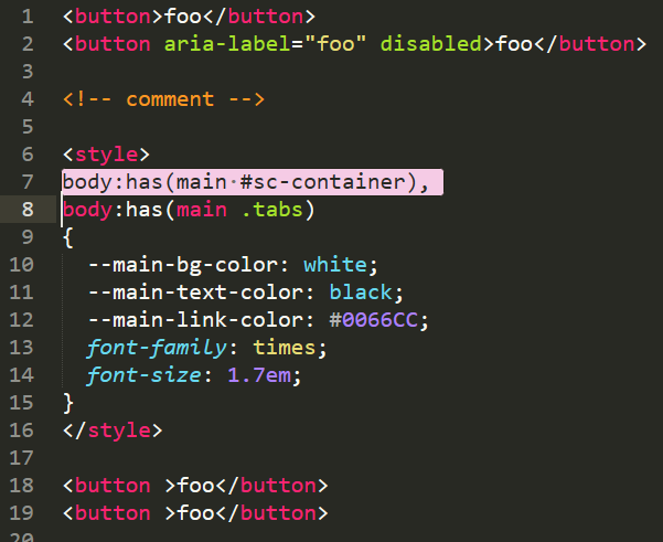
Here’s what sublime looks like:

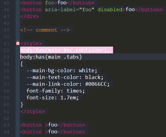
And here’s what notepadd++ looks like with the same RGB values for all the elements:

I don’t think it’s my eyes. Notepad++ looks different.
- The HTML tags should be a brighter pinkish color.
- The orange comment should be brighter
- HTML attributes should be a brighter green and the values a brighter yellow
- My selection background color seems to be used but the selection foreground color (which I have set to black) is not used. It’s using white text.
I verified I have the right RGB values in the Style Configurator. Am I missing something obvious?
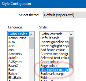
Also, is there a way to set the line number color?
-
@Glen-Walker said in colors seem washed out:
My selection background color seems to be used but the selection foreground color (which I have set to black) is not used. It’s using white text.
See
enableSelectFgColor.xmlinfo HERE. -
-
@Glen-Walker said in colors seem washed out:
I don’t think it’s my eyes. Notepad++ looks different.
It’s using a different font and/or font size. That changes the shading.
I verified I have the right RGB values in the Style Configurator.
And I grabbed your two screenshot images, and found that the pink background color is exactly the same RGB triple – so if those screenshots look like a different pink to you, then it is your eyes. (Did you see a blue dress or pink dress? It’s the exact same thing here. Color context matters, and that black-foreground vs white-foreground on top of the pink background changes the way your brain interprets the color.)
For the HTML tags, when I found a similar spot in the center of the downstroke for the
bof<button>, I got the same RGB in both images.But your screenshots say that Notepad++ is presenting the same colors that Sublime was for those two.
And on the green, I wonder if you happen to have “bold” on Sublime and “not-bold” on Notepad++, because they are very similar shades of green, but not identical.
-
I get the impression from some quick reading that Sublime Text may use hardware acceleration. I know that VSCode does, and VSCode seems to have sharper colors than Notepad++. Might hardware acceleration vs. lack thereof account for this sort of thing, at least in part?
-
@Alan-Kilborn Thanks, I never would have found that. I’m not able to copy files to C:\Program Files\Notepad++ so I’ll have to see if I can get my IT to do it.
-
@Alan-Kilborn You know, I saw that in the configurator but for some reason I thought it was the divider between the numbers and the actual text. I think because I had seen “Folder Margin Style” in the preferences just before looking for the color. Thanks again.
-
@Glen-Walker said in colors seem washed out:
@Alan-Kilborn You know, I saw that in the configurator but for some reason I thought it was the divider between the numbers and the actual text. I think because I had seen “Folder Margin Style” in the preferences just before looking for the color. Thanks again.
Yes That’s right.
