Secondary carets not visible with dark theme
-
After updating to v.8.6 I was wondering why I couldn’t set multiple carets holding Ctrl as before, but once I tested writing something I realized it still worked, the secondary carets just were the exact same color as the dark theme background (dark grey) so I couldn’t see them.
As far as I understand there was a fix to enable setting the secondary caret color (github. com/notepad-plus-plus/notepad-plus-plus/issues/14302) but it is not clear to me how to use this option, as the Style Configurator seems to still have only “Caret color” that impacts the primary caret only.
So please any advice on changing the secodary carets’ color and I’d be really grateful.
-
@Jyri-Lehtinen said in Secondary carets not visible with dark theme:
the Style Configurator seems to still have only “Caret color” that impacts the primary caret only.
In a fresh 8.6 I see:
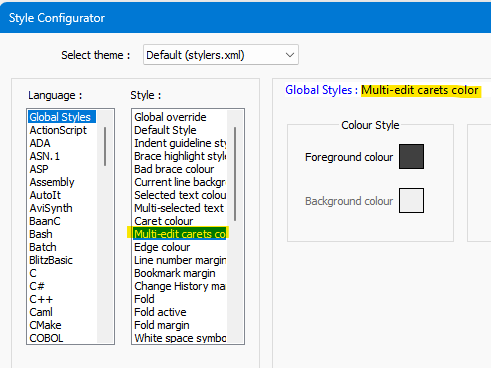
Not sure why this one is spelled color when everything else refers to colour…
Maybe I should have shown it in dark mode:
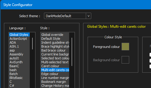
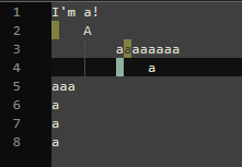
With dark mode, the carets show up for me:
-
@Alan-Kilborn That is strange, I don’t see such an option in Style Configurator. I have Notepad++ v8.6 build Nov 23 2023 - 16:58:44
-
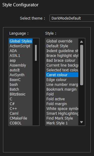
Scrolling the style list does not reveal anything like “Multi-edit carets color”.
-
You probably need to hand-merge this in. Reference stylers.model.xml and your own stylers.xml and see if you can add the new parameters.
-
@Alan-Kilborn Thanks for the advice, will see what I can do.
As a general request I would prefer that the secondary carets would have lighter grey background when using the dark theme. I think that would be reasonable to implement this to let all dark theme users avoid the need for the change in Style Configurator even when the option is visible there.
-
@Jyri-Lehtinen said in Secondary carets not visible with dark theme:
have lighter grey background when using the dark theme
Maybe show a screenshot of what you like once you get it configured, so others can see what you mean. Change the caret to block mode temporarily for the screenshot (like I did), for maximum impact.
-
From the change log:
- Make multi-select background & caret colors customizable.
Not on my machine.
I found the entry in “stylers.model.xml” and copied it to my stylers.xml but it doesn’t show up in the StyleConfigurator.
As of now the multiselcet (column) cursor (caret) is invisible in dark mode.
I de-and reinstalled, didn’t change anything.
-
@MaxJalon said in Secondary carets not visible with dark theme:
I found the entry in “stylers.model.xml” and copied it to my stylers.xml but it doesn’t show up in the StyleConfigurator.
If you’re using the default Dark Mode theme, you have to put the new XML entries in the
themes\DarkModeDefault.xml, not instylers.xml. (Or, if you haven’t customized your theme, you could just copy DarkModeDefault.xml from the v8.6 portable.) -
Thank you Peter, that did it!
I’m happy editing again… :-)
-
EDIT - actually I’ve been using cloud-settings-sync, maybe if NP++ adds new features, I won’t get them because I use my old settings x____x I added the line to my cloud sync themes -> dark-default and it’s syncing now
2024 March and Notepad++ dark mode - fresh install latest version still has invisible multi line select characters…
Added this into the widget section of dark theme default
<WidgetStyle name=“Multi-edit carets color” styleID=“0” fgColor=“40ffff” />
Is it possible for this to be added into notepad++ fresh install? seems like a terrible bug hiding the caret - makes multi line editing a stab in the dark…

-
@JTB-Ben_Sync said in Secondary carets not visible with dark theme:
Is it possible for this to be added into notepad++ fresh install?
As a matter of fact, it was added to all the standard-issue themes in time for the “Anniversary Edition” (8.6.0) last November.
Have a look at this related GitHub issue and consult the user’s manual on how to completely refresh your user configs after a feature upgrade.