Why does "Find result" window tab icon look like it does?
-
I’ve always thought, WTF is that “Find result” window tab icon supposed to be?
At actual size it looks like a black flagpole on the left, with a grey flag at half staff:

If I blow it up it doesn’t help:

Any ideas on why it looks like it does, and couldn’t it be made to look better?
-
@Alan-Kilborn
isn’t that a binocular?And btw. I never noticed a icon as I use my find result window always docked
on the bottom as a single window. -
Mine’s at the bottom too but it brings along a friend :-)

Ah, binocular! Okay.
But any chance of a “good look” for that is ruined with the black bar on the left. I don’t know, it’s just kind of “ugh”.
-
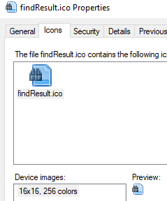
If you download the icon from https://github.com/notepad-plus-plus/notepad-plus-plus/blob/master/PowerEditor/src/icons/findResult.ico, you can zoom in slightly better.

It’s more obviously binoculars in that.
-
@PeterJones said in Why does "Find result" window tab icon look like it does?:
It’s more obviously binoculars in that.
Sure. Maybe rephrase my original question to be “Why does it have to look so bad in Notepad++?” Now that I know it is binoculars, I remember seeing it in other programs, just not as badly rendered. :-)
-
These 16x16 images are not really beautiful, especially if they are shrunk even further.
-
So, the binocs are a 9x9 segment of a 16x16 icon, and then Notepad++ shrinks down the Y from 16 pixels to 14 pixels without scaling in X as well? (I am assuming that’s what
.scaleY(14)does.) If that’s the case, I’m surprised it’s as good as it is. :-)Just think what it must look like on a high-DPI monitor. :-)
-
@PeterJones said in Why does "Find result" window tab icon look like it does?:
high-DPI
You just said a bad word in Notepad++ land. :-(
-
-
Eko’s day for image posting!
-
Too much time and nothing works as expected, results in gifs and gifs and even more gifs :-)
