Same Notepad++ version, different look n feel
-
So I have a Run menu entry that I have configured to run a second independent instance of Notepad++, from my main instance.
I normally run the portable version, and just to be clear, the second instance I’m talking about is not a second instance of my first version, but a running of a fresh N++ portable.
In both cases they are version 7.9.5.
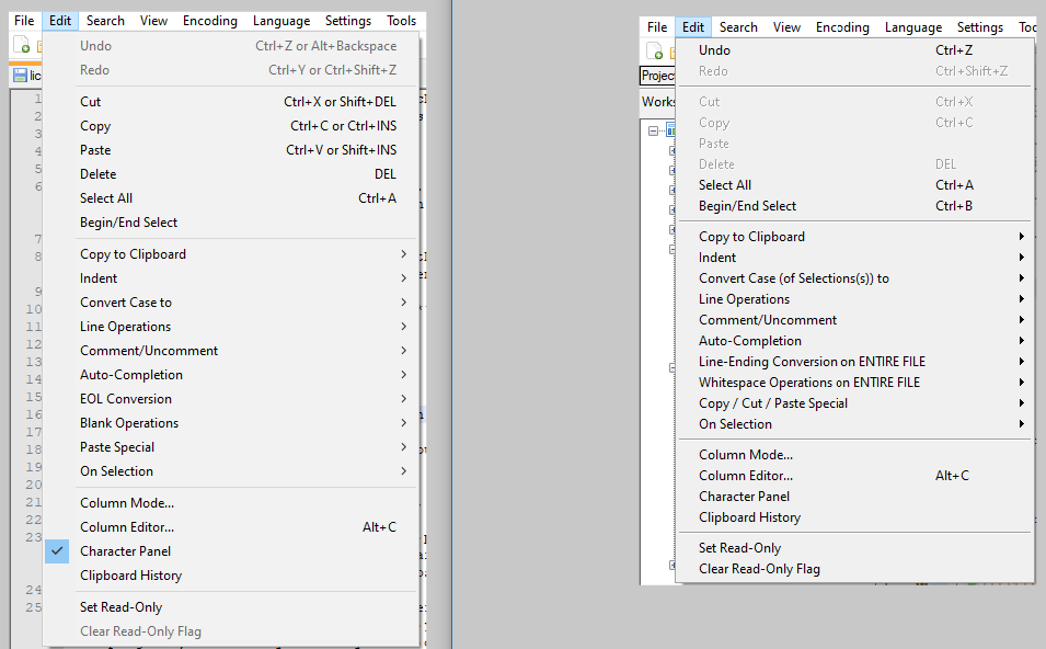
My question is, what could cause them to look different, from a UI perspective? Here’s a look at the dropped Edit menu from both:

These are screenshots taken on the same monitor in each case.
Notice how the edit menu on one is physically longer than the other vertically, and the submenu indications on one look like
>symbols while on the other they are right-pointing triangles. -
It was my “main” version on the right, and I noticed some other odd things:
-
my menu items are my “english_customizable” ones, even though I set my language back to “English” before doing the screenshot (and most other text in the UI changed back to “English” values).
-
after exiting my secondary instance, and restarting my “main” version, I now have a vertically-long Edit menu, and the submenu indicators are now
>… so, in other words, things have now reverted to matching my Run menu instance.
-
-
I created two fresh 795-64 portables (in 795a\ and 795b). Running 795a, I changed to english_customizable (though not customized any) and added Run > Other795 which runs a multi-instance of 795b\notepad++.exe
I cannot see ⏵ in the menus of 795a, and don’t know how you got in that state. And I cannot see any vertical size difference in the font/spacing of the Edit menu (or other menus).
Do any of your english_customizable settings use non-ASCII Unicode characters? Maybe that subtly changes things.
If I were you, I would first try to determine what gets your main NPP to use the ⏵ in the first place – what circumstances it does and doesn’t do that, because it seems to me the issue is with your main, rather than the alternate.
-
Maybe some plugin’s fault? HexEditor has this problem:
https://github.com/chcg/NPP_HexEdit/issues/26 -
@ArkadiuszMichalski said in Same Notepad++ version, different look n feel:
Maybe some plugin’s fault? HexEditor has this problem
Ah, that’s it.
I have HexEditor, although I don’t use it much – usually just to check on UTF-8 encodings.
It turns out that if I use it in a N++ session, I get the strange behavior I cited: shorted menu, different submenu arrows…
Problem solved. -
I noticed one other “bad effect” from a use of the HexEditor plugin during a session.
After its use, the right-click context menu for bookmarks – that results from right-clicking the bookmark margin – no longer works (the editor’s right-click context menu appears instead).
In pictures, instead of getting this:

I get this:

Note that the “red dot” shows the right-click point – in the bookmark margin (between the line number margin and the text editing window).
I have “lost” this ability in the past, and it left me puzzled. Now I know why.
Perhaps I will get rid of the Hex Editor plugin entirely and create a Run menu entry to open the current file in a real and independent hex editing program.
-
Maybe, report a bug to Hex Editor also?