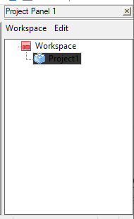
Workspace / Project Tree - Unable to see label on nodes (dark font with dark background)
-
After upgrading to 8.1.4, within the Workspace / Project panel, the node label text are presented in dark font with a dark background. It becomes difficult to see the label of a folder or file items under the Workspace / Project root. It is only when I click on the Workspace panel, that the font of the node labels will be presented as a light font with a dark background (this is good). But when I click outside the Workspace / Project panel (e.g. typing a new text document), the node labels will be presented in dark font against a dark background

-
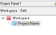
Sorry, I had tried to replicate yesterday, but couldn’t (everything displayed as expected for me). When I take the focus away from the Project Panel and back to the editor pane, the shade on the active project-name in the Project panel does change shade a little bit, but not nearly as dark/unreadable as you have.
Maybe it is an interaction with the particular theme you are using. Which theme do you have set (Settings > Style Configurator > Theme)?
-
@PeterJones
Thank you, for taking the time to reproduce the behavior. I am using the default (light) theme. I believe it is called Default (stylers.xml)
-
Sorry, that’s the theme I use, too, and I don’t have that super-dark background when Project panel is de-focused.

for comparison, my has-focused color is:

AFAIK, there isn’t a way in the Style Configurator to change that. Maybe it’s affected by Windows settings, but Windows makes those colors intentionally hard to find/change in modern Win10.
So I don’t have anything left to help you. Sorry.
-
@PeterJones , thank you for your help and support. I think the latest Notepad Plus 8.1.5 might have fixed this odd UI behavior.
Hello! It looks like you're interested in this conversation, but you don't have an account yet.
Getting fed up of having to scroll through the same posts each visit? When you register for an account, you'll always come back to exactly where you were before, and choose to be notified of new replies (either via email, or push notification). You'll also be able to save bookmarks and upvote posts to show your appreciation to other community members.
With your input, this post could be even better 💗
Register Login