Unreadable lines when comparing in dark mode
-
When using dark mode while comparing text, some lines are unreadable because text is white and the lines that are different are displayed in a white background.
-
I assume you mean with the Compare Plugin. A screenshot indicating what you thought was “unreadable” would be helpful.
Unfortunately, the author of Compare Plugin has stated that no further updates will be made to the existing plugin – they are working on a new-from-the-ground-up plugin for doing a much better job of comparing, but that’s been in development for more than a year now, with no hint as to when it might actually get released.
I will agree, with default Dark Mode and default settings of Compare plugin v2.0.1,

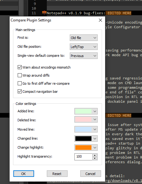
that compared line is unreadable.But if I go to Plugins > Compare > Settings, and change the “changed line” color, I can easily make it readable:

Anytime you change themes – whether through just picking a theme, creating your own, or switching to Dark Mode with its default theme or another dark theme – there are other settings that you need to change in order to keep things legible, from plugin colorings to the settings for your UDL highlighting, because plugins and UDL are separate from the base themes that Notepad++ uses. This is nothing new with Dark Mode, but it’s just more likely people will see the need for doing those changes as more people discover Dark Mode.
-
@peterjones Thank you!
-
P PeterJones referenced this topic on
-
P PeterJones referenced this topic on
-
P PeterJones referenced this topic on
-
P PeterJones referenced this topic on
Hello! It looks like you're interested in this conversation, but you don't have an account yet.
Getting fed up of having to scroll through the same posts each visit? When you register for an account, you'll always come back to exactly where you were before, and choose to be notified of new replies (either via email, or push notification). You'll also be able to save bookmarks and upvote posts to show your appreciation to other community members.
With your input, this post could be even better 💗
Register Login