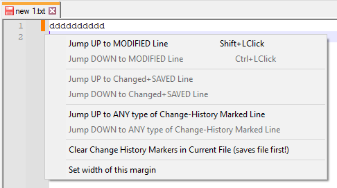
Orange line next to anything I type now, cant seem to figure out how to turn it off.
-
@Alan-Kilborn I wanted to switch this off because it’s a broken feature! (When I print, then lines with a green bar next to their line number the whole line’s background is printed green)
-
Read the FAQ.
-
@Jeremy-Thornton Preferences / Margins/Border/Edge uncheck “Display Change History” and it’s back to printing properly.
-
@Alan-Kilborn said in Orange line next to anything I type now, cant seem to figure out how to turn it off.:
is there a “Change history” button which is currently ticked. if so, untick it and see if it goes away.
Perfect!! Phew! Thank you that resolved it.
OMG, you just turned off one of the best (new) reasons to use N++.
I’m glad you feel good about doing this.
Better would have been to wonder what possible new benefit N++ was giving you, but, well, I guess not…Do you think that rude sarcasm is going to change their mind?
-
@Ultimaximus said in Orange line next to anything I type now, cant seem to figure out how to turn it off.:
Do you think that rude sarcasm is going to change their mind?
Probably not, but not because of the “rude sarcasm”. A smart person, just an unknowing one, might get that kind of reply and think, “wow, if someone says that, maybe there really is something to it; I need to dig deeper…”. A non-smart person, well, we know what they’re going to do.
-
@Alan-Kilborn said in Orange line next to anything I type now, cant seem to figure out how to turn it off.:
Change History is a big new feature. With all such things, there will be some “growing pains” and unanticipated consequences.
And those “growing pains” are a good reason to have the new feature be turned off by default, at least initially, whatever the argument is for having the feature default to being turned on in later versions.
My own preference is for new features to default to “off.” If I want a feature, I can check to see if it’s already implemented and just needs to be turned on. If I don’t want a feature, then clumsy, unwanted attempts by the program to be “helpful” are a plague and a nuisance.
-
One way to reduce the freak-out factor of a new feature being on by default, especially when the feature impacts the experience of a typical user, is that after a version update, a pop-up appears with a very brief description of “what’s new”, a limited number of times. This sort of approach has been in use with s/w roll-outs for decades.
In the case of np++, the pop-up should not simply be the contents of change.log; people see a numbered list and may have good reason to not want to bother with it in the moment. Rather, it should be a friendly but terse description of just the most visible or important changes, and where users can find more info about them.
A plausible rule-set for when it appears could be: the first 5 or 10 times any of these events occur: open app, and, file open/save/close (but not if the open is part of a session open); a “views remaining” count could be shown.
I suppose it can get a bit complicated if for example a release doesn’t yet have all supported language translations up to date and such.
As for this “Display Change History” feature, “default on” seems like the right choice: the number of people who stand to benefit from it but wouldn’t know to turn it on vastly outnumbers those who will consciously prefer it off.
Still, this conversation would benefit from “default on” proponents understanding that when a sophisticated user sees a colored line show up unexpectedly with freshly edited lines, especially right after a version update, they might justifiably wonder if they’re seeing the artifact of a bug: “What the… Oh no! A wonky pointer is clobbering data in an output buffer… the app can crash at any moment! Maybe I should I downgrade. Maybe I should switch editors!” Someone working a mission critical task could get pretty nervous.
I think this is somewhat what I experienced for a short time, and later became glad about the feature.
Now that I’ve been seeing the feature for some weeks, I find the line is far too loud, ie, thick. Take a look at the screen shot in the first post above. Compare the line thickness to that of the vertical section of the ‘5’ in the line number. I see no reason for the former to be any wider than the latter. The change indication, much like line numbers, is only occasionally of interest, usually ignored. Both should be visually quiet making them easy to ignore, but not hard to see when you purposefully look.
-
after a version update, a pop-up appears with a very brief description of “what’s new”, a limited number of times
I don’t disagree with this. But maybe it is simpler than you describe: I’d say have the popup, but only on each startup of N++. Don’t have a countdown. Have buttons: “Thanks, don’t show me this again” and “Remind me about this stuff next time”. A user that doesn’t care at all can click “Thanks…” while a user in a hurry this run can click “Remind…”.
As for this “Display Change History” feature, “default on” seems like the right choice: the number of people who stand to benefit from it but wouldn’t know to turn it on vastly outnumbers those who will consciously prefer it off.
VERY well said.
a sophisticated user sees a colored line show up unexpectedly with freshly edited lines, especially right after a version update, they might justifiably wonder if they’re seeing the artifact of a bug
Maybe…but you said “sophisticated user”, and to me this type of user is a “smart” user, and wouldn’t be likely to think that such an obvious “bug” slipped passed the devs in the release process. It must be some cool new feature that will increase productivity, that just needs to be learned about.
Maybe I should I downgrade. Maybe I should switch editors!”
Now we’ve moved away from talking about a sophisticated/smart user.
Someone working a mission critical task could get pretty nervous.
Someone doing this isn’t upgrading ANY software, until they move out of their “mission critical” phase.
Now that I’ve been seeing the feature for some weeks, I find the line is far too loud, ie, thick.
To each his own, but I find it “just about right” in thickness:

In fact, I’ve written a script which adds right-click functionality to that margin, and I find trying to hit the default-width margin with a right-click a bit difficult – so I’ve changed the script to widen the margin and now use it at–gasp!–twice its default width! Oh, the horror! :-)
If you use PythonScript, here’s a snippet of code which you can run that will set your margin to whatever width you’d like (
9is the default):editor.setMarginWidthN(2, 9)Also easy to do with the NppExec plugin:
sci_sendmsg 2242 2 9 -
@Alan-Kilborn said in Orange line next to anything I type now, cant seem to figure out how to turn it off.:
“Thanks, don’t show me this again”
Would be ok but gives too much freedom for the impulsive, overconfident types who tend to get into trouble.
wouldn’t be likely to think that such an obvious “bug” slipped passed the devs in the release process
Wasn’t there an issue some months back that totally discombobulated screen drawing but only when (I think) Slack was running? Yeah, bugs are like that, and sometimes only express themselves in very particular circumstances (combos of version of O/S, hardware, preference settings, plugins…), and can evade even the highest powered testing strategies, as you well know.
here’s a snippet of code which you can run that will set your margin to whatever width you’d like
That’s really lovely, thanks so much! Not having walked the code in any serious way, I’m always surprised how much innards are exposed by Scintilla/NP++.
(But I betcha, unless that right-click thingy you came up with is super useful, if you tried width 4 or 5 for a few days you’d prefer it.)
Speaking of the code, I think I read that it’s a Visual Studio project, and I’m wondering if it’s buildable with a free version of VS (or maybe a non-VS command line VC++? … That might be a dumb question but I’m really out of touch regarding this family of tools).
-
@Neil-Schipper said in Orange line next to anything I type now, cant seem to figure out how to turn it off.:
“Thanks, don’t show me this again”
Would be ok but gives too much freedom for the impulsive, overconfident types who tend to get into trouble.
People can only be “babied” so much.
Wasn’t there an issue some months back that totally discombobulated screen drawing but only when (I think) Slack was running?
Not a great example (for making your original point) because the Slack thing was not a Notepad++ problem. At least, I don’t recall ANY changes being made by Notepad++ devs to deal with that situation.
unless that right-click thingy you came up with is super useful
It is, at least until the following type of thing gets implemented natively:

if you tried width 4 or 5 for a few days you’d prefer it.
Considering visuals alone, I’m sure you’re right.
-
@Neil-Schipper said in Orange line next to anything I type now, cant seem to figure out how to turn it off.:
Speaking of the code, I think I read that it’s a Visual Studio project, and I’m wondering if it’s buildable with a free version of VS (or maybe a non-VS command line VC++? … That might be a dumb question but I’m really out of touch regarding this family of tools).
Yes, it IS a Visual Studio project.
I believe the developers currently use Visual Studio 2022 Community Edition, which is free.
I use Visual Studio 2022 Professional for work, so when I’m taking a look around the Notepad++ code I use that.
But really if you’re just browsing around the code, an editor such as Notepad++ itself is fine.
-
-
@Neil-Schipper said in Orange line next to anything I type now, cant seem to figure out how to turn it off.:
I actually found it kind of grueling to get to this point…
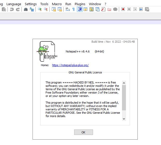
It took me a few beats to notice what you were trying to show with your about box:

Perhaps we’re getting OT…but let’s continue. :-)
Tip for others trying to build and run the code:
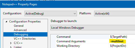
One thing that I remember happening to me when I was first trying to run code I had built was that I’d press the Run button in the Visual Studio environment, and it would seem to do something briefly and then control would be returned to the IDE. After a bit I discovered that since I already had my release copy of Notepad++ running, any other version I would try to run simply activates the running version and exits. So now when I want to work with code I’m building, the first thing I do is go to the debugger options and change the command line box to include
-multiInst:
-
@Alan-Kilborn Definetely a black eye
As a Notepad++ enthusiast who installed it to every computer I use and every computer my colleagues use and I set it as their default editor whether they wanted it or not, they’ve all loved it.Until this Display Change History feature. Now it’s infuriating.
I can’t print until I turn off the option.
It won’t stay turned off !
Every new instance of a blank notepad has it on again.
I have to turn it off in every document I create. This is CRAZY !!
Black, black eye.
-
@rebber2 ,
I can’t print until I turn off the option.
Or you could have read our FAQ, where all you have to do is save the file and reload it. But, you know, why ruin a good rant with facts.
It won’t stay turned off !
It does stay off, unless you have multiple instances open simultaneously. In which case, as has always been the case, settings changes do not propagate from one instance to a different, already-open instance, and only one instance has authority to write its configuration to disk. This is nothing new.
I have to turn it off in every document I create
Only because you haven’t learned an essential part of Notepad++ settings that’s been present for years (probably since the multi-instance feature was implemented).
In case the procedure is still unclear to you: close all instances of Notepad++. Open one instance. Change the setting. Exit to make sure that setting is saved. Now it will be properly saved, and apply to all of the multi-instances that you open from here on out. (This same procedure is required, and has “always” been required, if you want to ensure that Multi-Editing is enabled in all instances, or setting your backup mode, or … any other setting from the whole Preferences dialog.)
But back to the original premise of your rant: the printing issue was a quickly learned bug, and they started working on it as soon as they learned about it. And it is now fixed in the upcoming v8.4.7, which is in release-candidate mode right now – so before you even typed your rant, it was already fixed. If you want, you can grab a copy, and get that infuriation fixed. Or you can continue to yell at fellow Notepad++ users. It’s your choice (though I know which I’d prefer – both which I would prefer “if I were you” and which I would prefer for you to choose).
-
@PeterJones said:
It does stay off, unless you have multiple instances open simultaneously. In which case, as has always been the case, settings changes do not propagate from one instance to a different, already-open instance, and only one instance has authority to write its configuration to disk. This is nothing new.
