Tab Changed appearance on update
-
What specific thing are you looking for?
-
@Alan-Kilborn
I am trying to remove the white outline from the tabs in the first image to make them appear the same as the tabs in the second image.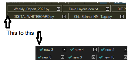
I preferred the incomplete outline and more compressed feel. It isn’t the color, but the outline and separation.
-
Ah, OK, if I’d have been left to guess I would have guessed you were missing the green checkmark in front of each tab. Thus it is better to be specific about what is very obvious to you, when you’re posting.
It’s also good to not say “the latest update” and to be specific about what version number.
And, about the “white outline”…I have no idea as that doesn’t happen for me, with N++ 8.5.3.
-
@Alan-Kilborn
Thank you for the advice, I’ll get some details together and be right back! -
@pmeriwether said in Tab Changed appearance on update:
It isn’t the color, but the outline and separation.
As far as I know, in my years of documenting the Preferences menu, I have never seen a setting that will draw a full box with a full outline.
My guess is that you’ve got a plugin that does it. As Alan says, you should be “specific about what version number”, and the most reliable way to do that is to go to ?-menu’s Debug Info, and copy the contents of that window (with
Ctrl+Cor clicking the "copy debug info to clipboard) – as this gives us version, bitness, various settings, and the list of plugins you have installed.The reason I highly recommend Debug Info in this situation is because I am quite confident that it’s one of your plugins that’s causing the display difference. I would recommend following the advice in our FAQ section on “Possible Culprit: Plugin” to narrow down which one. (yes, I know your problem isn’t a crash of Notepad++, but the debugging procedure in the FAQ for narrowing down which plugin is causing a problem is exactly the procedure you need to follow here). If you find a culprit, then either change the settings for that plugin, or remove it, to get rid of that behavior.
If you can prove it’s still displayed wrong with no plugins active, then please also share your Theme choice, and a screenshot of your Preferences > Dark Mode . I don’t see how any of those could cause the problem you’ve shown, but if it’s not a plugin, I will be grasping at straws.
-
@PeterJones
Will do, thank you! -
Notepad++ v8.5.3 (64-bit)
Build time : May 15 2023 - 06:09:36
Path : C:\Program Files\Notepad++\notepad++.exe
Command Line : “C:\Program Files\Notepad++\change.log”
Admin mode : OFF
Local Conf mode : OFF
Cloud Confiug : Removed in EDIT
OS Name : Windows 10 Pro (64-bit)
OS Version : 22H2
OS Build : 19045.2965
Current ANSI codepage : 1252
Plugins :
AutoSave (1.6.1)
DSpellCheck (1.4.24)
mimeTools (2.9)
NppConverter (4.5)
NppExport (0.4)
TakeNotes (1.2.3)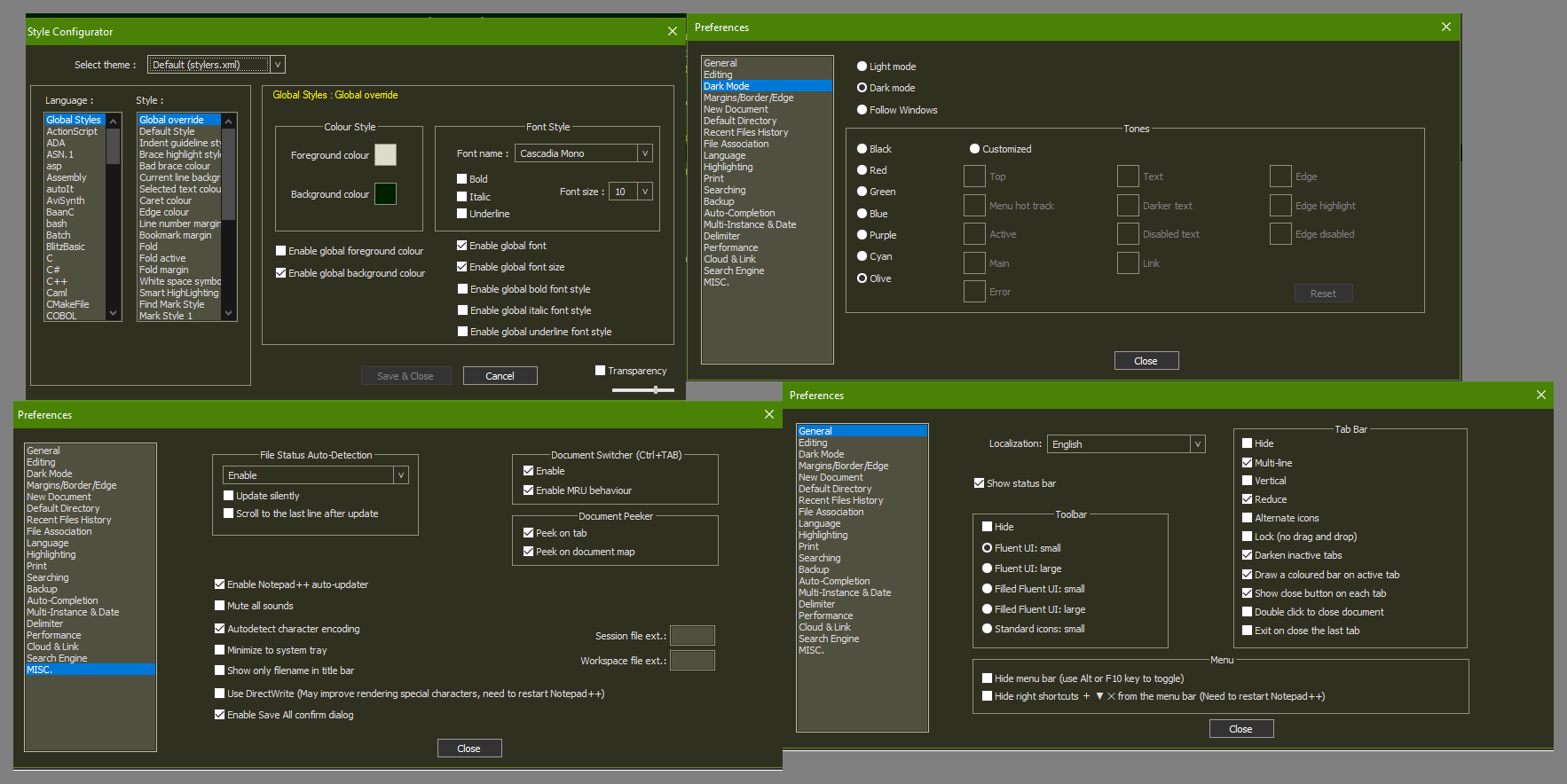
-
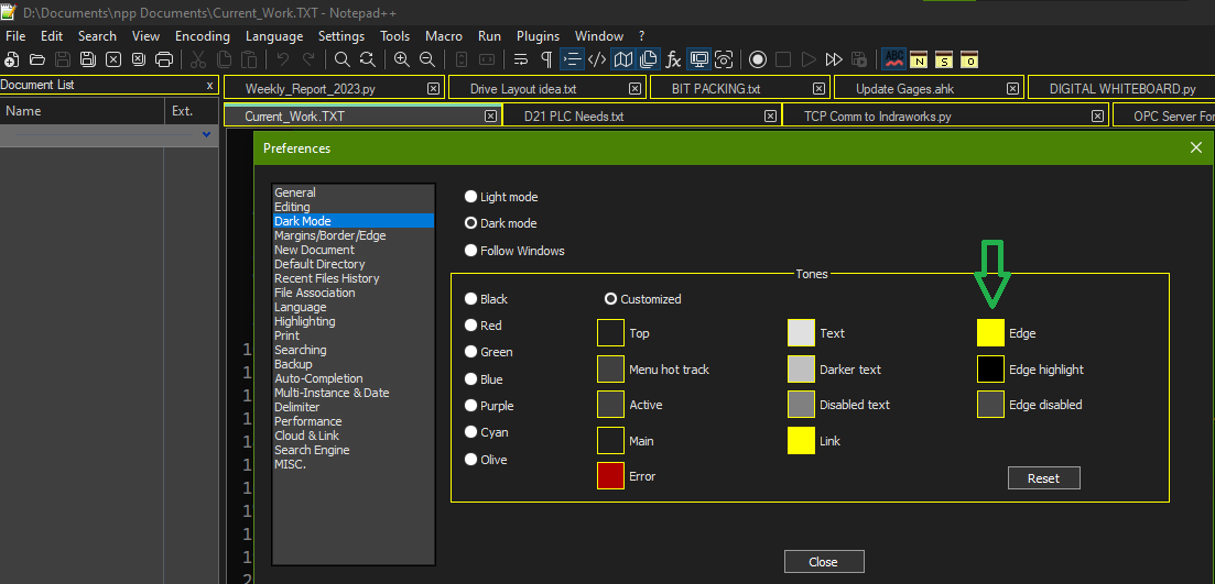
@pmeriwether There is a preferences setting under dark mode for “Edge” but for me that only seems to set a left or right edge color and not the entire box.
Try setting the Edge color. Does it change the color of the entire box around your tabs?
I suspect you have a Windows accessibility setting enabled that is drawing an extra border around common elements.
-
Thanks. I can confirm with a portable v8.5.3: it’s the multi-line Tab Bar option in combination with being in Dark Mode. In Dark Mode with single-line tab bar,

In Dark Mode with multi-line tab bar:
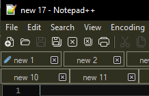
I went back and bisected versions: v8.4.8 matches your “old” screenshot
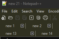
but v8.4.9 looks the same as the v8.5.3 screenshots from above.I cannot see anything in the release notes that indicate a change that affects the tab bar, but that doesn’t mean that it wasn’t something he didn’t bother to include in the notes.
-
@PeterJones
@mkupper
I found I am able to change the color through using customized tones, please see the screenshot.
I can take it from here, thank you both!