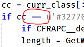
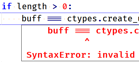
In normal text file, ... and === and <<< are displayed oddly. How to disable?
-
I’m a few-hours-old noob to Notepad++, so far just using it on plain text files (yes, it says “Normal text file” at bottom left when I’m editing). By happenstance I have a file with “===” in it, and Notepad++ is displaying that as a single “three-lined” equal sign. While typing I also noticed that three periods in a row, or three “<”, or three “>” are also displayed weirdly. I’m doing precise textual stuff with a monospaced font, so this weird “visual replacement” is a huge problem. I’ve scoured Settings and Style Configurator and can’t find how to turn this off. Is there a way?
-
Ok, I sort of figured it out. I had chosen Cascadia Code for my font, so I tried some other monospace fonts just now and they don’t seem to have this issue. So I guess it’s the fault of Cascadia Code? Too bad, I really liked the look of that font, but I guess I shall avoid it.
-
Hi @Michael-K
Probably what you were seeing was the ligature (where certain chain of characters are joined in one) support from that font.
If you like Cascadia, you may try the version ‘Cascadia mono’ which is a version of Cascadia without ligatures. -
Oh, wonderful - Cascadia mono works perfectly. Thanks!
-
@litos81 said in In normal text file, ... and === and <<< are displayed oddly. How to disable?:
Probably what you were seeing was the ligature (where certain chain of characters are joined in one) support from that font.
For readers unfamiliar with “ligatures”, in simple terms it is a visual transmuting of adjacent characters.
Here are some examples, from typical programming languages:
-
test for equality: without ligature support it would appear
==; with support it looks like this:

-
test for inequality: without ligature support it would appear
!=; with support it looks like this:

-
if you put three equal signs together (
===), you can get this:

All the examples I’ve shown use the equal sign in them, but ligatures go way beyond that (using other character combinations).
-