UIX Design
-
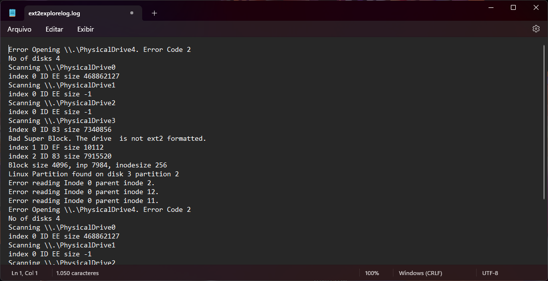
Could the NotePad++ have a design that’s at least a little similar to this?
I’ve been using it for years, but it’s been years as well since we’ve seen any improvements in the app’s appearance.
A visual makeover would be really nice.
-
@Pablo-Hernandez said in UIX Design:
have a design that’s at least a little similar to this?
Perhaps you want to put some effort into it and say what you like about the screenshot, and what you don’t like about Notepad++ 's current UI…
-
In Settings / Preferences you can
- In the General section hide the menu bar, hide the toolbar, and hide the tab bar.
- In the Dark Mode section switch to dark mode.
In Settings / Style Configurator
- Make the global background color black and enable global background color.
- Make the global font style Courier New and enable global font.
That will make Notepad++ look like your screen shot.
More tweaks are possible such as that you can turn the line numbers on the left edge off.
-
Here’s a classic thead from almost a decade ago, on the same subject: https://community.notepad-plus-plus.org/topic/250
Hello! It looks like you're interested in this conversation, but you don't have an account yet.
Getting fed up of having to scroll through the same posts each visit? When you register for an account, you'll always come back to exactly where you were before, and choose to be notified of new replies (either via email, or push notification). You'll also be able to save bookmarks and upvote posts to show your appreciation to other community members.
With your input, this post could be even better 💗
Register Login