Last update issues
-
Hello there !
I’m experimenting a few small but bothering issues since the last update.
- The common selection cursor have now moved under the characters instead of standing to their left - as it was the case previously. This is especially annoying for precise selections of long text segments.
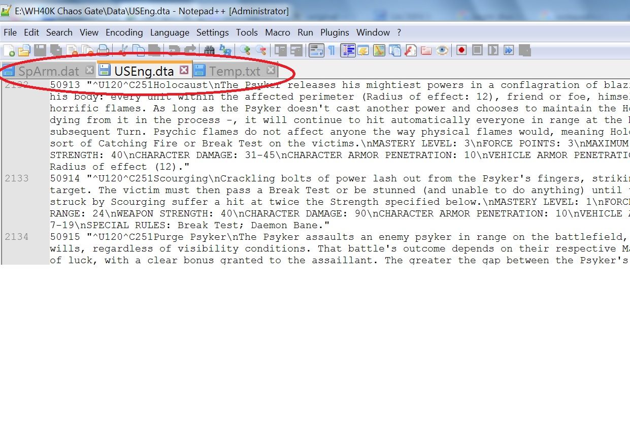
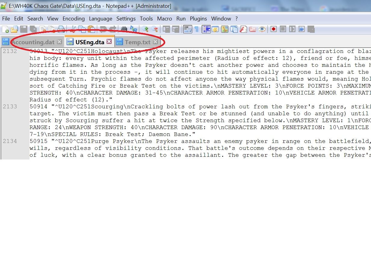
- The default style used for several parts of the interface, especially the tab titles, has been modified and now favors taller characters, composed in bold.
And, good gracious, I searched both in “Parameters” and in “Style configurator” to no avail. I just can’t find whichs option might return those behaviours to their previous settings. Would anyone have an idea about what’s going on ?
Thanks in advance… -
@Benjamin-Kirscher said in Last update issues:
the last update
Before pondering the other things further, please specifically state the version you are talking about.
Also it would be helpful to know the version you updated from.
-
Sure, sorry - I should have stated that right away -, but it’s quite easy since everything’s automatically updated on this rig. So I now have the last (8.6.7) version and the previous one was most probably 8.6.6. At worst, if anything wrong happened behind my back, it would be 8.6.5.
-
@Benjamin-Kirscher said in Last update issues:
The common selection cursor have now moved under the characters instead of standing to their left
Does your status bar say INS or OVR, over on the far right?
Press and release the Insert key to toggle between. -
Mr Kilborn, that was a good suggestion ! Indeed, the interface had been switched in Overtype mode. I didn’t even consider that, focused as I was on trying to understand which part of the update was responsable… Thanks !
And would you have an idea about the font/style change for the interface tabs ? They grew so big (and bold !) after that update that any label which is more than 4 letters long can’t be read easily now… and I don’t see any option to correct that. -
@Benjamin-Kirscher said in Last update issues:
focused as I was on trying to understand which part of the update was responsable
That would be YOU, for sometime previously toggling the Insert key.
And would you have an idea about the font/style change for the interface tabs ?
You probably should paste a screenshot of what you’re seeing.
-
@Alan-Kilborn said in Last update issues:
That would be YOU, for sometime previously toggling the Insert key.
Honestly, I don’t believe so. I never experienced that issue in, well, I don’t even know. 15 years ? More ? So while it’s not completely impossible that my fingers did that, I’m pretty sure it was due to the update. I was working on something and all visual issues happened right after I proceeded through that installation.
You probably should paste a screenshot of what you’re seeing.

Here’s for a screenshot. It’s not a mean issue. Just the sudden change in size and (bold) composition of the tabs’ style. I never saw that, since I never touched that kind of option. But browsing through the “Preferences” or “Style configurator” menus doesn’t help for now. Did I miss something ?
-
@Benjamin-Kirscher said in Last update issues:
Did I miss something ?
If you haven’t already, try:
Settings | Preferences… | General: Tab Bar: check Reduce.
-
@Benjamin-Kirscher said in Last update issues:
So while it’s not completely impossible that my fingers did that,
It’s quite easy. If you tried to type 0 on the numeric keypad, but NumLock wasn’t on, it might have toggled that. Or if you were using the group of keys on your keyboard (where INS, DEL, and HOME are all near each other), it’s really easy to bump it. I do it on a regular basis, especially when I’ve just switched between two slightly different keyboards (like the one at home vs the one at work).
Just the sudden change in size and (bold) composition of the tabs’ style. I never saw that, since I never touched that kind of option.
Turn back on Settings > Preferences > General > Tab Bar > Reduce to go back to the smaller tabbar text.
And if you never touched that, then something may have gotten corrupted. I’ve never seen that symptom, and why just your Tab Bar > Reduce and INS/OVR settings would be wrong, but nothing else is, is exceedingly weird.
Of course, you are running in Administrator mode, based on your screenshot, and that’s generally a bad idea unless you are editing a protected file. Maybe Admin mode had a bad interaction with your
%AppData%\Notepad++– either during the update, or when you first ran-as-admin after the update.If you don’t have a lot of customized settings, I might recommend exiting out of Notepad++ completely, moving
%AppData%\Notepad++to%AppData%\Notepad++.corrupt, then re-launch Notepad++ not in Admin mode so the right user creates a new copy of your config files. -
Okay… Settings > Preferences > General > Tab Bar > Reduce did have an unexpected impact.
The tab labels actually use a smaller font with the “Reduce” option unchecked !
But it’s still composed using a Bold style. I really don’t understand why, but I’ll tell you what : I could live with that ^^.
I also experimented with %AppData%\Notepad++ and Administrator mode - which was checked, indeed, because of protected files : I use that a lot. But no dice… Recreating a new folder didn’t change anything.
Thanks a lot for trying to help ! As said above, I could honestly live with tabs in Bold, now that I can at least read longer labels ^^… It’s just a weird issue.
Hello! It looks like you're interested in this conversation, but you don't have an account yet.
Getting fed up of having to scroll through the same posts each visit? When you register for an account, you'll always come back to exactly where you were before, and choose to be notified of new replies (either via email, or push notification). You'll also be able to save bookmarks and upvote posts to show your appreciation to other community members.
With your input, this post could be even better 💗
Register Login