Fluent close/x on tab bar
-
Hello. I see nice theme fluent. Can we somehow have fluent x icon of tabs? I noticed it is XP close window icon. It’s about consistency in estetique of the tool.
-
@Thomas-Carter said in Notepad++ release 8.9:
Can we somehow have fluent x icon of tabs?
The Announcement topic is only for talking about problems that newly exist in the most recent very of Notepad++, and is not for feature requests. As such, I have moved your post to General discussion.
Official feature requests go in the issues tracker on GitHub, as our FAQ describes. In the future, if you want to talk about a feature possibility before making the official request, please use the appropriate category
fluent x icon of tabs?
I am not sure how a Fluent x would look different from an XP x. Could you show pictures contrasting them?
-
P PeterJones moved this topic from Announcements on
-
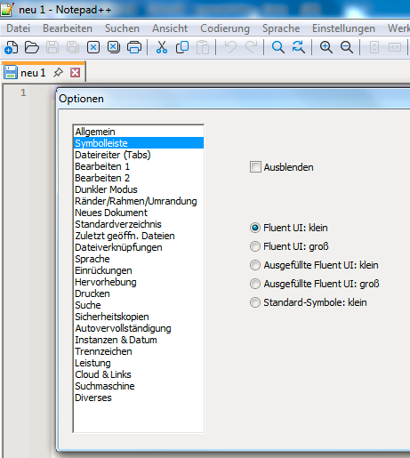
I think, what is meant is the x icon on tabs in light mode while using fluent UI. See screenshot:
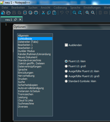
Compared to dark mode:
Sorry, for beeing still on Win 7 🙃
-
Sorry, other than the red background, I don’t see a significant difference… and that could just be the difference between “light” vs “dark”. If that’s literally the only difference between the two types of x, I wonder, what’s the big deal? They both look like window-closing x’s to me. The red-background x doesn’t seem jarringly-different than the rest of the UI to me. Does that really bother people?
IMO, if that’s really what this request is: sheesh! let the developer focus on implementing real features or fixing true behavioral bugs that have existed for years, not nitpicking a few dozen pixels just because it’s slightly different.
-
Chill, Peter :-) Breath in, breath out. Everything is fine. (This is meant in a very positive way. I feel that you are very busy right now.)
Of course, yes, this is definitly no big deal. But it is nothing wrong in talking about it. Or just bringing up a question about it. Or an idea.
IMO, Thomas is not wrong with his observation/question/request. The red x icon is the only colorized icon while using light mode and fluent UI. So a more consistant behaviour would be, to have the x icon appearance coupled on the icon choice rather than the light/dark mode choice. (Means red x icon coupled to standard icons, a fluent x icon to the fluent UI.)
Yes sure, this issue is nothing important compared to the more urgent topics in the issue tracker.


Hello! It looks like you're interested in this conversation, but you don't have an account yet.
Getting fed up of having to scroll through the same posts each visit? When you register for an account, you'll always come back to exactly where you were before, and choose to be notified of new replies (either via email, or push notification). You'll also be able to save bookmarks and upvote posts to show your appreciation to other community members.
With your input, this post could be even better 💗
Register Login