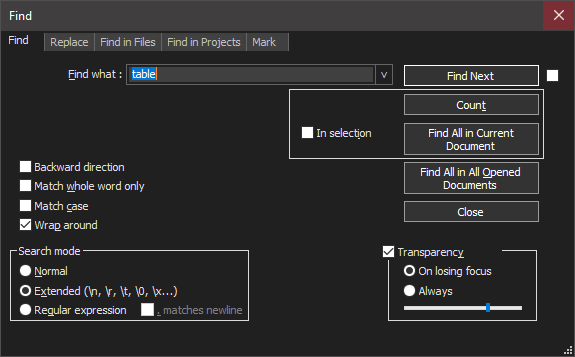
Dark Mode - Search dialog
-
The “In selection” pane is positioned to the right, instead of to the left left.
-
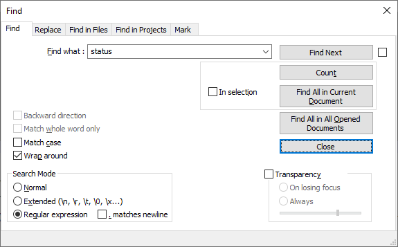
Do you think that’s different than the non-dark mode? because other than color, everything looks the same to me in normal mode:
As far as I can tell, that’s the way the dialog was designed.
What do you think is not correct about it?
-
…
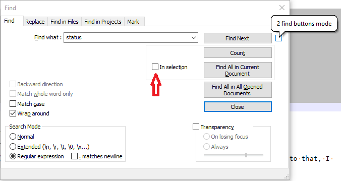
unless the checkbox to the right of Find Next is confusing you.
The checkbox to the right of Find Next is the “2 find buttons mode” – you can see that by hovering over the right checkbox, as shown in the screenshot below (the speech bubble is seen when you hover over the checkbox with your mouse). The checkbox to the left of “In Selection” is the “In Selection” checkbox (pointed to by the red arrow I added to my screenshot).
Hello! It looks like you're interested in this conversation, but you don't have an account yet.
Getting fed up of having to scroll through the same posts each visit? When you register for an account, you'll always come back to exactly where you were before, and choose to be notified of new replies (either via email, or push notification). You'll also be able to save bookmarks and upvote posts to show your appreciation to other community members.
With your input, this post could be even better 💗
Register Login