Community
    • Login

    Dark Mode - Search dialog

    Scheduled Pinned Locked Moved Help wanted · · · – – – · · ·
    3 Posts 2 Posters 172 Views
    Loading More Posts
    • Oldest to Newest
    • Newest to Oldest
    • Most Votes
    Reply
    • Reply as topic
    Log in to reply
    This topic has been deleted. Only users with topic management privileges can see it.
    • Jos SchaarsJ
      Jos Schaars
      last edited by

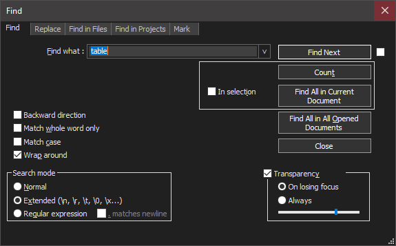
      The “In selection” pane is positioned to the right, instead of to the left left.
      Knipsel.PNG

      PeterJonesP 1 Reply Last reply Reply Quote 0
      • PeterJonesP
        PeterJones @Jos Schaars
        last edited by PeterJones

        @Jos-Schaars ,

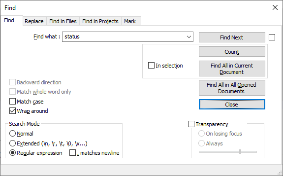
        Do you think that’s different than the non-dark mode? because other than color, everything looks the same to me in normal mode:
        918642dd-56e6-4b87-90bb-211a962639bc-image.png

        As far as I can tell, that’s the way the dialog was designed.

        What do you think is not correct about it?

        PeterJonesP 1 Reply Last reply Reply Quote 0
        • PeterJonesP
          PeterJones @PeterJones
          last edited by PeterJones

          …

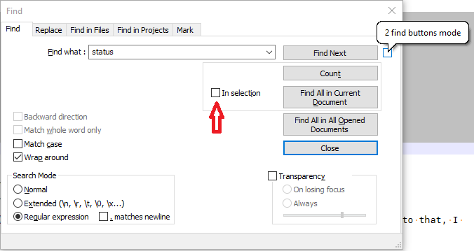
          unless the checkbox to the right of Find Next is confusing you.

          The checkbox to the right of Find Next is the “2 find buttons mode” – you can see that by hovering over the right checkbox, as shown in the screenshot below (the speech bubble is seen when you hover over the checkbox with your mouse). The checkbox to the left of “In Selection” is the “In Selection” checkbox (pointed to by the red arrow I added to my screenshot).
          dead3443-ba68-4234-a296-f783a4c4b502-image.png

          1 Reply Last reply Reply Quote 1
          • First post
            Last post
          The Community of users of the Notepad++ text editor.
          Powered by NodeBB | Contributors