Auto-Complete List Format Changed
-
I noticed that the Auto-Complete feature changed between Version 8.2.1 and all of the Version 8.3.x and I am wondering if there is a way to reverse that change.
In Version 8.2, when the Auto-Complete list pops up, the list begins right under your cursor and the first word in the list is also right under the cursor (fully Aligned Left).
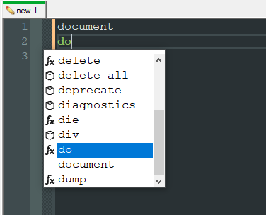
However, when I upgraded to Version 8.3.x, the Auto-Complete list now has a tab of space before the word list begins. To borrow a Word turn-of-phrase, the list is now indented.
I understand that some people may prefer that style. I do not - to the extent that I uninstalled Version 8.3.x, installed a lower version, and even had to nuke my settings to get my preferred Auto-Complete back.
Does anyone know the setting within Notepad++ which would allow me to control the Indent of the Auto-Complete list? I would like to upgrade to the latest version of Notepad++, but I do not want to end up downgrading and nuking my settings again if I can avoid it.
-
As of 8.3.1, auto complete includes icons to denote what auto complete words are from the autoCompletion/*.xml files and which ones are words from the current document.

Cheers.
-
Thank you for the information. Definitely explains the change and I can sure see why developers would want that feature.
However, I mostly use Notepad++ for my notes, not development. Is there any way to turn that feature off if we don’t want to use it?
-
@sunstarunicorn said in Auto-Complete List Format Changed:
Is there any way to turn that feature off if we don’t want to use it?
Not at this time.
Cheers.
-
Thank you so much for explaining the change and answering my questions.
I won’t deny that I’m disappointed that there isn’t a way to turn this feature off, but I appreciate the time you took to explain.
I guess I will stay on Version 8.2.1, then.
-
@sunstarunicorn said in Auto-Complete List Format Changed:
I guess I will stay on Version 8.2.1, then.
As far as I can tell, this is the root of the complaint:

To me a little bit of whitespace isn’t a deal-breaker for this feature. But sure, stay on some old version because of this, and miss out on any new enhancements.
BTW, IMO this is not something that needs a preference setting controlling it. In the words of the N++ author: “too many options = no option” (that may not be an exact quote).
Hello! It looks like you're interested in this conversation, but you don't have an account yet.
Getting fed up of having to scroll through the same posts each visit? When you register for an account, you'll always come back to exactly where you were before, and choose to be notified of new replies (either via email, or push notification). You'll also be able to save bookmarks and upvote posts to show your appreciation to other community members.
With your input, this post could be even better 💗
Register Login