Toggle Dark Mode off when using Compare Plugin
-
It’s clear from forum postings that no one is working on a Compare Plugin that addresses the visibility issues when using the one created by Ty Landercasper, Jean-Sebastien Leroy, Pavel Nedev .
I’m using V2.0.2 of that plugin with np++ 8.3.3.
Would be nice to have a macro that toggles Dark Mode off to compare, then another to toggle back on when done with compare, but it appears macros can’t touch settings. If that is true, is it possible to create a keyboard shortcut to toggle Dark Mode?
-
@greg-vaeth said in Toggle Dark Mode off when using Compare Plugin:
It’s clear from forum postings that no one is working on a Compare Plugin that addresses the visibility issues when using the one created by Ty Landercasper, Jean-Sebastien Leroy, Pavel Nedev .
In that Pavel is spending time working on the ComparePlus successor, rather than spending more time on the old Compare version, because the successor was necessary to make it easier to progress forward in the future, rather than trying to patch the old codebase – under that rather large caveat, then yes, I agree that no one is working on the old codebase anymore. And that’s for the best: the focus should be on the new ComparePlus.
I’m using V2.0.2 of that plugin with np++ 8.3.3.
Would be nice to have a macro that toggles Dark Mode off to compare, then another to toggle back on when done with compare, but it appears macros can’t touch settings. If that is true, is it possible to create a keyboard shortcut to toggle Dark Mode?
Why does anyone want to switch back-and-forth between the two modes? I just don’t get it… either you like Dark Mode or you don’t. If you really can’t decide yet, and want to go back-and-forth for comparisons, just unzip two portable Notepad++ instances, and make one Dark Mode. Then load the one you want to use for that series of usage. And make a decision, and make your permanent version match that decision. (Personally, I made my decision of embracing the Light, not the Dark, years ago; every once in a while, when some tool defaults to Dark Mode, I again confirm that my eyes work better in Light Mode in about 10seconds. I don’t see how it could take a long time of back-and-forth to decide. But maybe my snap decision on Light vs Dark is a failing on my part.)
And all I had to do was change a few colors in the Plugins > Compare > Settings, and I was able to get everything readable… and I bet with a little effort on your part, you could find a color set that was aesthetically pleasing to you.
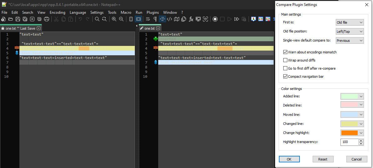
default colors: I agree, not very readable

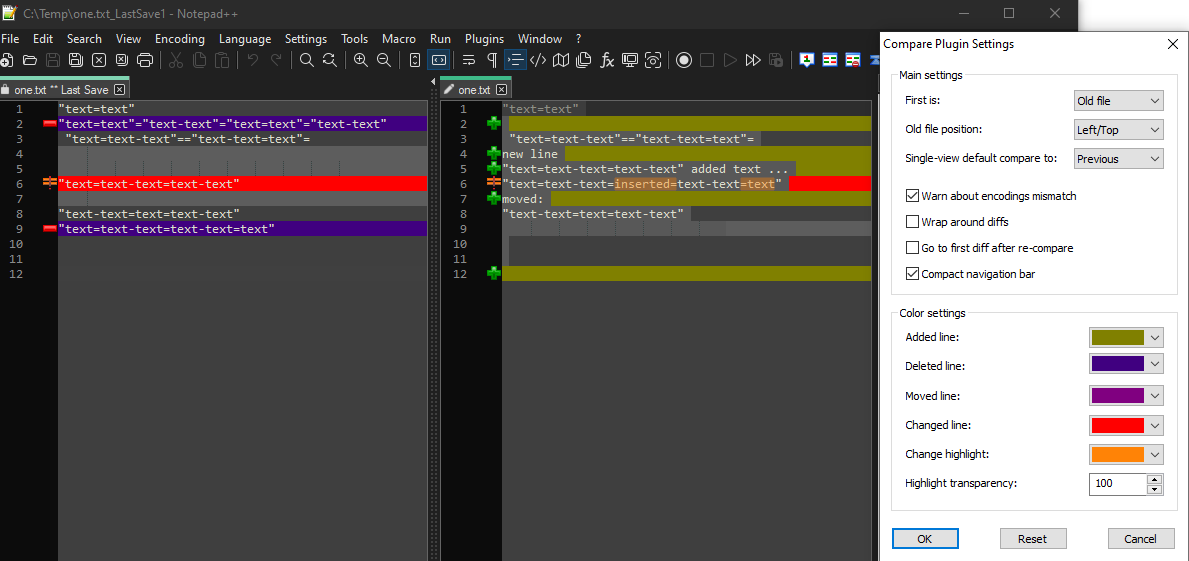
changed colors: I was able to change everything that wasn’t readable for me

-
P PeterJones referenced this topic on
-
P PeterJones referenced this topic on
-
@greg-vaeth said in Toggle Dark Mode off when using Compare Plugin:
It’s clear from forum postings
You could have linked to those postings, to make it clear to everyone, rather than just you.
I have to assume you were referring to
- Dark Mode & Compare Plugin from July 2021, where I said people would likely have to wait until ComparePlus was released. But if you read the follow on, another user in April 2022 corrected me to point out that, like I just said above, all you have to do is change your settings.
- or the Unreadable lines when comparing in Dark Mode from December 2021, where I had come to my senses and pointed the questioner to the already-existing color settings in the plugin.
- or the On Dark mode, the compare not show text from later in December 2021, where I just pointed the user to my answer a few weeks earlier
Only one of those three included any idea that it wouldn’t work in Dark Mode… and that was only my not thinking to look for plugin-specific settings, and if you’d read the whole conversation, you would have seen the instructions on how to change the colors.
-
@peterjones said in Toggle Dark Mode off when using Compare Plugin:
Why does anyone want to switch back-and-forth between the two modes? I just don’t get it… either you like Dark Mode or you don’t.
My eyes are pretty light sensitive. I vastly prefer bright-white-light modes in the day, but the white backgrounds burn my retinas at night. Even when “night” is is a bit relative and my sensitivity seems to vary day to day. Similarly even a cloudy vs a sunny day affects it, also whether I’m the office with ceiling lights or in my home office in a shoulder level circle of lights etc.
In short, I’d be happy if it was possible to use a keyboard shortcut to change it at will.
-
@snabel42 said in Toggle Dark Mode off when using Compare Plugin:
I’d be happy if it was possible to use a keyboard shortcut to change it at will.
Well, as fellow users, we in the Community Forum cannot change the code. There is a FAQ explaining how to make an official feature request.
-
@peterjones Thanks. Lesson learned - I did not do a thorough search, and did not see references to changing the light colors to darker ones. In fact, never noticed the Settings option until I read your reply.
-
Compare plugin will not be supported anymore (at least by me) because I consider it obsolete and because (as Peter Jones said) I am working on another plugin - ComparePlus that is Compare plugin’s successor.
ComparePlus will have default color settings for Notepad++ DarkMode. I hope to release the first version soon.
@PeterJones ,
Peter, thanks for all the support, much appreciated!BR
-
 T Terry R referenced this topic on
-
 T Terry R referenced this topic on