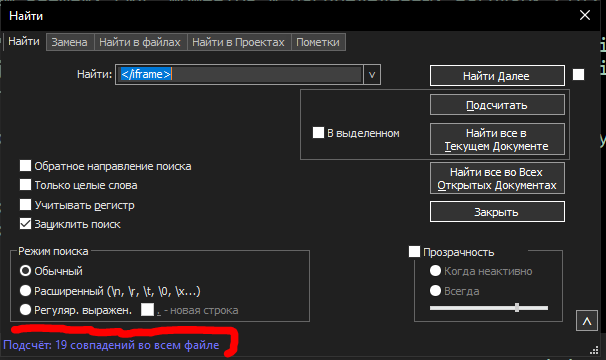
Как поменять цвет и размер шрифта уведомления в окне поиска?
-
Здравствуйте.
Скажите, пожалуйста, как изменить цвет и размер шрифта уведомления, отображаемого фиолетовым цветом в окне поиска?

Спасибо. -
@User1727 said in Как поменять цвет и размер шрифта уведомления в окне поиска?:
Hello.
Can you please tell me how to change the color and size of the notification font displayed in purple in the search box? Thank you.It is currently (v8.6.5) not possible, I don’t believe – there’s a chance I could be wrong about it…?
You could make a FEATURE REQUEST for it.
Note: It is much more likely that color could be changeable, than size. -
@User1727 said in Как поменять цвет и размер шрифта уведомления в окне поиска?:
how to change the color … of the notification displayed in purple in the search box?
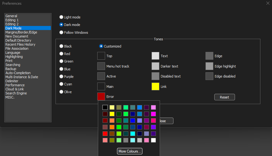
I was really hoping it would follow one of the Tones in the Settings > Preferences > Dark Mode > Tones, but unfortunately, it does not.

There are actually 3 different colors for that status bar, and none of them follow any of the Tones:
- Count or Mark (whether or not sucessful) =>


- Successful Find =>
 (only some successful finds show anything there, usually on wrap)
 - Failed Find or Invalid Regex =>


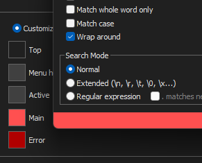
it’s actually possible to choose a Main color that makes one of those three invisible:

If you were to follow @Alan-Kilborn’s suggestion and make a feature request, I would suggest that you ask that it follow the Error Tone when it’s not a match or has a regex error, and that two new Tones be added for the Count/Mark and the SuccessfulFind.
Or, if it’s not in the Tones section, then having those three colors selectable in the Settings > Preferences > Searching section would make the next most sense.
- Count or Mark (whether or not sucessful) =>
-
@PeterJones said in Как поменять цвет и размер шрифта уведомления в окне поиска?:
and that two new Tones be added for the Count/Mark and the SuccessfulFind.
Or, it could be simpler and just use one color (currently the green, but to be made programmatic) for both.
make a feature request
Actually, I think there was an old feature request for this, from a visually impaired user (and this predates the time when there was a dark mode).
The colors would ideally be made configurable for either dark or light modes.
-
-
Всем большое спасибо за ответы.
Буду ждать решения проблемы в следующих обновлениях.
Было бы идеально, если бы в темном режиме эта строка отображалась белым цветом -
@User1727 said in Как поменять цвет и размер шрифта уведомления в окне поиска?:
Thank you all very much for your answers.
I will wait for a solution to the problem in the next updates.Well, we here don’t control development, so…don’t count on anything happening, but… be glad if it does
It would be ideal if in dark mode this line was displayed in white
If it is programmable, you can set white if you like; I’m sure a suitable default will be chosen for all modes.
-
@User1727 This forum thread from the year 2020 also mentions the issue. Unfortunately, the code in FindReplaceDlg::drawItem has not changed in years and is hardwired for three colors for light mode and another set of three for dark mode.
-
@Alan-Kilborn said in Как поменять цвет и размер шрифта уведомления в окне поиска?:
Or, it could be simpler and just use one color (currently the green, but to be made programmatic) for both.
I added a comment to Issue #9309 with my suggested ideas of either using colors from Tones, or having the colors choosable in Preferences > Searching .
I’m not hopeful that anything will ever come of that, but at least the suggestion is there.