Different indicator for unsaved Tabs
-
Is there a way to set a different indicator for unsaved tabs? Currently, the disk icon changes color (Blue vs Red, I believe), but as a color-blind person, it is next to impossible to see which tabs are saved and which are not, especially for tabs that are not the current one. Is it possible to add an indicator next to the filename, such as an asterisk (*) when a tab has changed, but is not saved? Anything but color would be helpful.
Thanks.
Rich -
I think it would be awesome to have even a totally different icon when a file is unsaved. And another if a file is read-only.
Truthfully, the “disk” icon (of whatever color) is a bit antiquated, don’t you think?
However, it appears there has been some resistance to even slightly adjust what we do have in certain circumstances, e.g. https://github.com/notepad-plus-plus/notepad-plus-plus/issues/5666
But, if you want to, you could open an official feature request for your suggestion; see here for how to best do that: https://community.notepad-plus-plus.org/topic/15741/faq-desk-feature-request-or-bug-report
-
@richlux ,
Good idea. The asterisk is visible in the title bar for the active file, but that doesn’t help inactive files.
@Alan-Kilborn said,
resistance to even slightly adjust what we do have in certain circumstances,
Hopefully, if couched in “accessibility” terms, the developer would be more likely to
the “disk” icon (of whatever color) is a bit antiquated
Well, yes. But, even if they don’t know know why, I think “the kids” still presumably associate the disk icon with saving, because it’s still used in just about any application I use (including those by Microsoft) that has toolbar-based or icon-based save feature.
But maybe 💾 for a saved file, 🔒 for read-only, and maybe 🚫 or ⚠ or ✎ for an edited file. (I like the lock icon that was used in https://github.com/notepad-plus-plus/notepad-plus-plus/pull/5097 – not sure why it was rejected, because “it looks different” is a strange reason to reject something like that.)
@Alan-Kilborn said,
you could open an official feature request for your suggestion;
@richlux , if you do, make sure to link it here. And explain clearly that it’s for accessibility reasons in your request. And explain that if he is resistant to changing the icon behavior, at least add the * to the tab bar as well – give him options, so it’s less likely to be rejected.
-
@PeterJones said in Different indicator for unsaved Tabs:
I’m not a big fan of the “asterisk” method, as it is hard to see (but I get it for color-impaired persons).
---------------------------
💾 for a saved file
It’s okay, because it satisfies the historical purists, and not just history of diskettes, but the history in Notepad++!
But, and I’m not the expert of Unicode characters here to provide an example, but what about a bright-green (sorry OP!) checkmark for a saved file (green implies “saved”)?
---------------------------
I do like these, choices, very much:
🔒 for read-only
✎ for an edited file
But why not a RED (again, sorry OP) pencil? Red implies “unsaved”, at least in my world.
---------------------------
And… I think the colors of the little icons should NOT change whether or not a tab is the active one or one of the inactives.
-
@PeterJones said in Different indicator for unsaved Tabs:
I like the lock icon that was used in PR5097 – not sure why it was rejected, because “it looks different” is a strange reason to reject something like that.
The fact that it “looks different” is the absolute BEST reason to use it! :-)
-
@Alan-Kilborn said in Different indicator for unsaved Tabs:
@PeterJones said in Different indicator for unsaved Tabs:
I’m not a big fan of the “asterisk” method, as it is hard to see (but I get it for color-impaired persons).
There is historical precedent (as in title bar). But I’m not stuck on that – I just think convincing Don “you already use an asterisk in the title bar, so please also use it in the tab bar” is a more likely successful tactic.
💾 for a saved file
It’s okay, because it satisfies the historical purists, and not just history of diskettes, but the history in Notepad++!:-)
But, and I’m not the expert of Unicode characters here to provide an example, but what about a bright-green (sorry OP!) checkmark for a saved file (green implies “saved”)?
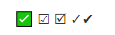
✅ ☑ 🗹 ✓✔
Note that all of my examples were just what I could find at http://www.fileformat.info/info/unicode/char/search.htm, and were just meant to be indicative of the icon, not the exact representation (since I don’t know what font is displaying the unicode character on your browser, I have no idea what the character looks like to you.
---------------------------
I do like these, choices, very much:
🔒 for read-only
✎ for an edited file
But why not a RED (again, sorry OP) pencil? Red implies “unsaved”, at least in my world.
Once again, unicode to give the gist; actual design would be a true icon bitmap, with appropriate colors
And yes, I prefer the red lock from PR 5097 to the yellow-on-black that the unicode char looks like in my font. Red pencil would be a great idea.
And… I think the colors of the little icons should NOT change whether or not a tab is the active one or one of the inactives.
Definitely.
-
I realize the Unicode samples are just that, but they are very helpful I think to “hammer out” a prototype solution (not that all our “blacksmithing” skills matter one iota).
Of the checkmarks, I like the rightmost green one:

It has the advantage of “slanting” the opposite way of the pencil, which is a further differentiator:

If the “pencil” is made red, I’d prefer the “lock” be yellow as it implies “caution” (which is what the readonly attribute on a Windows file implies – “change at your own risk, I’m just a suggestion”):

Images (re)provided so you can for sure see what I saw. :-)
Are we missing anything in the set? Could something different be done for OneDrive or network share files? Hmmmm…
One more thought: “Boxing” like some of the checkmarks have, is undesirable because it “muddies” the pureness of the image trying to be represented.
-
@Alan-Kilborn said in Different indicator for unsaved Tabs:
I realize the Unicode samples are just that, but they are very helpful I think to “hammer out” a prototype solution (not that all our “blacksmithing” skills matter one iota).
Of the checkmarks, I like the rightmost green one:
Images (re)provided so you can for sure see what I saw. :-)
Interesting: all but the first checkbox were just black and white in my font.
Are we missing anything in the set? Could something different be done for OneDrive or network share files? Hmmmm…
We already have the eye-icon for a file being monitored.
One more thought: “Boxing” like some of the checkmarks have, is undesirable because it “muddies” the pureness of the image trying to be represented.
Good point. I was just showing a wide variety of checkmarks
I have created the issue: https://github.com/notepad-plus-plus/notepad-plus-plus/issues/8068 – feel free to add suggestions or example images over there to support/bolster my case. :-)
-
Hi @richlux, All
Is it possible to add an indicator next to the filename, such as an asterisk (*) when a tab has changed, but is not saved? Anything but color would be helpful.
Let me suggest you to take look at Window > Windows… and you will notice that unsaved tabs show an asterisk at the end of their filenames.
It is not as handy as to have that indicator visible in the title bar, but may help you while the feature request is delivered (if ever).
BR
-
I’m glad others feel as strong about this as I do. Thanks for all the comments. I see that Peter already created a feature request and sasumner split it into 3 distinct features. Now I guess I just wait to see if someone decides it’s worth doing. @astrosofista, thanks for the Window -> Windows… suggestion. I didn’t know about that and it helps, but not nearly as nice as a quick visual cue would be.
Thanks,
Rich -
Someone in your situation might also be able to provide valuable input on some other “accessibility” issues I located:
-
Hello, @richlux, @alan-kilborn, @peterjones, @astrosofista and All,
Generally speaking, there are about
8.3 %of colour-blind people, among the world population !All these people can be broken down into the different groups, below, with their proportions :
    Anomalous Trichromacy :                       Dichromatic view :                          Monochromatic view :

Red-Weak/Protanomaly        1%             Red-Blind/Protanopia        1%             Monochromacy/Achromatopsia  < 0.0001%
Green-Weak/Deuteranomaly    5.2%           Green-Blind/Deuteranopia    1.1%           Blue Cone Monochromacy        0.001%
Blue-Weak/Tritanomaly       0.0001%        Blue-Blind/Tritanopia       0.008%         Rod Monochromacy              0.003%
This means that, roughly,
92.7%of people have a normal vision
To understand the colour problems, faced by colour-blind people, here’s what they actually see when Notepad++ is opened with three tabs, on a
Win XPlaptop :-
The first one, with a file to save (
Richlux.txt) -
The second one, with a file already saved (
license.txt) -
The third one, with a read-only file (
Don-Ho.txt)
Here are the screen-shots of Notepad++, as seen by the main groups, with these visual impairments and people with normal vision :
- Normal vision (
~ 92,7%) :
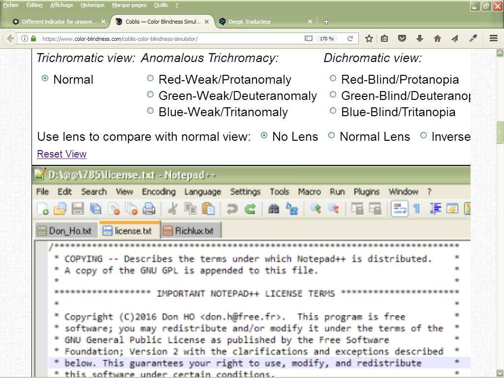
- Red-Weak/Protanomaly (
~ 1%) :
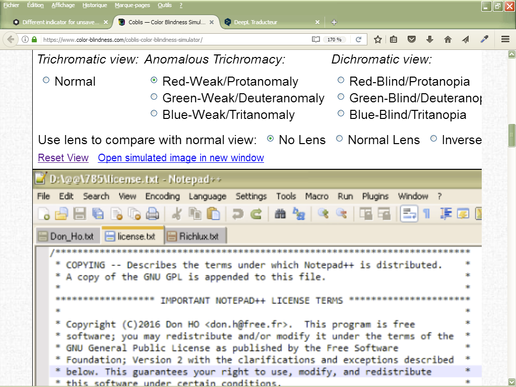
- Green-Weak/Deuteranomaly (
~ 5.2%) :
- Red-Blind/Protanopia (
~ 1%) :
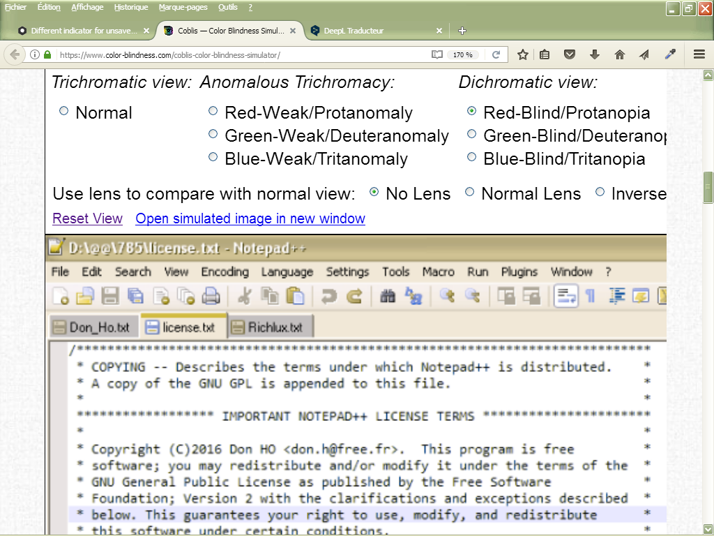
- Green-Blind/Deuteranopia (
~ 1.1%)
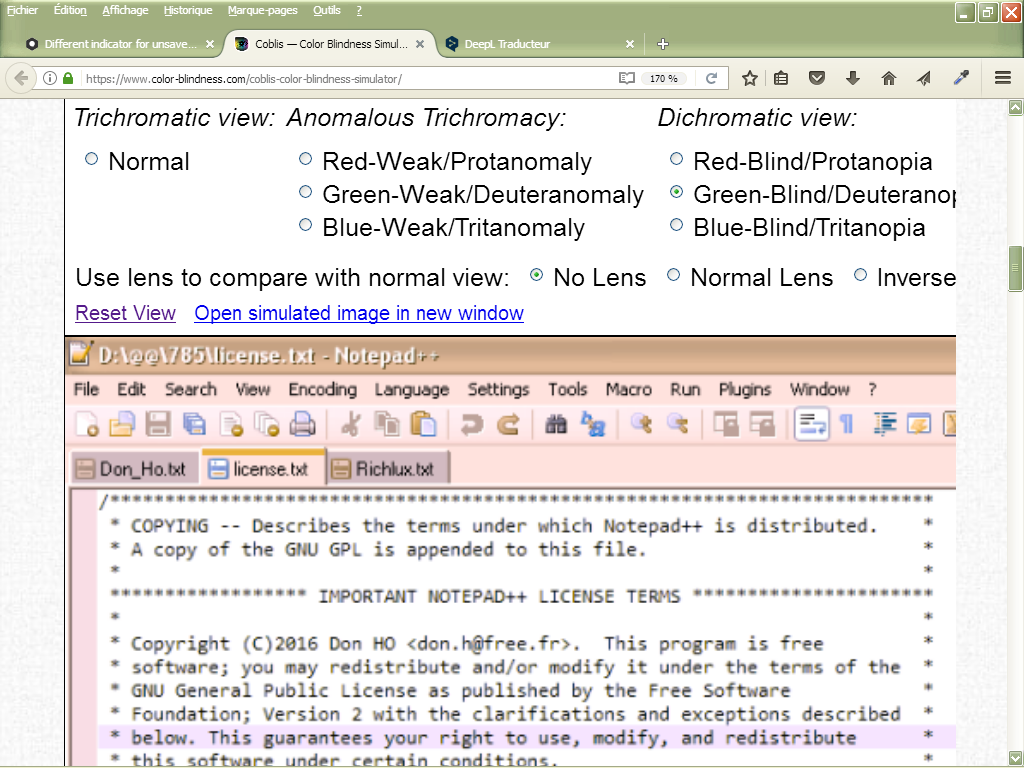
As you can see, it is far from being simple for this category of people and every developer should pay attention to this aspect when developing his software !
Note that I got these screenshots, with the help of a color-blind simulator, below :
https://www.color-blindness.com/coblis-color-blindness-simulator/
Best Regards,
guy038
-
-
Nice analysis.
An after thought: It may improve things for users if they make sure Preferences -> General -> Tab Bar -> Darken inactive tabs is un-ticked ? I’m not sure how the adjacency of contrasting colors might affect those with vision issues.
-
@guy038 said in Different indicator for unsaved Tabs:
As you can see, it is far from being simple for this category of people and every developer should pay attention to this aspect when developing his software !
This is why using color as the only means to portray meaning is a big no no for accessibility. I work for a company that does software/website development for the Federal Government and all software developed must adhere to the Section 508 Accessibility standards (https://www.epa.gov/accessibility/what-section-508). This means making sure it can be used by the visually impaired, physically impaired, etc. We would never be allowed to use color in this way, because a screen reader wouldn’t be able to convey this to the user.
Rich
-
You “endorsed” Resource Hacker in this thread: https://community.notepad-plus-plus.org/topic/14038/remove-spam-from-program-s-description
You could probably employ that same program to change the tabs on the tab bar, if Notepad++ devs don’t do something for the opened issue(s). Just sayin.
-
@Alan-Kilborn
Hmmm. I never thought of that. This would work, but I would need to make the changes every time I upgraded Notepad++. I might try it just to see what it would look like.Thanks,
Rich -
@Alan-Kilborn said in Different indicator for unsaved Tabs:
if Notepad++ devs don’t do something
The good news is, @Scott-Sumner is involved in those issues now, so at least there’s an advocate who agrees with us, and might be able to convince Don to accept the PR when they are provided. Let’s hope. :-)
-
@richlux said in Different indicator for unsaved Tabs:
I would need to make the changes every time I upgraded Notepad++.
True; it’s called “patching”. :-)
But unlike most patching, it doesn’t require rebuilding the source code.
Plus AFAIK Resource Hacker has a command line way of doing things, in addition to its GUI, so it could be relatively painless to have truly personalized tab bar icons!I might try it just to see what it would look like.
Additional prototypes of acceptable solutions would be good I’m sure.
Hello! It looks like you're interested in this conversation, but you don't have an account yet.
Getting fed up of having to scroll through the same posts each visit? When you register for an account, you'll always come back to exactly where you were before, and choose to be notified of new replies (either via email, or push notification). You'll also be able to save bookmarks and upvote posts to show your appreciation to other community members.
With your input, this post could be even better 💗
Register Login