Dash and Hyphen - no visible difference
-
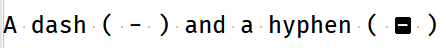
I was trying to debug something which appeared did not appear to have any issues, but it actually contained two very different characters. A dash ( - ) and a hyphen ( – ) which caused my script to fail because of the use of the hyphen. They appear the differently on here as I am writing this, but was using trusty Notepad++ as the text editor, which is where I came unstuck as they looked identical. Is it possible to make these two look more obviously different as they do in other text editors?
Many thanks,
Rob
-
Isn’t the simplest answer is to choose a font in Notepad++ where these two characters appear differently?
-
@Alan-Kilborn Thank you for that suggestion and yes it does work well! I was not aware of this limitation with the default “Courier New” font after doing a default installation in Windows until I was using a different editor. Many thanks.
-
Hmmm, it isn’t easy to immediately “pick up” visually, even in a font that does have an “obvious” difference for the characters. You’d almost have to see them both near each other to know which was which.
This is actually a rather “tough” problem. :-)
Maybe a visual effect like this is more desirable?:
If that’s acceptable, I can go more into how to achieve it.
-
@Alan-Kilborn Thank you for that. I have had a look at why I picked it up in Notepad rather than Notepad ++ and found that yes the font may be the key. I have now updated to use “Consolas” instead of “Courier New”, which displays the difference far more clearly and is still has very clearly different 1 and lower case L characters. I will never forget this though, just in case the “Consolas” font has it’s own quirks - you just don’t know until you know. Thanks for your time.
-
It appears there are a fair number of Unicode dash/hyphen/thingies that appear similarly; I found them here: https://www.compart.com/en/unicode/category/Pd
And I show how they appear in Notepad++'s default Courier New font, with their U+xxxx notation:
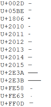
Ok, so not all would be hard to distinguish, but there’s enough of them with a common “look” that this might be a “problem”, in any font.
-
@Robin-Tyers said in Dash and Hyphen - no visible difference:
“Consolas” instead of “Courier New”
Consolas is indeed a good choice.
I oscillate between liking Consolas and Fira Code.
Deja vu sans mono might be a good one as well. -
@Alan-Kilborn said in Dash and Hyphen - no visible difference:
It appears there are a fair number of Unicode dash/hyphen/thingies that appear similarly; I found them here: https://www.compart.com/en/unicode/category/Pd
And I show how they appear in Notepad++'s default Courier New font, with their U+xxxx notation:
Ok, so not all would be hard to distinguish, but there’s enough of them with a common “look” that this might be a “problem”, in any font.
Wow, I never knew there were that many variations. Thank you for taking the time to highlight that and for the font suggestions.
-
Hi, @alan-kilborn,
Again, as for the https://graphemica.com link, many thanks for pointing us to the https://www.compart.com/en/unicode/ site !
Just for information, the main sections are :
https://www.compart.com/en/unicode/ : Home https://www.compart.com/en/unicode/charsets : List of Character Sets https://www.compart.com/en/unicode/block : List of Unicode Blocks https://www.compart.com/en/unicode/category : List of Unicode Categories https://www.compart.com/en/unicode/scripts : List of Unicode Scripts https://www.compart.com/en/unicode/html : List of HTML Entities https://www.compart.com/en/unicode/search?q : List of Unicode Characters INPUT Examples in the "Search" zone : - Char => Character ITSELF - U+10180 or 𐆀 => Character U+10180 ( Character : GREEK FIVE OBOLS SIGN ) - ⟄ => Character U+27C4 = U + Hex(10180) ( Character : OPEN SUPERSET )Cheers,
guy038
Hello! It looks like you're interested in this conversation, but you don't have an account yet.
Getting fed up of having to scroll through the same posts each visit? When you register for an account, you'll always come back to exactly where you were before, and choose to be notified of new replies (either via email, or push notification). You'll also be able to save bookmarks and upvote posts to show your appreciation to other community members.
With your input, this post could be even better 💗
Register Login