Is there a settting for :"high visibility" options?
-
Many other applications that show “rows” have a view option of some kind that deliver a high-visibility presentation enhancement that improves the visibility of each row. I cannot see one in Notepad++.
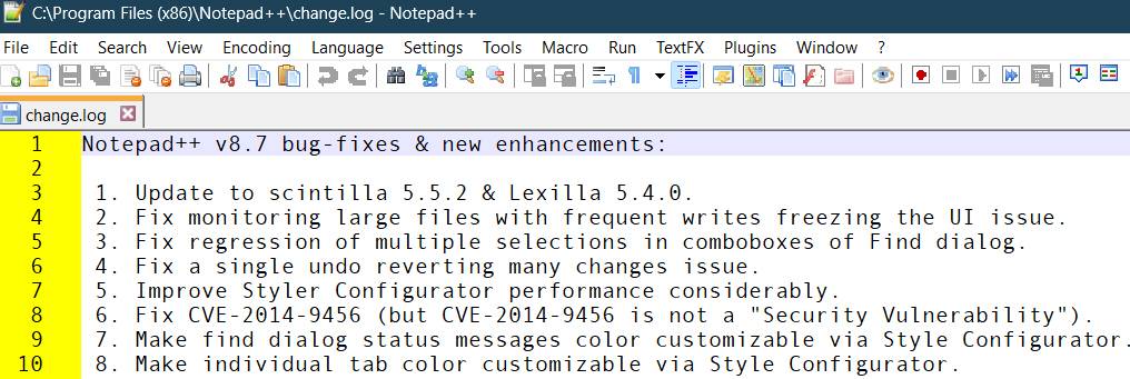
So each row’s text appears on a plain white line, with no separator from the line above or below. I’m not talking about color highlighting of a specific type of text (like a programming language). I’m talking only about the basic separation of lines, with some sort of highlighter.

==> Does Notepad++ have a similar presentation enhancement to make seeing rows clearer and more defined?
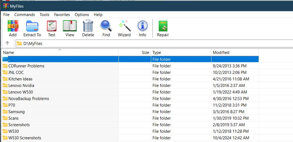
For example, something like alternating row colors such as light/dark or different background shades:


Or, “grid lines” where each row has a visible line under it:

Or even a very high-visibility high-contrast matrix or spreadsheet appearance:

==> So, am I missing that setting in Notepad++, if it is present already?
If not, sure seems like a useful improvement in user interface.
-
-
Thank you for pointing me to that source f information on how something like this could be done. Looks a bit above my pay grade, and all things considered I think I’ll just stick with N++ in its stock form.
Personally I do feel that any type of presentation based on discrete lines / rows, especially ones where there’s an explicit line number on the left and a long line data area to the right where the eye must travel, having some kind of a “ruler” effect in order to guide the eye as it scans on a single line from left to right is a very useful feature. Not critical, but very helpful, and especially when lines can span across a very large window or even the entire width of the screen.
In other words if/when it ever does get developed and implemented in the base product, I’ll certainly take advantage of it at that time. Anything from a simple thin “ruler line”, or very pale alternating colors/shades, would be perfect. You don’t want the visibility enhancement to be overwhelming. Just subtle, but sufficient enough to assist the eye to remain on a single line as it is viewed.
Anyway, thank you very much for the direction.
-
Looks a bit above my pay grade, and all things considered I think I’ll just stick with N++ in its stock form.
Your choice, but it really isn’t that hard to just use something as opposed to writing it yourself. Someone else already did what’s “hard” about it.
having some kind of a “ruler” effect in order to guide the eye as it scans on a single line from left to right is a very useful feature
There can be a lot of coloring going on in a file’s presentation, depending upon the file type. Probably it was thought that an every-other line coloring was too much for the standard product. Certainly for “plain” files where there isn’t any other coloring going on, it makes some sense.
You can always make a feature request for it; see details HERE on how exactly to do that.