@p-k said in Lost document list panel:
if a user upgrades across multiple versions (skipping 8.1.3) he/she won’t see these release notes, but will see only the latest release notes.
Then look for the older release notes as well. For example, the complete change history is stored at https://github.com/notepad-plus-plus/notepad-plus-plus/wiki/Changes , so you can look over nearly two decades of changes on about 3 pages. Enjoy.
And anytime you see something change unexpectedly, and cannot find it in the most recent change list, you can try to look it up in the Online User Manual, which is linked from the ? (help) menu in Notepad++ as “Notepad++ Online User Manual”.
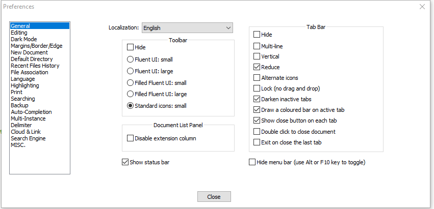
For example, for this feature, since it used to be on the Settings > Preferences > General tab, you would go to npp-user-manual.org, click on Preferences, then in the jump list go to the General subcategory of the Preferences page, then read down until you come to the “Document List Panel”, which is the feature you were looking for.
[image: 1643579142002-57a2633d-437b-4935-8df3-4506ba8cc3ab-image.png]
There, as you can now see, it specifically said “This section removed in v8.1.5.”, and in the “Show” checkbox section, it says that control was removed in v8.1.3, and says exactly where it is controlled now, and links to the appropriate section of the usermanual.
But I wouldn’t call it entirely an improvement.
You are entitled your opinions. Personally, I think that the Document List panel should have always been controlled in the same place that all the other Panels are controlled (that is, where they are now): so to me, it was a drastic improvement.
If an application changes its expected behaviour after an upgrade, then it’s not an improvement.
You cannot change software without changing the behavior. That’s the definition of change. If you don’t want change, don’t upgrade. (There’s even a toggle in the preferences which will turn off automatic upgrades, to help people who don’t want Notepad++ to change. You can find it documented in the User Manual.)
