@Kendall-DeMott said in Session Fails ? ? ?:
@Terry-R
Terry TY for your help and suggestions.
I don’t know anything about Notepad++'s own backup system,
Then read the FAQ, as @Terry-R suggested. Understanding is always better than not understanding.
PS, when I looked in Notepad++'s backup folder, all there is is just file that load a single tab from mods that I edited, but none of the file were the (5) that I use all the time,
That “backup” folder is where Notepad++ keeps the unsaved changes for any files that have unsaved changes. As soon as you save a file, it will delete the backup, because the periodic backup copies are only intended for tracking unsaved changes; once you save a file, it has no unsaved changes, so there is nothing to track. Similarly, if you close a new 1-style never-saved tab, Notepad++ will prompt you to make sure you aren’t about to lose all your changes with never saving it; but it trusts you: once you tell it you don’t want the file, it will accept your decision, and close that file and remove the periodic backup because the periodic backup is only for files that are actively open in Notepad++.
funny how it backed up all these single files, but not one of them is one of the five tabs that I would open on almost a daily basis.
It backs up exactly the ones that are currently being edited in Notepad++, no more and no less.
I was keeping (backing up) the session file from Notepad++ install Dir, this has never failed in the past.
That very much surprises me, since in a normal installation where your settings files (and backup directory) are in AppData (which yours is, as shown by your Debug Info), then the active session.xml file is the one in AppData, not the one in c:\program files\Notepad++\session.xml
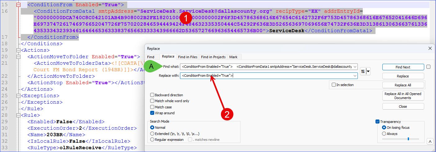
This is the session file, you can clearly see the (5) lines are there, they just not longer load from this file when the default session file from Notepad++'s install Dir is overwritten by my BU file copied from the install Dir:
You seem to be saying different things about the session.xml file. When you try to “restore” you session file from the backup, where do you copy it from? Where do you paste the file to? What order do you do things? Because some of your phrasing implies you are backing up your session file into the installation directory, and other of your phrasing implies you are using the one in the installation directory as the backup. And I’m confused what you’re actually doing.
Assuming you have some directory that I will call c:\backup\ which contains c:\backup\session.xml that looks like what you pasted in your reply, then the steps to get back that session would be:
Exit all copies of Notepad++
Copy c:\backup\session.xml to %AppData%\Notepad++\session.xml
Open Notepad++
Assuming those files still exist on the I: drive and the drive is accessible, those files will open at this time
However, any usaved changes that didn’t get saved to the files before will obviously not be there, because whatever went wrong earlier that caused your session to get messed up caused Notepad++ to think it was safe to delete the snapshot from the backup\ folder, so your unsaved changes for those files no longer exist. Going forward, you need to keep in mind that Notepad++'s backup folder is really misnamed and should be called a “snapshot” folder – it’s where a “snapshot” of the unsaved changes are stored, but it’s highly temporary, and should never be relied up for long term backup.
My recommendation, and the recommendation of most of the regulars here, is that you take an active role in backing up your data, and don’t rely on backup settings that you don’t understand. This is the advice I have incorporated in to the FAQ.
If a file or data is critical: 1) save to a known location, often; 2) have an established backup system that is independent of Notepad++; 3) when appropriate, use revision control software like svn or git, so you can better track changes over time. Doing anything less than that says that you don’t actually think the data is critical.